Friday, October 02, 2009

Builders in my life


I don't mean to complain, but one of these photos is the view from my office, and one is the view from my house.

A bit off-topic and personal for this blog, I know, but my excuse is to point out the continuous set of labels that are being buried on top of 11,000 volt cables outside my office. They tell a future digger operator he is about to fry.


Saying what it is on the tin

Which of these is actually a pink grapefruit?


Tuesday, September 29, 2009

The poetry of Donald Rumsfeld

Slate some years back collected together the poetry of Donald Rumsfeld. There is no point in reproducing the famous 'Known unknowns' – it is too well known. But I thought this ode to clarity would suit this blog very well.

Clarity
I think what you'll find,
I think what you'll find is,
Whatever it is we do substantively,
There will be near-perfect clarity
As to what it is.

And it will be known,
And it will be known to the Congress,
And it will be known to you,
Probably before we decide it,
But it will be known.

Feb. 28, 2003, Department of Defense briefing

Tube map latest


The London tube map has long been an information design icon, so it's not surprising that the latest version has attracted controversy - the river is missing. It's just one of a set of changes that are intended to declutter the map... which is a good thing. Except the river is a critical landmark in London, and now London mayor Boris Johnson has ordered it reinstated. 

I'm less worried about the river, and more concerned about the welfare of the famous animals on the underground


For example, the raven no longer works now the angle of the Kings Cross link has been changed. However, Euston Square now gets a big dot, and results in a decent canary to take the raven's place.


Wednesday, September 23, 2009

Little people run to the left


I think this sign (seen at the Eden Centre in Cornwall) means the nearest fire exit is to your right, but there is another one to your left. Unless the left hand exit is for the piskies.

Monday, September 21, 2009

Ladies THIS WAY


Usability in action. Not one but two extra signs have been required here to persuade the ladies that this really is the way in. What's gone wrong? At a guess, the height of the signs, the collision of too many signs (the baby, the shower... or is it a jellyfish), but perhaps the icons for men and women are just too similar. The two word sign 'Ladies toilet' forces the type to a smaller size, too.


Another thought - where do dads go to change their babies?

Monday, September 14, 2009

Monkey vs umbrella


What's going on here? Monkey (long arms + tail)?, umbrella?

Thursday, September 10, 2009

More titles to choose from


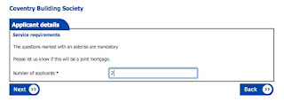
While I'm twitting the Coventry Building Society (nice old-fashioned phrase, that - not the same as tweeting, although you could do both: you could tweet a twit on twitter) here's their choice of titles. They obviously do well with the RAF and the Royal Artillery, and not just the officers. But not as posh as Harrods etc, obviously.

Back to the next page


Filling in this form online, I wondered why I kept being sent to the previous page. Well, where would you click to move on?

Monday, September 07, 2009

A typographic pedantry test

Careful, dancers


See my other post on this...

Doing without signs


I mentioned before that architects don't seem to like signs. I was in a brand new office block last week, looking for the loos. There were labels on the doors themselves to distinguish the ladies from the gents, but nothing you could see side on or from more than a couple of metres. But I had no trouble finding them by instinct, or perhaps through deduction (they are often near the lifts as they both need the central service shaft). Of course the clincher was the cleaning trolley.

Sunday, September 06, 2009

Beanfeast


Not only do signs fade – so do words. If you pass this sign in Highgate, and wonder why all the beans, let me save you the trouble. I looked it up, and a beanfeast is "an annual dinner or party given by an employer for employees". The bean bit may not be connected with beans, apparently, coming instead from the Latin bene.

Friday, September 04, 2009

Visual Voltage

Visual Voltage is an inspiring exhibition by a group of Swedish designers and engineers, of technology that helps people visualise their energy use in the home. We've just installed a meter that tells us how much energy we're using - you can switch the washing machine on and see the hourly cost shoot up. But it's not very compelling, and you forget about it quite quickly. These devices are more visceral - some of them actually work on an emotional level (such as the energy flower than blooms when you use less electricity). The powercord (below) looks like it's wasting energy, and you can't wait to switch it off. The energy clock maps your households usage, and shows you the times when you might need to change your habits.

The exhibition is touring at the moment, but there don't seem to be any UK dates.

Thursday, September 03, 2009

Making Policy Public

Have a look at http://www.makingpolicypublic.net/, where the Centre for Urban Pedagogy publishes a regular series of foldout posters that explain public policy. They act as go-between to introduce campaigners to designers and the results are impressive. Here's one on predatory equity (businesses who buy up rent controlled buildings, then harrass tenants until they leave).


Top: folded out as a poster
Below: information spread

Friday, August 28, 2009

The hotel I didn't choose

Just back from a few days trying out my new boat on Ullswater. We stayed at a nice hotel, but not at the one in the picture. In reality, it is perfectly fine, and right next door to a place I could keep the boat. But I couldn't bring myself to book it. Great art, poor ad.


Top: The hotel
Below: The Munsters' house

Thursday, August 27, 2009

Grumpy old man's thoughts on channel strategy

Companies who deal with the public have something called a channel strategy. One effect is that you can go online very easily to add stuff to your Sky TV package but not to cut it back. To do that you have to join a phone queue, press buttons, listen to the Four Seasons and finally talk to a specially trained crack salesperson who knows all your weaknesses and trains their finely honed neurolinguistic programming weapons on you until you relent.

I 'joined' Experian to get a copy of the file they had on me, but it seems I have to call them to cancel. They have a machine that read my email and spotted the word 'cancel'. So now I have written again, mis-spelling it - the automatic reply now says a human being will deal with it in a day or two. We'll see.

When we moved house recently I wrote to BT, but they ignored my letter and carried on charging me. I thought writing things down was the safest way, but apparently not. I called BT and was told 'der, we are a phone company you know'.

By the way, 'der' isn't a mis-spelling of 'dear' but my attempt at spelling that word teenagers say: derrh? de-ergh? Any suggestions?

Monday, August 10, 2009

Ghost signs


Hats off to the History of Advertising Trust (HAT) who are calling for contributions to a ghost signs archive. Ghost signs are those fading ads painted on old buildings. If you see any, they'd like them for their collection.


Thursday, August 06, 2009

Two ideas for typefaces


Cooper Black Peeling: I'm sure the food is fine, but this sign isn't very fresh.


Stickynote Sans: Beth Shepherd sent me this - from a conversation by post-it notes with the office across the road.

Monday, July 27, 2009

Still transforming after all these years

Robin Kinross recently published The Transformer, an essay by Marie Neurath supplemented by his own writings on the subject. It is a beautifully produced and timely contribution - timely given the growing interest in the work of the Isotype Institute. But make sure you ask for 'The Transformer: principles of making Isotype charts', and not 'Transformers - all hail Megatron' or 'Transformers - revenge of the fallen'.

Many years ago when I worked for the Open University, we took the Isotype concept of the transformer role, and applied it in the new community education courses being developed. They were on topics such as parenting, health, and retirement. To help the specialist academics write in an accessible way, we set up processes that encouraged them to write in page units - each topic had to be a single page or a double-page spread. They had to write a series of linked stories, which had to be within a recommended word limit, and accompanied by a sketched layout of how they anticipated them appearing on the page. The idea was to stop academics from simply expounding on their topic, and to help them imagine a reader with a busy life who needed to support from the visible structure of text to help them read strategically and actively. So the transformer role was partly accomplished by people, and partly by processes.

Pam Shakespeare (now Professor of Practice Based Open Learning) gave her inaugural lecture at the OU last week, and I went over to hear her. I hadn't previously realised that the transformer idea had made any kind of lasting impact, but it seems to have. A video of her lecture is online at http://stadium.open.ac.uk/berrill/ (it starts about 6 minutes into the video).

Sunday, July 05, 2009

No fun

More notices


I suppose 'deep' is a relative term.


I think if there really are quicksands here, we need a greater sense of alarm in this notice. Both signs seen along the Thames Path in Gloucestershire last week.

Friday, June 19, 2009

Banksy versus Bristol Museum


I haven't had so much fun in an art show for years (well, ever...). There is a lot to pick out, but in the interest of relevance to this blog, here's a nice reference to small print.

Our MA students


Our MA students have finished the practical part of their course (dissertation still to come) and their work has been on display this week. They have been a delight to work with, and their work is terrific. Here they are having their photo taken, and striking suitably creative poses.

Our forms design portfolio


Well, now the MPs' exes have been published and you can see our work in its full glory - the blacked out bits spoil it a little, but still...


Tuesday, June 09, 2009

MPs' expenses: our small part in their downfall

I remembered the other day that we (Information Design Unit, my former company) once had the job of designing the House of Commons expenses forms. The job went on for a long long time, as different wordings were tried and rejected. Obviously I would be sent to the tower for showing them (and I don't know which version, if any, was finally used), but it seems OK to mention that the declaration closely reflects the HMRC rules on taxation of expenses: "I confirm that I incurred these costs wholly, exclusively and necessarily... for the purpose of performing my duties as a Member of Parliament". I would say that is pretty clear.

Friday, May 29, 2009

Words in the street


Thanks to the Lancaster Literacy Research Centre for this link.

Monday, May 11, 2009

Branding oxymoron


The new kettle in our department is all wrong. A Frigidaire is a fridge. It has to be cold.

Oddly enough, I kept trying to turn it on by pressing the switch down (I think every other kettle works that way), but you had to pull it up. I thought it was because Frigidaire is an American brand and their light switches work the opposite way to ours (up is on). Paul Luna had a more ingenious idea - if Frigidaires normally get cold when you switch them on (ie, push the switch down), to get them to be hot you had to do the opposite (ie, pull the switch up).

Waiting for...


Perhaps I’ve seen it a million times before, but I’ve only recently noticed this sign at Liskeard station. I love the icon. You could set a short story contest around it.

"Waiting for the one o'clock train, now approaching Saltash, St Germans next, Jim wonders (proudly sitting in his union jack flares, head curiously detached) how he will lift his heavy well-strapped case, armless as he is. "

Easy Read not easyRead

A quick quiz. What is Easy Read?

1. Easy-Read is an ergonomic book holder that makes it easy to hold a book and turn the pages.

2. EasyRead is an application that lets you enlarge web pages to make them easier to read.

3. Easyread is a system for teaching dyslexic children

4. Easy Read is a way to write simply for people with learning difficulties, using pictures in support of clear language.

Hint - it’s all in the capitalisation. And it’s nothing to do with Stelios. That would be easyRead.

Friday, April 17, 2009

Two pictures of the ground


No information design in this post - just a couple of photos of the ground. After burying a new sewer pipe, the contractors have carefully restored the double-yellow no parking lines in our car park, in spite of the fact the rest of the line is completely worn away. After building this new ramp, someone walked through the wet cement leaving big boot marks. I love they way they have been carefully filled using cement of a different colour. Now there’s no missing them.

Tuesday, March 31, 2009

Cranks and idiots


Since I am on a religious theme, these two books found themselves juxtaposed on my bookshelf. One is now in the kitchen where it belongs.

Making reading digestible

Still on a scriptural theme... the Reader's Digest Bible cuts out the ‘boring bits’ – the genealogies or details of the Old Testament law – in an effort to make it less of a weariness of the flesh. But quite often when you look at other translations, the boring bits are actually graphically signalled, helping people read strategically (ie, helping them skip those parts).


In this page from Numbers, I've highlighted the section of the Reader's Digest Bible that is the equivalent of a spread from an edition of the New International Version (I designed the one shown some years ago for Hodder & Stoughton). 

The sections shaded pink are the ones left out of the RD version – I hope the image is clear enough to see that the list of tribes is spaced and indented in a way that makes it easy for the reader to simply skip over, noting the authenticity of the historical record (the main function of that passage for the modern reader). The spacing was not introduced by me but by the scholars and theologians responsible for the translation.

On another occasion I tried to take an even more explicit information design approach to Bible design. The Contemporary English Version is translated to be easier for people without a religious background to understand – it avoids theological terms, for example. I tried to make it look less bibly and to use genre cues to help readers approach it in a more strategic way. I could not avoid double columns (for space reasons) but I was able to use single column for poetry, so the line endings would be clearer. I used a three column ‘fine print’ approach for the boring bits, and bold headings.

Thought for the day

Paul Luna twitters on a scriptural theme:

“God as usability guru? ‘We have never sent a messenger who did not use his own people’s language to make things clear for them’ Qur’an 14:4

I counter with Ecclesiastes 12:12: ‘Of making many books there is no end; and much study is a weariness of the flesh.’

Oddly worded no smoking sign

My compulsion to whip out my iPhone in toilets continues - this one from a National Express train.

I suppose it is entirely reasonable that if I watch someone smoking in the loo, they can complain to the train guard.


I'll have to stop these toilet posts - Paul Luna's talking about the Oxford Literary Festival in his blog this week, and I'm lowering the tone.

Another toilet sign

I like the thoroughness of this sign. When you warn me about hot water, I want to know where it's likely to come at me from.


Location: Royal Station Hotel, Newcastle

Doing what it says on the tin


We all like things that do what they say on the tin. I also like things that say on the tin what they do. Like these shop signs: no guesswork required (unless you're too young to know what a gramophone is).

Locations: the wool shop is in Liskeard, and the radio shop is in Jedburgh.

Thursday, March 19, 2009

Information design anthem: new contender

Radio Berkshire was in our department yesterday, interviewing staff and students. I was called back later in the day to comment on the Local Government Association's call to ban the use of jargon by local councils. Actually, their list was a little weak - 'coterminous' is translated as 'singing from the same hymn sheet'. That's not what it is, and even if it was, it's not so far from the kind of stuff they're trying to ban.

I played the programme back on iPlayer today, and realised that I hadn't spotted the music Radio Berkshire put on just before the spot on jargon: the Animals, 'Don't let me be misunderstood'.

Google street view melts car


Google has launched street view in the UK. I love the side effects of their car-mounted cameras - this car looks like it's programmed Australia into its satnav.

Monday, March 09, 2009

Musical forms


Following an earlier post about information design in rock, John Willmer tells me he reckons the only musical arrangement of a government form is Frank Zappa's wonderful 'Welcome to the United States' from the album The Yellow Shark. Do you know otherwise?

I suppose you could argue that Rowan Atkinson's schoolmaster is a performance of a bureaucratic process, but while perfectly timed it's not musical.