I recently had the pleasure of meeting Borries Schwesinger, author of what looks like a landmark book on forms design, Formulare Gestalten. I say 'looks like' because I don't read German, but the scope of the book is visible from the extensive examples, both historical and modern, and by its comprehensive assemblies of graphic styles. It is beautifully produced, and is already attracting awards. Borries is currently working on an English language version, and I'm looking forward to it.
Wednesday, December 31, 2008
Chance encounter
One of the joys of computer search is when it throws up strange stuff that seems much more interesting than the topic you are concerned with. Best one today is 'Sword swallowing and its side effects', an article in the British Medical Journal. I particularly like its reference to a sympton known as a 'sword throat'. Recovering from flu, I reckon that's what I have right now.
I'm a little puzzled about how this article appeared in my search for research on the effectiveness of financial advice. Perhaps sword swallowing and financial advice are both forms of trickery and illusion.
Saturday, December 27, 2008
The latest high tech
There's a great collection of scanned Radio Shack catalogues here. Thanks to Collin McDougall for the link. I enjoyed flicking through them, and found myself wanting to order the latest tape recorder. We've come a long way since 1961, but it was just as exciting in those days, with hifi and tape recording still quite recently introduced.
Tuesday, December 23, 2008
One hundred years of progress
I've found a box of prehistoric documents, including a talk I gave to the ISTC in 1976. It was a little depressing reading it again, to find how little my ideas have progressed in 30 years. But it was nice to find these examples of information design from railway manuals from 1855 and 1972 (from Michael Macdonald-Ross's collection). One of them is very usable – pocket sized, with simple language, and accessible summaries in the margin. Progress?
Here's a scan of the talk, in case anyone's interested.
Friday, December 19, 2008
Monday, December 15, 2008
Disappointing
Graphic designers have a noble role to play in news communication through diagramming and graphic explanation. But they seem to have turned instead to the naff branding of news stories. Channel 4's graphic treatment of the Mumbai terrorism was breathtakingly crass, with its fake hindi curry house logo.
Tuesday, December 09, 2008
Agreeable?
I've asked a number of conference audiences if anyone has ever read the small print you get shown when you install software. One person has put their hand up, out of several hundred people. I don't particularly mind saying I agree with something I haven't read, but I don't feel comfortable saying I have read it, and even less comfortable saying I have 'read and understood' it. After all, I thought I'd read and understood my chemistry O level textbook, but look what happened.
I propose an alternative:
You can't be too careful
Wednesday, October 29, 2008
Quite big
A while ago I posted a note about the Michelin guides' francocentric use of the Eiffel Tower as a unit of comparative height. Now I've found a copy of their New York guide to illustrate the point. The usual point of these pictures is to impress you with the size of the new object, as compared with the known one. In this case we think 'wow, I didn't realise the Eiffel Tower was so big'. I think this is something approaching bad manners in a guide book - rather like dining with friends, and complimenting them that the meal was slightly better that the one you cooked yourself that day for lunch.
Saturday, October 11, 2008
A life explained
Thanks to Paul Luna for showing me this homage to infographics. It's by the French agency H5 (I loved their other stuff too - have a look at 'wuz', which has a great ending).
Since I first posted this, the link has been removed from Youtube, but you can see it on the H5 website - go to Film/Clip/Royksopp.
And I've just been told (thanks, Brian) you can download it on iTunes (seach for 'Remind me').
Since I first posted this, the link has been removed from Youtube, but you can see it on the H5 website - go to Film/Clip/Royksopp.
And I've just been told (thanks, Brian) you can download it on iTunes (seach for 'Remind me').
Another fading sign
Passing this sign, with the red worn away through years of shouting danger, I saw someone lighting a cigarette. Now that people can only smoke outside public buildings, I suppose they might expect there to be permissive signs to mirror the prohibitive ones on the door.
Turning the corner, though, this newer sign makes it very clear why lighting up wasn't such a good idea, and certainly to be avoided while naked.
Tuesday, September 30, 2008
Slippery jazz hands man
I love the jazz hands on this stick man.
For years I was an embarrassment on family holidays by constantly stopping to take photos of whatever it was we were designing at the time: airport signs or payphone user instructions were favourites. So it was nice to get this photo sent to my phone by my son Alex, overcome by a sad genetic urge to snap a sign for the first time. It's only a matter of time before he inherits my baldness too.
Wednesday, September 17, 2008
News graphics
I recently made the acquaintance of Max Gadney - he's responsible for news graphics at the BBC (or at least I think he may have moved on from that role as, googling him, I find his very information-rich job title is Channel Editor, BBC Two & BBC Four, Vision Multi-Platform team). As a sideline he creates terrific information graphics for World War II magazine, like this one.
Have a look at his website.
Max also told me about the Society for News Design.
Have a look at his website.
Max also told me about the Society for News Design.
Tuesday, September 09, 2008
The book - tech support
This wonderful YouTube clip from a Norwegian comedy show was doing the rounds a year ago or so, but in case you missed it...
Tuesday, September 02, 2008
A worry for the literal minded
Stop, stop, please stop
Martin Evans has sent me this link to a nice video: what happens when marketers brief an agency to design the stop sign.
Wednesday, August 20, 2008
Craphology
Paul Luna found this old book on graphology in a second-hand bookshop. The cover is interestingly and appropriately worn – appropriately, because at first glance I took it to say... well, read the first four letters for yourself. Graphology, if you recall, is the 'science' of analysing handwriting, which some organisations apparently take seriously when considering job applications. This particular book claims to tell you how to judge someone's confidence, altruism, degree of introversion, and many other things, but it makes little mention of 'was writing this on a train', 'was using a rubbish biro', 'is obviously French' or 'was trained as a graphic designer'.
Wednesday, August 13, 2008
You will only remember 10% of this, apparently
Every now and again you see a claim that we remember 10% of what we read, 20% of what we see, 30% of what we do... I forgot how it goes, and so I should since it is entirely spurious. In one place, I found it reported with much more plausible precision: 9%, 17.5%, 31%, etc. But it was still rubbish, it turns out.
Some years ago I saw this stated authoritatively on a BBC web page, even attributing it to 'recent research', so I wrote to ask for the citation. They replied that they had got it from the British Dyslexia Association, so I wrote to them. They in turn replied that they had read it somewhere, but they hadn't got a source.
Hunting for the source, I posted a query on the Infodesign Cafe, which put me in touch with Michael Molenda of Indiana University, who was on a similar hunt. He eventually published a short paper with his findings (you can find it here). He traced it to Edgar Dale's 'cone of experience', published in the late 40s. Dale used a schematic diagram (below) to illustrate his view that increasing richness of experience would lead to greater learning.
Somewhere along the way, someone has added the figures, and these have been repeated endlessly ever since, deeply embedded in the teacher training curriculum.
Tony Betrus and Al Januszewski of the State University of New York have published a collection of bad cones.
It seems unlikely that a 'quotation' like this would have survived for so long unless there is some truth in it - in other words, it chimes with people's experience in some way, just as a saying such as 'a picture is worth a thousand words' does. Perhaps this is just a modern version of a proverb – it's just that these days we need statistics.
The Education department at Cisco Systems have looked into the evidence that actually does exist, and produced a useful metareview .
Diagrams and irony
There are various websites around that collect data graphic interpretations of pop songs - they're good for a chuckle until you tire of them. One that's been doing the rounds is this nice graphic from Evita (credited to brianmn).
To be literal minded for a moment, I could point out that the song doesn't actually suggest that anyone should 'cry for me' – because, after all, 'I never left you'. Or perhaps it is ironic and suggests that Argentina should actually be crying.
But of course, diagrams don't do irony very well.
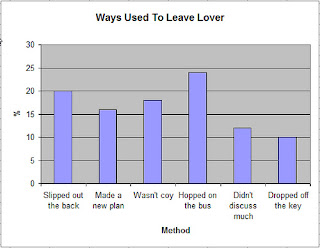
This next one (credited to sftekbear) shows another limitation of its chosen format. There are in fact fifty ways to leave your lover, only a few of which are specified in the song, and they are not given comparative frequencies as implied by this chart.
However, a professor writes:
In fact, although Simon (1975) is often quoted as identifying ‘50 ways to leave your lover’, we must treat this figure with caution. Reviewing the primary source, we find that Simon speculates that there ‘must be’ 50 ways, but does not present supporting data, nor does he claim 50 as an exact number.
Only four ways are detailed:
Just slip out the back
Make a new plan
Just drop off the key
Hop on the bus.
Simon makes 2 additional proposals concerning the manner of departure
You don’t need to be coy
You don’t need to discuss much.
A major theoretical problem arises from the lack of a clear categorial distinction between the 4 ways. An alternative view is that these are simply 4 stages of a process model: that is, in combination they describe only one way to leave your lover:
1. Make a new plan;
2. Drop off the key;
3. Slip out the back;
4. Hop on the bus.
However, this view is easily countered by further reference to the original data: Way 1 (slip out the back) specifically applies to a named individual (viz. Jack), whereas Way 2 (make a new plan) is specific to people named Stan. Since the principle underlying the allocation of method to individuals appears to be rhyming, we may reasonably speculate that Way 1 would also be appropriate for persons named Mac, or Zak, while Way 2 is also appropriate for persons named Dan.
On this basis we may proceed to a more accurate calculation of the different ways to leave your lover – that is, it must correlate with the number of available names within the population, with allowances made for duplication resulting from homophonic terminal phonemes.
We may, then, posit a direct relationship between available forenames within a particular language, culture, or discourse community and available options for terminating amatory relationships.
This leads to the conclusion that the number of available amor-terminatory strategies is directly proportional to the number of available personal nomenclature allocation options.
Some cultures (eg, the UK) permit an infinite range of options, with no rules for spelling (viz, Agnes, Agyness), while others (such as Portugal) require parents to choose from a prescribed list. In Sweden, there is no prescribed list, but parents can be prevented from choosing unusual names. It is therefore tempting to hypothesise that divorce rates in regulated countries should be lower than unregulated countries, since there will be correspondingly fewer ways to leave your lover.
This is indeed confirmed by the statistics: UK – 2.7 divorces per 1000 population; Sweden – 2.4; Portugal – 1.9. Of course, this figure should only be properly calculated using data adjusted for the frequency of matching terminal phonemes (which reduce the lover-leaving options within some language groups). And further we may speculate that in unregulated societies, parents may opt for names that, having no suitable rhymes effectively insulate their progeny from the risks of divorce: this may have been the motive of the Swedish parents naming their children Lego, Metallica or Brfxxccxxmnpcccclllmmnprxvclmnckssqlbb11116 (see Daily Telegraph, 7June 2008).
We may conclude that further research is necessary.
etc, etc.
Thursday, July 24, 2008
Architects and signs
Sign designers sometimes complain that architects don't like signs cluttering up their beautiful buildings. As Edo Smitshuijzen reports in his recent book, Signage Design Manual, “They perceive signage as an assault on the aesthetics of their creation and as an insult to the self-evidence of their spatial design. A lot of them carry an almost sacred but entirely unfounded belief in the functionality of their ‘wordless’ buildings”.
Perhaps this is taking it a bit far, so, as preparation for a short article I'm writing on this, I thought I would see what coverage sign design and wayfinding gets in the RIBA bookshop.
There was one book on signs - Smitshuijzen's. And I can confirm that there was indeed a sign outside the building... just.
Sunday, July 13, 2008
User ballistics
'User ballistics' is a term I sometimes find myself using to describe the movement of people around environments. It's important for the placement of signs, and suggests that, as well as a logical analysis of decision points and sight lines, you need to take account of users' initial trajectory, speed and momentum.
David Lewis and I came up with the term about ten years ago, when researching and advising on the placement of flight information displays in Gatwick Airport. Observing people entering the airport concourse from the train station, we found they came through in bursts (all having arrived on the same train) and were impelled into the room by the momentum of the crowd. Often they progressed 20 or 30 metres into the concourse before they had a chance to stop and look around. At this point they had missed the flight information screens, which were placed to be visible if you looked to the left just a few metres from the door.
As well as the push effect of the crowd, we also found distant features to have magnetic force. At this same point, a very large flight information wall was visible, but not legible. People would walk towards it, but stop at a certain point when the word 'Arrivals' became visible. Those wanting Departures would then turn and look for another direction.
Friday, July 11, 2008
Designors (a recycled post)
Many years ago when I edited Information Design Journal, I included a column of short thoughts that I called Sorts (a typographers' in-word meaning a piece of printing type, particularly an obscure symbol or character). Tidying old papers, I came across one of these columns, and it occurred to me that this blog is just a continuation of that old series. So I thought I would recycle something from 1986:
"Graphic design has become big business, but a recent ad for a personal computer graph plotter indicates that graphic designers might have something of an image problem: it promises 'a complete studio at your fingertips - with no delays, no tantrums, no egos'. Now in a slick public relations move the Society of Industrial Artists and Designers is to drop the 'artists' bit, with its connotations of temperament and other-worldliness. I understand that it has voted to change its name to the Chartered Society of Designers, redolent of chartered accountants, surveyors and so on...
They might like to go further and consider the use of the '-or' suffix, whose prestigious associations were noted some time ago by the linguist Dwight Bolinger*. 'This is evidenced in the -or of expeditor (adopted after much discussion by the members of this profession), which has appeared also in advisor, publicitor, realtor and weldor'. The only one still to appear in my dictionary is 'realtor', which turns out to be a trade mark of the National Association of Realtors...
Bolinger himself managed to achieve distinction as a linguist without changing his own name to Bolingor. Any votes for designor? graphicor?"
*Bolinger DL (1946) 'Visual morphemes', Language, 22:333-340.
Petitions for all occasions
I have to confess I had not heard of the Type Museum, until I received news of a petition to stop its collection being dispersed. Judging by its website, it looks really good, although I believe it may already have closed. You can sign the petition at http://petitions.pm.gov.uk/typemuseum/.
Having signed the petition, I explored this site for more causes I could lend my esteemed name to. It contains hundreds of petitions to the Prime Minister and it's comedy gold.
Only three people have so far signed the petition to 'use a lie detector on retiring prime ministers'. Pity. Whereas 293 have urged Gordon to 'Prohibit the use of the names North and South Humberside'.
I'm neutral on that one. But there are quite a few requests that focus on clearer information. Unfortunately they have only been spotted by a few people. For example:
'Make it Law, that mobile phone companies inform contract customers of their balance' (3 people).
'Make all references to digital tv to state that only a freeview box is required not a new TV' (3 people).
'Urge companies to stop discriminating against people without internet access when charging for paper billing' (6 people).
'Stop HM Revenue & Customs wasting paper' (7 people).
'Investigate mobile phone operators underhand practices' (8 people).
In the absence of a comment facility, some people have taken to using the signature field of the online form to give their reaction to the petition. Personally I support the petition to 'Make all tv companies to turn volume down when there is an advert break', but it has evidently been signed by someone called 'do you really want the PM dealing with this? what a nation of bone-idle idiots. Get a grip people.'
There's me told then.
Thursday, July 03, 2008
Should there be a wee comma there?
Andrew Belsey (he's my other reader) shares some quotes he's recently noted:
"Elsa Wilkins, age 6, of Annan, writing about "My Perfect Weekend" (Guardian Guide, 7 April 2007), said: "Then I go up, have a wee lie down and then jump on the bed (that gets mum up)". On first reading this I thought there should be a comma after "wee"!
"A recent magazine advertisement says "The Chrysler 300C, America's most awarded car" which prompts me to ask how many people has it been awarded to.
"I recently found this on a bookshop's website: "Store Description: Small country style internet business, all-ways ready to help a client, we deal in only quality book's, old and new". Would you buy a second-hand book from this shop?"
Well, I know I wouldn't buy vegetables from a greengrocer who wrote "bananas" not "banana's". It's all about context.
Monday, June 23, 2008
Indent, outdent, shake it all about
I've been reviewing a new graphic design textbook: Graphic design: the new basics by Ellen Lupton and Jennifer Cole Phillips. I tend to flip to the contents list, index and bibliography first to get an overview. Here's how the bibliography starts.
There's indenting and outdenting, and I know which works for me. Well, I did say it was a graphic design textbook. Not information design.
I should say that it looks like a good graphic design textbook - and although it seems to be something of a user-free zone, it gives a very good grounding in the aesthetics of graphic form.
Friday, May 30, 2008
Got alight?
Following previous posts on this, I note that you can still get a light for the Planetarium at Baker St tube station.
Whose Tom Jones?
If you didn't know that Henry Fielding is the author, and Tom Jones is the book, you might be confused by this Oxford World's Classics book cover that gives them equal billing. But seen in a bookshop, with others in the series, the relationship of author to title is clear:
So here, the status of author and title are indicated solely by position. But collecting together other editions gives a nice demonstration of how, in certain circumstances, typographic, layout and verbal codes are interchangeable.
The ones that use Fielding's original full title are the least ambiguous. In this last one, it's the picture that really disambiguates:
Friday, May 23, 2008
Unknown at this address
Speaking of direct mail, Tiscali have just sent a letter to our house that obviously needs redirecting to Donald Rumsfeld.
You can read Donald's poetry here.
Friday, May 09, 2008
Chandlery
I quoted a sailing manual in a post the other day, and I've been reading more. Much of the terminology is absolutely functional - you have to distinguish between ropes with different functions (halyards that pull sails up, sheets that control them, the painter that you tie the boat up with, and stays and shrouds that hold up the mast). And 'left' and 'right' don't really cut it when everyone on the boat is facing in a different direction. 'Port' and 'starboard' are relative to the boat itself, not the way you happen to be standing.
But it seems to me that quite a bit of nautical writing goes a little too far. It's the verbal equivalent of the gadgetry that boat owners love to buy. We love to rummage around for interesting pieces of kit - some of us want the high tech stuff, others are strictly traditional. But a lot of it is designed for selling not for using.
Verbal chandlery might describe words that are lovely to have, and to bring out from time to time, but which are not strictly necessary.
The best ones are made from wood and brass. Like the word 'witnesseth' that my solicitor included in a lease he's just drafted. Or the word 'thusly' that appeared twice in a student dissertation I've just marked.
Molesworth and personalised mail
People of my age and background may have spotted the Molesworth reference in my last post. I nicked this image from the St Custards website.
As a boarding school pupil I loved the Molesworth books* which normalised my odd experience of childhood. Our hero, Nigel Molesworth is at an archetypal prep school, St Custards, that I was convinced was modelled on my own.
His letters home start off as detailed accounts of his school-life, gradually homing in on test marks received, the latest school football match and the present he would like to be sent. Finally they come down to a form letter: (a) Maths 3/10 (b) St Cakes 4-0 (c) water pistol.
When my son Alex was about that age we were able to take advantage of modern technology to build a simlar mail merge system for his Christmas letters: the mail merge table contained a column with 'Granny, Aunt Marjorie, etc', another with a choice of suitable adjectives ('nice, interesting, great, brill') and third with a choice of gift ('cheque, book, WHSmith token', etc). It worked very effectively for several years.
*Written by Geoffrey Willans and illustrated by Ronald Searle, they were written in the mis-spelled voice of Molesworth. They are the origin of the Private Eye catchphrase 'as any fule kno'.
The correct form of address
I just looked up the postal address for information design consultancy and/or/if (they are former colleagues and very good). It is:
and/or/if,
Oakridge Barn,
Plum Park Estate,
Watling Street,
Paulerspury,
Towcester
NN12 6LQ
England
Great Britain
Europe
Earth
The Universe
I repeat it in full here not just to make my plug more complete, but to remark on the sevenlinesness of their address.
They do a lot of design for personalised laser-printed documents, and one of the things you have to do in that line of work is to test for worst-case examples. Long names or addresses for example. Years ago we worked on documents for BT, and found that their customer database required us to allow up to eleven lines for the name and address.
I suspect and/or/if deliberately chose their address so they could themselves feature as a test scenario. Expect one of them to change their name any minute to Lieutenant-Colonel Richard Trumpington-Verylongname.
Thursday, May 01, 2008
Exit alight
A while back I commented on the quaint use of 'alight', meaning 'get off train'. As in the message at King's Cross underground station saying 'Alight for the Royal National Institute for the Blind' (geddit?).
At some point recently the message changed to 'exit for the Royal National Institute of Blind People'.
So farewell alight as exit enters. And exit 'for', and enter the more empowering 'of' and the more respectful 'people'.
At some point recently the message changed to 'exit for the Royal National Institute of Blind People'.
So farewell alight as exit enters. And exit 'for', and enter the more empowering 'of' and the more respectful 'people'.
Home grown jargon
Hearing about the new Simplification Centre at Reading, David Betts (a retired member of staff) has written to suggest we look to our own language. As he points out, since his time, "'Porters' have become 'Building Facilities Attendants'; 'Buildings Officer' has become 'Director of the Directorate of Facilities Management and Estates'; 'Wardens' have become 'Group Senior Resident Tutors'."
Fair comment. I'll get one of our Linguistic Communication Disambiguation Officers on to it straight away.
Thursday, April 24, 2008
Ruff, Gaff and Guff
Here are three short text passages. How would you simplify them?
If it was just a matter of plain English, I wouldn't do anything to the first one - according to the Flesch-Kincaid readability formula it is already grade 7.2, which is pretty good. The other two are grade 12. But even after looking up 'ruff' in the dictionary (it means 'an act or instance of trumping when one cannot follow suit'), I am none the wiser. To make this passage clear to me would require an evening class over several weeks, at the very least. Even though the sentences are short, I don't know what the words mean. Even when I know what the words mean, I don't know the rules.
On that count, the sailing example should be clear to me, though. I happen to know what most the technical words mean, and I have a boat, so I know the rules. But it is not clear, and I need to draw a diagram to be able to place the different items on the boat, and understand how they are connected.
The third item is very similar to some text I am trying to edit right now. I have no idea whether its intended audience can understand either the words or the rules of the game.
Two Hearts by West was not a pretty contract. North led the queen of spades and South overtook with the king and returned the queen of clubs, preparatory to a defensive crossruff. Declarer won the club and led with his diamond. North won the ace, gave his partner a club ruff, and South followed with two more top spades, North discarding a diamond, then a fourth spade, ruffed with the nine and overruffed with the jack. North gave his partner a final club ruff, then came a fifth spade, declarer’s ruff with the ten winning. From the bridge column of The Times newspaper.
The common and traditional way to rig the tops'l sheet (or clew outhaul) is from the clew to a turning block at the after end of the gaff, then forward and down to a turning block on the lower side of the gaff jaws, continuing down to deck level to be belayed. Traditionally, the belay point is on the main boom, near the gooseneck/yaws, and the turning block at the gaff jaws is hung from a short pendant. With the belay point on the boom, sheet tension ought to remain constant from one tack to the other (as opposed to being belayed to a pin on deck, where the lead would change). From the website of the Old Gaffers Association (hint: sailing boats)
The UK funding system introduced by the Pensions Act 2004 works on the basis that the target funding level (technical provisions) combined with the employer covenant forms the basis of security for defined benefits. If the covenant is removed or marginalised, trustees should recognise that this should substantially increase the scheme’s appropriate level of technical provisions, and they should reflect this potential change in negotiations and the mitigation they seek. From a discussion paper of The Pensions Regulator
If it was just a matter of plain English, I wouldn't do anything to the first one - according to the Flesch-Kincaid readability formula it is already grade 7.2, which is pretty good. The other two are grade 12. But even after looking up 'ruff' in the dictionary (it means 'an act or instance of trumping when one cannot follow suit'), I am none the wiser. To make this passage clear to me would require an evening class over several weeks, at the very least. Even though the sentences are short, I don't know what the words mean. Even when I know what the words mean, I don't know the rules.
On that count, the sailing example should be clear to me, though. I happen to know what most the technical words mean, and I have a boat, so I know the rules. But it is not clear, and I need to draw a diagram to be able to place the different items on the boat, and understand how they are connected.
The third item is very similar to some text I am trying to edit right now. I have no idea whether its intended audience can understand either the words or the rules of the game.
Sunday, April 20, 2008
Walk this way
Waiting to pay for a book in Foyles at St Pancras station the other day, I found myself queuing from the wrong direction. When the shop person finished dealing with the person in front, she then served someone else who just arrived from the other direction... as if I wasn't there.
I apparently misinterpreted the sign pictured here. I saw it as indicating the direction of travel of the queue, and as ushering me into the space just behind it. Its real intention was to point in the direction I should walk before turning around and queuing from the other side. I should add that the other side did have a notice saying 'queue from this side' but it wasn't visible to me.
Feeling stroppy, and wishing to embarrass my family as all good fathers and husbands should, I complained. The shop person just could not see the problem, because she knew which direction the queue was supposed to go. In effect, she made the case for user-testing. Just because we, having written and designed something, have no difficulty with it, does not mean someone else will react in the same way.
Happily for me, the next customer who arrived made the same 'mistake' as me. So of our sample of three customers, 66.6666% recurring interpreted the arrow as I did.
Friday, April 04, 2008
Small print walks tall
There's been an interesting discussion on the infodesign cafe list about a recent attempt by a British Member of Parliament (Nick Palmer) to introduce a minimum type size for 'small print'. On the advice of the RNIB (the main advocate group for the partially sighted in the UK) and the Plain English Campaign, he suggests a minimum of 12pt. This recommendation surfaces from time to time, but is usually unaccompanied by suggestions about what to do about the paper mountain that would ensue.
As several correspondents on the list observed, 12pt type is not a very precise term, and height does not in itself bring legibility... as film posters demonstrate:
I've sometimes wondered why Hollywood stars insist on taller type to assert their importance on film posters. Has anyone ever insisted on a contractual right to legible type?
Friday, March 28, 2008
Pub spelling
Sign outside a bar in Reading: "Credit cards excepted". I think I know what they mean, but I suppose they could mean what they say.
Another sign outside a pub, this time in Dublin: "Help wanted. Apply wittin".
Role on phonetic spelling.
Another sign outside a pub, this time in Dublin: "Help wanted. Apply wittin".
Role on phonetic spelling.
Friday, March 21, 2008
What's that in buses?
A reader complained to the BBC today about a report on the new terminal at Heathrow airport - he thought they had been patronising in describing its length as 'three football pitches' when we would be perfectly capable of visualising metres.
In the UK, we use double decker buses for length and height, and football pitches for length and area. We also use Nelson's columns for height, and Wales is our unit of large area. And, as Stephen Fry pointed out on the telly the other day, we use fahrenheit for heat ('it's in the nineties') but celsius for cold ('it's minus three').
Other countries have their own variants, and I remember thinking that it was odd that my Michelin guide to New York used Eiffel Towers to express the height of the Empire State Building. I thought, if they've bothered to translate it from French into English, why couldn't they translate the pictures too?
I've just googled this and found a rather nice translation utility: The Double-Decker Bus Calculator. You can use it to translate between preferred measures: for example it turns out that Wales is 401.138996 Manhattan Islands. Oddly enough, it omits Belgium (the metric equivalent to Wales).
Wednesday, March 19, 2008
Responsibility avoidance: how the passive voice helps
Easyjet wants an extra fiver for something called 'Speedy Boarding Plus'. Presumably this means you get to jump the queue in the boarding sprint. Here's how they explain it:
"Speedy Boarders get the widest choice of seats provided you’re at the gate when boarding starts. At certain airports we offer Speedy Boarding Plus which means you can check in at a dedicated priority desk. If you are bussed to the aircraft we can’t guarantee that you’re off the bus first."
We need a connective between the last two sentences: I think it means 'However, if you are bussed...'. In fact it sounds like people who pay the fiver get onto the bus first, which usually means they are last off.
Of course it would not be Easyjet's fault if you paid them a fiver and 'you are bussed'. In the passive voice, it just happens. No one makes it happen. It's just the way it is.
Tuesday, March 04, 2008
Benefits of dramatic projection
Police procedurals like CSI often include interfaces that the TV detectives use for matching fingerprints or tracking vehicles. These interfaces are unlike any normal ones you find in workplaces - graphic features have to be exaggerated in order to be legible on television. Similarly, ransom notes are always written in large legible writing.
Actually, this how everything should be designed - clear and bold enough to get how it works at first glance. It isn't a bad design principle to ask yourself: how would my interface work on TV?
Friday, February 01, 2008
Good news! We putting up the price!
We buy our electricity on a green tariff from Good Energy, who buy only from renewable sources. They've just written to say they have put the price up, reflecting changes in the wholesale market... or something - there is a bit of gobbledegook about how the market works and how the price increase is nothing to do with them (and there's me thinking there's a direct wire from their windmill to my house).
The letter ends with a splendid piece of rhetoric: 'We hope that increases in price, although unwelcome, will have a positive outcome by helping households across the UK to treat electricity as the precious resource it is and to use it wisely'.
Perhaps they should have gone the whole hog, and entitled the letter: Great news! Electricity prices have gone up!
Thursday, January 31, 2008
Indexed blog to be a book
Saturday, January 26, 2008
Design police
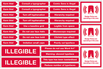
Thanks to Beth Shepherd for alerting me to the Design Police (2022 note: the link has disappeared). It's obviously hit the spot because it's on practically every design blog - and has revealed one or two sense of humour failures, judging by some of the comments.
*The Design Police are Stephen Woowat and Karl Goldstraw.
I wonder if this doesn't represent a real insight into simple, engaging ways to represent good practice. Having said that, each rule invites the question 'why', and the answers would range from legibility research to simple 'nice boys/girls don't do that'.
For example, using inch marks for quotations doesn't actually do anyone any harm, but it is a signifier of competence that people will judge you by – like using the wrong knife at dinner.
Inspired by the Design Police, I'm now speculating about repurposing road signs (not original, I know) to warn readers of problems ahead in complex writing. Here are some signs whose meaning I hope is clear:
Friday, January 18, 2008
Certain discrepancies
Standard Life wrote recently to tell us they are raising the management charge on our ISA. I'm trying to find the right adjective to describe their explanation of the reason for this:
"Standard Life Investments conduct regular reviews of their products. Following their most recent review, certain discrepancies came to light between their charging structure and those of their competitors."
Don't you just love the third person - nothing to do with us, it's them... although them is actually us. And obviously a discrepancy is a terrible thing. I'm so glad they've put it right. Happy to pay more. Wouldn't want a discrepancy. Oh no.
Subscribe to:
Posts (Atom)