Saturday, December 10, 2022

Wikipedia, moi?

I've discovered that someone has created a Wikipedia page about me. I've no idea who. It's quite short (obviously) and Wikipedia flags it up as having 'multiple issues'. Well, yes, tell me about it...

I may have mentioned before that I (well, my name) was also listed in the Wikipedia entry 'PG Wodehouse minor characters' where Robert Waller was described as 'a benevolent-looking man, with a pair of mild blue eyes behind his spectacles'. He appears in one of the Psmith books.

I just checked the link and it's gone. But Robert Waller is now listed under a new page called List of PG Wodehouse characters  where I am now described as 'an amiable sort, but a secret socialist'. Well, I'll take that too, up to a point.

It's odd to find a Wikipedia page disappear altogether. You can search for deleted pages, though, and find out why someone did this. I've heard that Wikipedia is patrolled by bossy types who like to police other people's efforts. In this case they've justified the deletion by saying  '"Minor" denotes that they are inconsequential to the audience of a general encyclopedia'. Literal-minded or what? I hope the entry for Morris Minor isn't next.

Guns for your garden


erm...

Friday, October 14, 2022

Graphic design and trust

Will Stahl-Timmins gave a great talk to the IIID last week (International Institute for Information Design). He is the data graphics designer for the BMJ, a leading medical journal.  

Almost as an aside he mentioned the issue of trust: well-finished graphics in a medical context can sometimes be mistaken for marketing by pharma companies. 

Integrity can be a problem for infographics, and I've mentioned it before: infographics which round the numbers up or down too much, or which haven't been proof-read against the data, give graphic design a bad name.

Over-simplification is the main objection the plain language movement face. You don't often hear it mentioned in the context of graphic design - perhaps that's because no one actually takes us seriously enough.

Thursday, October 13, 2022

Icons as rhetoric


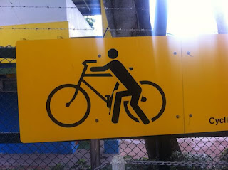
What's the rhetorical function of this sign in Hong Kong? It's not a warning, but an instruction. 

And these deer in a recent New Yorker cartoon also reckon their sign is an instruction.


Men in hats, take note


I think this sign, seen in Munich, means "If you've had too much to drink, you'd better take the metro home".

Monday, September 12, 2022

My mum was not the Queen


As a very small child I remember wondering if my mum and the Queen might not be the same person. Looking back, I suppose they're not all that alike – everyone had the same hair and lipstick then. 

On the other hand, Mum...

  • liked horses
  • often wore a headscarf 
  • was educated by a governess and never went to school
  • had a three bar electric fire
  • kept her cornflakes in Tupperware.

Wednesday, September 07, 2022

How we got our names

A lot of English names come from where one of our ancestors lived or what they did for a living (Baker, Smith etc).

This is happening afresh in our smartphone contacts apps when we don't know people's surnames, or think we won't remember why we put them there. How about we start again each generation? It could avoid the problem of whose name to pick when people marry/live together - just make up a new one.

We might want to apply some minor editing in some cases. Mike might also known as Mike Nextdoor to some people.

Friday, September 02, 2022

Twicked


Have you noticed there are a lot of Turkish barber shops these days. And this Twikish one.

Gotta love this jargon


When the bus stop is near the tram stop...

Actually, multimodality also describes how words combine with pictures.

So this is a multi-modal multi-modal public transport interchange text image combination

Can't you read?


It's an internet meme, I know, but I can't resist. 

Thursday, August 11, 2022

Am I being judgemental?

Well, yes. I'm a judge of the Plain Language Awards in New Zealand, and we're going through the Public Sector entries at the moment. I've been doing this since 2014, and really enjoy the process which is impressively thorough and open - you can see who the judges are, and what they look for. 


Tuesday, August 09, 2022

Using OCR apps as legibility tests

There are now several apps you can use to copy text from books – Microsoft Lens, or Adobe Scan, for example. They are pretty good. You take a photo and it scans it with an OCR (Optical Character Recognition) routine to turn it into editable text.

I've noticed that, much like people, these apps struggle with less legible typefaces. So it's possible to use them for informal legibility testing - a kind of app-based strudel test we might say.

Here's some text from a paper I'm writing which I scanned with Microsoft Lens in three typefaces. One is Baskerville which is a typical book typeface, the other is Caslon Italic which most of us would think a bit less legible than Baskerville, and lastly I've included Pixelated, which recalls the earlier for matrix printers of the 1970s and which is on the threshold of legibility.


Lens read Baskerville perfectly, but here's what it managed to read in the Pixelated font:


It's a lot happier with Caslon Italic, although it joined a lot of words together.


The strudel test

Strudel pastry is said to be thin enough when you can read a newspaper through it. This suggests a legibility test for typefaces – which ones are most legible in these extreme conditions? Can some keen pastry chef set up a test, please?

Rachel Roddy's recipe in the Guardian, from my brief google search, seems to be the only one that actually shows the principle.


Sunday, August 07, 2022

Personalised ads take a sinister turn

Personalised ads in online newspapers sound like a good thing, because you only see stuff you're interested in. Since my seventieth birthday, though, things have taken a depressing turn. Most want me to borrow money against my house using equity release, but today it was...


...yes, coffins. 

On a closer look, though, these are for pets. So the data must have come from an online cat food subscription service that I've mentioned here before, which knows my cat is now of pensionable age.

Monday, August 01, 2022

My cat is not a child and nor am I

Our cat is getting old now, and increasingly fussy about its food. So I've tried a couple of the online subscription firms who claim their food is purer and healthier. 

The cat seems to like it, but this post isn't about the food. It's about the continuous barrage of kitty puns and whimsy. So, note to cat food companies:

  • I am not my cat's parent
  • You asked me if I want to "change my purrefurences". But only one pun per word please. So I suppose you can ask me if I want to 'change my prefurences' (did you spot the word 'fur' there?). Or you can ask me if I want to 'change my purrferences'. But not both.
  • My cat does not observe her birthday, and no one knows when it is.
  • It's made of beef, not "Moo!".
Update the next day: "Concatulations! Your order is on its way." 
Update the next week: pussy won't eat the food, so I have catcelled my subscription. Fur goodness sake, this is cat-ching.

Serifs and old graffiti

I love coming across old graffiti – it's quite common in churches and cathedrals. Look behind the organ in a typical parish church and you'll find generations of bored kids have left their mark while waiting to start pumping again for the next hymn.

You find yourself muttering about thoughtless vandalism, and then realise that it's dated 1630 or 1842.

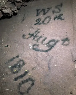
What's remarkable to me is that almost all old graffiti has serifs. It seems they are considered as essential a part of the letter as, say the cross bar of the A – not just minor decorative flourishes. 

Here's an example from a recent newspaper piece about the discovery of old mine workings: 


Wednesday, June 08, 2022

Body Of Organised Knowledge

 My last post brings to mind a piece in Punch magazine about an amazing new piece of technology that allowed instant access to information. You could go straight to the part you want, or start at the beginning and work through. It could be easily stored and the information was permanently recorded, etc, etc.

It was called the Body Of Organised Knowledge, or by its acronym BOOK.

Ironically (or perhaps not) I couldn't find reference to this on the internet, so forgive me if I have forgotten the title or the publication... but I don't think I've made it up.

Amen to Artillery

 Looking at old encyclopedias* in a bookshelf** it occurred to me that what with the internet an' all, they are a completely redundant genre. So we no longer get those poetic juxtapositions of headwords at the top of pages and on the spine. Amen to Artillery, Art Nouveau to Begin.


* For younger viewers, an 'encyclopaedia' is a book*** where we used to look up random facts before we had the internet.
** a 'bookshelf' is a place we used to keep books. 
*** a 'book' is a collection of paper pages, glued together in a block. You could read it one page at a time, and then turn to the next page.

If you're wondering why I'm starting to sound like Victor Meldrew, it was my birthday last week and I turned 70. I am feeling a personality change coming on, much like Harry Enfield's character Kevin when he turns 13.


Illegible in 22 languages

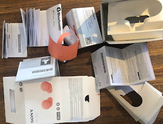
We just bought some headphones - tiny in-ear ones. Hat's off to Sony, who have packed them entirely in recyclable material. 

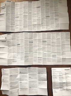
But there's an awful lot to recycle, including four leaflets in 22 languages – both sides are printed in what appears to be 5pt type, possibly smaller.

It's pretty much illegible so why bother? In a recent book chapter* I wrote about consumer contracts in tiny type:

"...can we really say that these business terms have actually been stated in any meaningful way? They might as well have been engraved on a metal plate and fired into space – they would still exist in a theoretical sense, and be no less accessible to consumers."

To give you a sense of scale, in the picture below there's a 2p coin and a type scale (younger designers – you won't know what this is, but we used it to measure typesizes before computers).


*Robert Waller (2022) ‘Designing contracts for human readers’ in Marcelo Corrales, Helena Haapio and Mark Fenwick (eds), Research Handbook on Contract Design, Edward Elgar Publishing.


Wednesday, March 23, 2022

Jubilatte

I do like a pun in a business name. Hairdressers do it best of course (Scissor's Palace, Curl Up and Dye, Hairport, Headmasters, etc).

But this church in King's Heath, Birmingham, is having a go, and I recently saw Triniteas on offer at another one...

RIP Martin Thomas


It was so sad to hear of the untimely and sudden death of Martin Thomas on 18 January this year. Martin was a lovely guy and one of those rare linguists who studied the relationship of language and layout. He joined our Simplification Centre team at the University of Reading to work on a multimodal corpus. 

Martin's doctoral thesis studied a genre in which graphics and text have to work together in a confined space for a very particular set of purposes: multilingual toothpaste packaging (Chinese/English). He built up quite a collection.

Long sentence which is convoluted and therefore hard to understand because it has too many nested clauses is found

Occasionally I run plain language training and it's good to teach with examples. Often I have to make them up because I can't find a real life example, so it's nice when a journalist does the job for me.

Thanks, Birmingham Mail: