The Met Office chart was one example of poor graphic proof-reading, and here is another one. I saw this in Which? magazine last November and sent them a green-ink letter. It's from an article about the cost of living in the UK, compared to other European countries. The article actually showed that the UK was the second cheapest of the five countries they compared, but they chose to highlight the high cost of fuel in their headline.
In a geeky moment, I compared the figures they gave with the accompanying bar chart - the £39 difference between Germany and the UK results in twice the height difference as the £112 difference between the UK and Spain. And their chart does not appear to start at zero. Here's their graphic and one I knocked up by entering the figures in Excel.
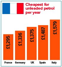

Perhaps this is a bit geeky, but Which? claims to be unbiased and evidence-based. They said they'd check what had happened, but the offending graphics are still on their website.