Showing posts with label Visualisation. Show all posts

Thursday, February 20, 2020

Dodgy chart hits the front page

It's not often you see information design cited in a political row but today the Number 10 press office tweeted about a dodgy chart used in an EU statement about trade relations with the UK. It's reported more fully on the Politico.eu website.

The EU published a chart showing the scale of trading relationships with various partners. It uses circles to represent amounts, and I've blogged about this before (well, it's nine years ago now...).


You shouldn't do that because humans can't compare volumes as well as they compare lengths. This is what Isotype was about...

Below left is the comparison they made. Then I've show the comparison by length, and, even better, horizontal bars with a block for every 10 billion and the figures provided.


According to Politico.eu:
'David Spiegelhalter, a professor of the public understanding of risk at Cambridge University, said the Commission's approach was "indefensible" and went against "standard graphical practice."
"It's also the biggest mistake to make. It's incorrect to use diameter to represent volume," he said, adding that it was "the sort of thing a junior person would do."'
...or a graphic designer, I'm afraid.

Monday, September 28, 2015

Information design meets gardening


I caught up with Paul Matson at the recent Vision Plus conference in Birmingham. Paul did the MA Information Design at Reading when I was teaching there. He works for the Institute of Physics in Bristol, creating web sites but as a sideline he's created a great gardening concept, Sowhow.

Paul sells organic seeds, packed on information cards that explain how to grow it, store it and cook it. I particularly like the link between garden and kitchen (I'm a fan of Monty and Sarah Don's Fork to Fork, not just for the clever title).


Sunday, March 15, 2015

Profound infographic insight about Nigel Farage

Don't you just love it when the numbers make a neat pattern. Thank you, Daily Telegraph website.


Monday, January 19, 2015

Do they proof-read news graphics?


It's surprisingly common to see news graphics where the numbers don't match the chart lines.

I think the first example is just incompetence - or possibly the omission of a white vertical line to indicate the zero point for the data.

The second one looks like a cut and paste error. If you add up the percentages they come to 118% for 2015. But if you change the UKIP captions to read 13% and 18% everything adds up and the lines are the right length.

Picture credits: The Times.


Wednesday, August 20, 2014

Visualisation of under the street


They are digging up the streets in the centre of Reading, and guys with spray cans have been creating a nice visualization of the project on the pavement.

Monday, December 16, 2013

Inconsistent scale alert

Check out the scale on this graphic from The Guardian's website. I hope they're not suggesting that 40 men are worth 60 women.


Wednesday, January 02, 2013

Compared to what?

Without the helpful pie chart, I'd struggle to understand this American Express statement.


Tuesday, December 06, 2011

Odd Peugeot graphic

Does anyone have any idea about what this could mean? Andrew Belsey found it in Peugeot's customer magazine, in an article about green issues. But with no caption, it's hard to know what's going on.

Wednesday, October 12, 2011

What we're all thinking?

A couple of refreshingly frank titles from blogs that just came up in a Google search. Haven't looked at them yet, but I don't really need to.

Stop Already With the F*cking "Infographics"

Enough with these so called ‘infographics,’ they’re nothing but chartcrap

Sunday, September 25, 2011

Infographics as knowledge curation

It's noticeable that more and more people are describing themselves as 'curators' - a term one used to encounter only rarely as the job title of someone arranging neolithic arrow heads in a museum. Words only appear or change their meaning when enough people have a new meaning they want to express. Perhaps the new curation is a reaction to the fragmentation of the digital world - we feel the need to make sense of the chaos, the speed of change, and the sheer vastness of what's on offer. So each of us curates our Facebook page or blog, in an updated version of the mixer tape, or the coffee table display of novels, CDs and obscure fruit we artfully disarrange to impress and educate our guests.

I wonder if this doesn't also explain why infographics are so in vogue. We can abandon the dismal process of endless clicks through news stories that retrace their path, that are all based on the same primary source, or that leave us stranded as if we're at the top of the stairs trying to remember what we came up for. Someone has looked at the data, sorted out the arguments and presented them to us in a single compelling display: they've curated the issues.

Tuesday, July 12, 2011

Explosive material: even more icons of doom


So I'm just posting these icons of doom, as usual, when Phil Gilbert sends me this one:


I wonder if the context helps? Barely...

Wednesday, February 23, 2011

Ship graphics

Yesterday's papers carried a story about giant new container ships which have been ordered. Obviously an opportunity for a useful graphic. Well, a graphic, anyway, in the case of The Times.

A few questions: What's the colour coded cargo represent? Can these two larger ships really be more than twice the length of the other big ships shown in grey below? Is the 18,000 container ship really the same size as the 12,000 container ship (the figures supplied suggest they are almost exactly the same size, so how come the apparently smaller one appears to have as many containers on it)?

The Guardian made a better fist of it, although much less ambitious.

The only problem with this one is that the correct unit of account to impress about the size of ships is surely the football pitch (105m) not the London bus. It's got to be something that you think is very big, that the impressive object is much bigger than. Most ships are longer than a London bus.

The greater error, of course, would be to compare it with something much bigger - for example, this ship might be big, but it's nothing like the size of Wales (or Belgium, if you want to go metric). Odd thing is, I can't think of  a unit of measurement that comes between a football pitch and Wales. The Isle of Wight, possibly.

Monday, January 31, 2011

Circles on maps

Last Friday I was at the excellent Design of Understanding conference at St Brides. David McCandless gave a very good presentation of the thinking and process behind his Information is Beautiful website and book.

A common technique used by David McC, and the various newspapers represented at the conference, is to vary the sizes of circles used to represent different quantities. At one point Mark Barratt asked the question on a lot of people's minds: hasn't it been established that circles are a pretty unreliable way to compare quantities? I'm not sure it would be fair to say he was brushed aside - perhaps the background to his question wasn't really understood.

Doubts about circles go all the way back to Willard Brinton's 1916 book Graphic methods for presenting facts. Perhaps further.


Brinton's explanation shows, first, the well-known difference between using diameter and area - diameter hugely exaggerates differences. However, he goes further and condemns even circles that compare areas, pointing out that they have the opposite effect - we tend to underestimate the area of the larger circle. His conclusion: 'Horizontal bars have all the advantages of circles with none of the disadvantages'.

In his 1956 PhD thesis, James Flannery proposed a correction formula, so that the perception of the difference would be correct, even if the actual area of the circles is not. Several other people researched the same issue and came up with similar findings to Flannery's (apparent value = actual value * 0.86).

Unfortunately for seekers after simple solutions, Hans-Joachim Meihofer then showed that individuals varied too much in their judgements for Flannery's formula to be reliable. However, he demonstrated that the whole problem could be solved by using stepped sizes of circle and providing a scale.

The story is well told in Michael Macdonald-Ross's 1977 review 'How numbers are shown'.

Unfortunately it is not quite as simple as that - Patricia Gilmartin went on to demonstrate how important context is when viewing circles of different sizes (demonstrated through the well-known Ebbinghaus illusion). The centre circles are the same size. Oh dear.

My personal view is quite relaxed - I see circles on maps as simply relative and I don't expect to derive actual data from them. I am happy to see them as approximate (tiny vs medium vs huge). However, I have great respect for those who see statistics as sacred, and yearn for integrity in presentation...  which brings us to Michael Blastland's excellent presentation at Design of Understanding. He rendered this whole discussion somewhat irrelevant by questioning the reliability of so much of the data used for apparently simple charts in newspapers. And he reminded us that statistics is as much about probability and uncertainty as about facts - a view enshrined in the title of Howard Wainer's latest book on quantitative graphics: Picturing the uncertain world.

Michael's Go Figure articles on the BBC website should be required reading for information designers.

  • Brinton W.C. (1916) Graphic methods of presenting facts. New York: Engineering Magazine
  • Flannery J (1971). The relative effectiveness of some common graduated point symbols in the presentation of quantitative data. Canadian Cartographer, 8(2), 96–109.
  • Gilmartin, P. P. (1981). Influences of map context on circle perception. Annals of the Association of American Geographers, 71(2), 253-258.
  • Macdonald-Ross, M. (1977). How numbers are shown – a review of research on the presentation of quantitative data in texts. AV Communication Review, 25(4), 359-409.
  • Meihoefer, H. J. (1969). The utility of the circle as an effective cartographic symbol. Canadian Cartographer, 6(2), 105-117.
  • Wainer, H (2009). Picturing the uncertain world: how to understand, communicate, and control uncertainty through graphical display. Princeton University Press.

Thursday, December 16, 2010

A personalised user guide

My mother is above the average age for mobile phone users, and has just got one for emergencies. A kind carer or possibly grandson has written out these personalised instructions. From the amendments it looks like they've been user-tested.


Wednesday, December 01, 2010

Editors vs designers

Eye magazine's blog features this nice infographic that they in turn credit to Andrew Losowsky of Stack America.

Sunday, October 24, 2010

Clarity 2010

Went to Clarity 2010 in Lisbon the week before last. Very stimulating, and met up with a lot of old friends. Three things stood out for me.
  • Plain language is happening in more and more countries, and is taken seriously enough for governments to take action. For example, the Portugese government used the conference to announce a new initiative, and while we there President Obama was signing the new Plain Writing Act in the USA.
  • While much discussion of plain language hasn't changed in thirty years (short sentences, common words, active voice), there were frequent mentions of information design, and several sessions looked at visualisations that clarify contract law.
  • Many of the meetings were visualised by Susanne Hoogwater of Legal Sketchpad - she is one of a growing number of people who make a living from recording meetings using visualisation. She introduced me to a new book, Visual Meetings by David Sibbet. Worth a look.  And there is an interesting link on her website to the use of visualisation in conflict negotiations: http://peacemapping.com/. The physical mapping of different views makes it less easy to ignore what the other side is saying, and reassures participants that their view has been recorded. Not that any fights broke out among the speakers.

Sunday, October 10, 2010

Dona Wong on information graphics

Dona Wong's Wall Street Journal guide to information graphics is a great desktop guide to the design of graphs, charts and tables. She goes through all the basics, and demonstrates them using a simple graphic syntax that is undistracted by cool examples or the work of famous designers. Once you get used to her at-first-cryptic way of distinguishing bad practice (down arrow) from good (up arrow), it works brilliantly. This wasn't planned as a full review, but to note her thoroughgoing approach to information design and simplification. I loved her diagrammatic acknowledgement of the people who helped.

Dona Wong (2010) The Wall Street Journal guide to information graphics: the dos and don'ts of presenting data, facts and figures. New York/London: Norton & Co.

Thursday, July 15, 2010

Energy and apathy

This is the energy meter I bought last year - it is supposed to tell us how much energy we are using at any one time, and to shock us into saving it.

Just noticed the battery's run out but no idea how long ago, and I don't think I'll bother replacing it. The truth is I stopped looking at it in about week three. Nothing changed very much, and few of the figures it displayed shocked us very much. Rather the opposite in fact. Running around the house turning off appliances on stand-by hardly dented the figure. And while putting the tumble dryer on was very noticeable, it was easy to conclude that we could afford the 90p per hour.

This makes me wonder about the millions being spent on the national rollout of smart meters. Most studies of their effectiveness report that few people are moved by them to reduce their energy consumption, and that for many people the economic motivation doesn't work that well. Having said that, whatever approach they end up taking to what is a huge behavioural change challenge, feedback will play some part - so there will be a function for these meters after all.

Sunday, May 16, 2010

Which? chart is the dodgier?

We've been discussing the concept of graphic literacy in our department. Part of it has to be the ability to spot errors, in the same way that you might spot a word used incorrectly, or poor grammar.

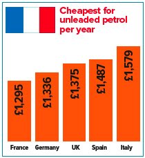
The Met Office chart was one example of poor graphic proof-reading, and here is another one. I saw this in Which? magazine last November and sent them a green-ink letter. It's from an article about the cost of living in the UK, compared to other European countries. The article actually showed that the UK was the second cheapest of the five countries they compared, but they chose to highlight the high cost of fuel in their headline.

In a geeky moment, I compared the figures they gave with the accompanying bar chart - the £39 difference between Germany and the UK results in twice the height difference as the £112 difference between the UK and Spain. And their chart does not appear to start at zero. Here's their graphic and one I knocked up by entering the figures in Excel.


Perhaps this is a bit geeky, but Which? claims to be unbiased and evidence-based. They said they'd check what had happened, but the offending graphics are still on their website.

Probably a poor chart

UK people will remember that in 2009, one of the rainiest summers in memory (and the third rotten summer in a row), the Met Office issues an optimistic press release promising "The coming summer is 'odds on for a barbecue summer', according to long-range forecasts".

This was accompanied by this bar chart, brought to my attention by Emma Hicks, a student on our MA Information Design course. She is doing a project with our meteorology department to suggest improvements to the way they express probabilities in forecasts.

Not only does it display 20%, 30% and 50% in the wrong proportions, but the hotter orange colour for the 50% bar makes it appear that a much more extreme difference in temperature is being forecast. Actually the predicted differences are less then 1 degree apart.

As it happens, the summer was warmer than average... the only problem was it rained all the time.

The Met Office has since announced they are dropping long range forecasts. They might want to look at their PR department at the same time.