Showing posts with label Typography. Show all posts

Tuesday, August 09, 2022

Using OCR apps as legibility tests

There are now several apps you can use to copy text from books – Microsoft Lens, or Adobe Scan, for example. They are pretty good. You take a photo and it scans it with an OCR (Optical Character Recognition) routine to turn it into editable text.

I've noticed that, much like people, these apps struggle with less legible typefaces. So it's possible to use them for informal legibility testing - a kind of app-based strudel test we might say.

Here's some text from a paper I'm writing which I scanned with Microsoft Lens in three typefaces. One is Baskerville which is a typical book typeface, the other is Caslon Italic which most of us would think a bit less legible than Baskerville, and lastly I've included Pixelated, which recalls the earlier for matrix printers of the 1970s and which is on the threshold of legibility.


Lens read Baskerville perfectly, but here's what it managed to read in the Pixelated font:


It's a lot happier with Caslon Italic, although it joined a lot of words together.


The strudel test

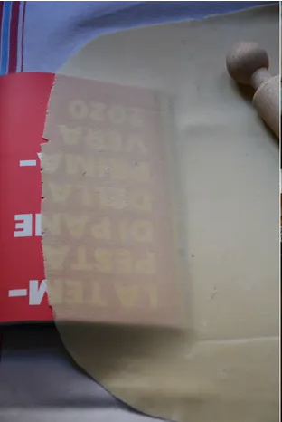
Strudel pastry is said to be thin enough when you can read a newspaper through it. This suggests a legibility test for typefaces – which ones are most legible in these extreme conditions? Can some keen pastry chef set up a test, please?

Rachel Roddy's recipe in the Guardian, from my brief google search, seems to be the only one that actually shows the principle.


Monday, August 01, 2022

Serifs and old graffiti

I love coming across old graffiti – it's quite common in churches and cathedrals. Look behind the organ in a typical parish church and you'll find generations of bored kids have left their mark while waiting to start pumping again for the next hymn.

You find yourself muttering about thoughtless vandalism, and then realise that it's dated 1630 or 1842.

What's remarkable to me is that almost all old graffiti has serifs. It seems they are considered as essential a part of the letter as, say the cross bar of the A – not just minor decorative flourishes. 

Here's an example from a recent newspaper piece about the discovery of old mine workings: 


Wednesday, June 08, 2022

Illegible in 22 languages

We just bought some headphones - tiny in-ear ones. Hat's off to Sony, who have packed them entirely in recyclable material. 

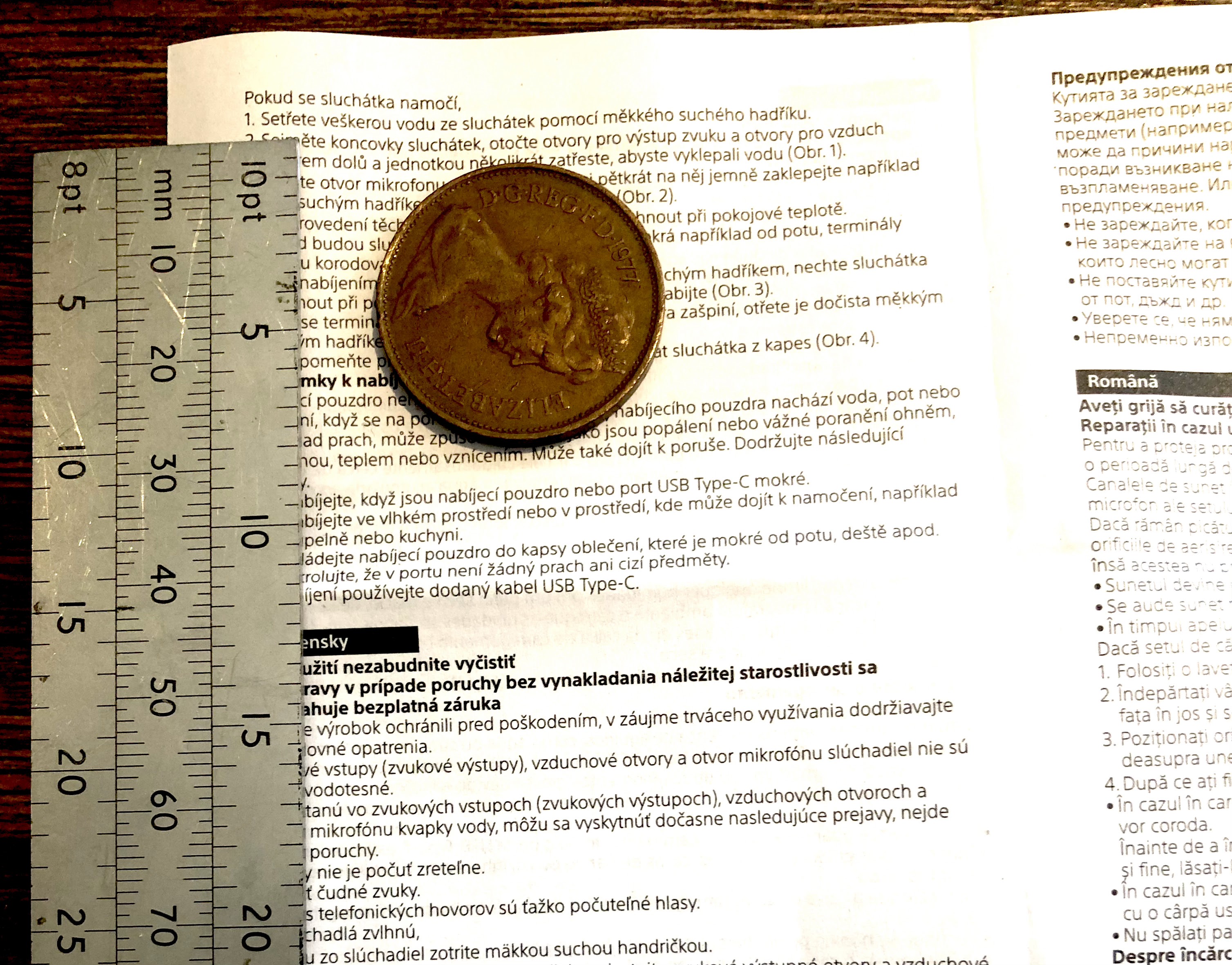
But there's an awful lot to recycle, including four leaflets in 22 languages – both sides are printed in what appears to be 5pt type, possibly smaller.

It's pretty much illegible so why bother? In a recent book chapter* I wrote about consumer contracts in tiny type:

"...can we really say that these business terms have actually been stated in any meaningful way? They might as well have been engraved on a metal plate and fired into space – they would still exist in a theoretical sense, and be no less accessible to consumers."

To give you a sense of scale, in the picture below there's a 2p coin and a type scale (younger designers – you won't know what this is, but we used it to measure typesizes before computers).


*Robert Waller (2022) ‘Designing contracts for human readers’ in Marcelo Corrales, Helena Haapio and Mark Fenwick (eds), Research Handbook on Contract Design, Edward Elgar Publishing.


Friday, February 19, 2016

A tad more


Apcoa wanted me to use this code to pay for my parking. I thought it started with 1. My stupid or theirs? A tad more space please.

Actually I think it needs more than a tad, which I take to be usually no more than 10-20% extra space. Typographic technical terms can easily confuse... for example, 'just a tad' is sarcastic, and is actually larger than a tad.

Tuesday, December 22, 2015

Haggis alert


I panicked when I saw a recipe book open at this page in our kitchen. Actually Jenny was making the recipe from the previous page (a very nice lamb stew) so all was well.

But this is yet another example of a recipe book designed for the bookshop not the kitchen. It is first-form stuff that one recipe should take one page. With a flexible approach to design and editing, it's never hard to take 4 lines back to the previous page.

Screwed cup pack design


I wanted 16 of these washers, so I bought two packs.

Well, it clearly says there are 10 of them in the pack... until you see the smaller 'QTY 20' at the bottom right.

The grammar becomes clear when you see the wingnuts I also bought:

Friday, October 09, 2015

Legibility research: seeing is unbelieving

A few years I did some legibility testing for BAA who were considering changing fonts for their airport signs. A key finding was that a narrow, condensed typeface (Vialog) was less legible from a distance than the regular ones tested (eg, Frutiger).


Top: Vialog
Bottom: Frutiger


In fact the results suggested that a smaller size of a regular font was just as legible as a narrow one at the same size – so using a condensed font to fit in longer names is actually unnecessary unless your main concern is consistency of x-height. [Insert usual disclaimer about more research being needed.]

This phenomenon is also recognised in studies by Garvey et al (1997) and Rubin et al (2006). It reinforces the warning that it is unsafe to assume that research results obtained with a particular typeface can be generalised across other typefaces – particularly if size is only defined in terms of height (eg, points or x-height) without taking relative width into account.

However, I recently read Gordon Legge and Charles Bigelow's very thorough 2011 review of recent legibility research. It's particularly interesting because Legge is a vision researcher and Bigelow a typographer, both distinguished and much published in their fields.

They express the opposite view, that narrower type is more legible, citing a 1996 study by Aries Arditi who has worked quite extensively with Metafont to explore different proportions and spacing of letters to optimise text for people with poor vision.

A little surprised at this, I've found the Arditi study and here is what he tested:


So... stop right there before you conclude anything at all from this with respect to setting proper typefaces for continuous reading. These letterforms are from opticians' test charts.

Although I imagine they are designed to occupy the same space on the chart, they are remarkably poorly conceived even to meet that objective. It is bizarre, for example, that the W has been compressed so it occupies the same maximum width as everything else, making no allowance for its angularity. No kerning has been allowed, with the result that although normally a wide letter it actually looks narrower than other letters.

By the way, don't worry, the narrow and wide letters here are the extreme forms tested (although why you would go that far I don't understand. Why would that ultra-wide 'I' ever be recognised? I have to confess that I understand very little of the Arditi study which uses a specialist terminology and reports its results quite cryptically, but it seems to be looking at the correct reading of individual letters in short strings, by very small numbers of visually-impaired people.


Arditi, Aries (1996) Typography, print legibility and low vision, in
Roy G. Cole and Bruce P. Rosenthal (eds), Remediation and management of low vision. Mosby Incorporated.

Garvey, P., Pietrucha, M., and Meeker, D. (1997). Effects of font and capitalization on legibility of guide signs. Washington, DC: Transportation Research Board, National Research Council.

Legge, G. E., and Bigelow, C. (2011). Does print size matter for reading? A review of findings from vision science and typography. Journal of Vision, 11(5), 1–22

Rubin, G. S., Feely, M., Perera, S., Ekstrom, K., and Williamson, E. (2006). The effect of font and line width on reading speed in people with mild to moderate vision loss. Ophthalmic and Physiological Optics, 26(6), 545-554.

Waller R. (2007) Comparing typefaces for airport signs, Information Design Journal, 15, 1-15

Wednesday, August 27, 2014

Bin Roman

Here's a tip if you're trying to remember which house number your typographer friend lives at. Look for the serifs.


(bin: Reading Borough Council; design: Martin Andrews).

Five is an odd number

This must be the oddest 5 I've seen... on the former Robinson and McKewan factory in Birmingham's Jewellery Quarter.


Wednesday, August 20, 2014

Embiggen – a new word marches on

If you look carefully at this clip from the Daily Telegraph web edition, under the picture it says 'Click to embiggen'.

I'm curious about this choice of word – is it possibly a little sardonic, given the topic?

It's not one I've seen before, so I looked it up. Apparently, it started in a 1996 episode of the Simpsons: read about it on the Future Journalism Project's blog.

There's no doubt we need a single word for 'make bigger'. Somehow 'enlarge' always sounds more written than spoken.
In our studio we used to use the verbs 'to bigger' and 'to smaller' when discussing type size, as in 'Can you try biggering the headline there?'.

Monday, October 08, 2012

Ideal font for Lucie Attwell fans with dyslexia


The BBC website recently featured the OpenDyslexic font by Abelardo Gonzalez. I'm not dyslexic so can't form an opinion, but I wonder whether Mabel Lucie Attwell was an influence.


Thursday, July 26, 2012

Neighbouring signs

Seen in Goodge Street: probably just my immaturity, but I like the way that a shop called Bang Bang ends up next to a sex shop.


And in the same street, I can't help wondering where the Jennings Bet designer had just had lunch on the day he or she designed the logo. Or was it the other way around?


Thursday, February 09, 2012

Four kinds of digital page

I'm revising a conference paper for publication, and was recently speaking about it with a student. So I thought I'd put this thought from it on the blog, in the hope of one or two comments.
----

Hypertext prophets used to speak as if the advent of digital text were a paradigm shift, incommensurate with past ways of thinking and acting through text. It is perhaps more common now to speak about the convergence of technologies and channels. In that spirit I identify four page archetypes which reflect generic resonances from the past, the continuing need for traditional functions of the document, and the technical capabilities and connectness of the current world.

Fixed pages are the most diagrammatic, and are found in illustrated books and PDFs. Because they are locked in place, the reader can assume that relationships between elements (text blocks, pictures, headlines, etc) are intentional and potentially meaningful. A page break signifies the end of a unit of text, in the same way as a sentence or a paragraph. The designer and writer, for their part, can craft graphic relationships knowing that they will survive the various technical transmission processes and reach the reader.

Flowed pages are represented by traditional novels, or by e-reader books. The author’s words are flowed in and fill the pages one by one, with page endings that are as arbitrary as the line endings are. But those page endings are fixed for the life of the document (or, in the case of e-documents, until the text is re-flowed after a change of font). Readers can therefore move back and forth between pages and use the constant geography of the book to navigate.

Fugitive pages are formatted temporarily and perhaps also populated with content temporarily. Pages are created afresh for each reading, and may change when revisited. A common example is an online newspaper, which offers a reasonably coherent appearance and user experience, but which is constantly updated. If you return to a story later in the day, you may find that it has been relegated to a lower position in the hierarchy or even disappeared from view.

Fragmented pages are compilations of page elements from a variety of sources which may not have any relationship predictable by their authors. Examples are the results of a search, or an aggregation application such as Flipboard (which assembles content from a range of the user’s favourite sources, such as blogs or social networking sites, into a magazine-like format).

These page types may exist in pure form or co-exist in combination. For example, an online newspaper may have fixed layouts into which fugitive content is flowed, and a column of fragmented advertisements drawn in through personalisation rules.

Why might this be interesting? Because there's a lot of talk about how the reading process is changing in the digital era, which has introduced us to fugitive and fragmented texts. Flowed texts are the stuff of e-readers, which are taking over from flowed paper books. But fixed pages, carefully crafted and diagrammed multimodal pages, are a challenge for digital channels. This could mean they die out, or it could mean someone will invent a digital channel that can handle them. Products like Inkling and the Apple iBooks textbook go some way, and are a response the finding that textbooks have not yet found a happy home in e-readers.

Sunday, February 05, 2012

Best Typography Oscars

Thanks to Kate Cooper for pointing me to this nice blog that nominates films  for a Best Typography Oscar.

Coincidently, I was today reviewing an article for a journal which asserts that typographers choose typefaces with personalities that match content. My first reaction was that, as a typographer, I cannot remember the last time I did that. But, of course, I don't get to work on film posters.


Mind you, these are both historical references rather than personality-laden. For example, the War Horse title is not horse-like, but of its time - and beautifully observed.

Tuesday, December 27, 2011

Proper handwriting

People were taught proper handwriting in the old days. This how some good friends, a little older than us, wrote the name on our Christmas card. I must practice my Ms.

Saturday, November 12, 2011

Green and black


Hey, Shell, what are you thinking of? Green is the colour code for petrol, black for diesel. So it's not surprising that I nearly put diesel into my car instead of petrol.

It doesn't help that the green brand name is positive (dark on light) and the qualifying word 'diesel' is negative. It's hard to see both at once, as this older blog post demonstrates.

Wednesday, November 02, 2011

Vs and Us

I don't know about you, but I read this bus shelter poster as 'Help glue a child'. Note to font designers: please make your Vs v-shaped.

That apart, it's an interesting use of type size and underlining to score our reading aloud.

Wednesday, September 28, 2011

If you're designing a form to print out at home

If you're designing a form for people to print out and send in, please make a note: don't use up all my blue ink.

I'm talking to you, Cooperative Bank.

Saturday, April 16, 2011

Laver's law and typefaces

Someone just asked me what's with Cooper Black - nice typeface but mostly seen as the credits roll for Dad's Army.


I remembered some kind of law of fashion cycles, in which our view of a fashion changes as time passes. So just went on 'tinternet and found it is known as Laver's Law

James Laver was a fashion historian at the V&A, and this appears in a 1937 book Taste and fashion.
"The same costume will be:
Indecent: 10 years before its time
Shameless: 5 years before its time
Outré: 1 year before its time
Smart: now
Dowdy: 1 year after its time
Hideous: 10 years after its time
Ridiculous: 20 years after its time
Amusing: 30 years after its time
Quaint: 50 years after its time
Charming: 70 years after its time
Romantic: 100 years after its time
Beautiful: 150 years after its time"
This seems to have worked quite well for flared trousers which have ceased to seem quite so ridiculous, and I feel I can once more share our 1975 wedding photos (merely amusing now, heading towards quaint). And it won't be too long before photos of blokes with their trousers falling down can be used for blackmail purposes.

But I'm not so sure it works so precisely with typefaces. I think Cooper Black is ready for mainstream re-entry, but I'm not ready to dust off Kabel.