Showing posts with label Legibility. Show all posts

Tuesday, August 09, 2022

Using OCR apps as legibility tests

There are now several apps you can use to copy text from books – Microsoft Lens, or Adobe Scan, for example. They are pretty good. You take a photo and it scans it with an OCR (Optical Character Recognition) routine to turn it into editable text.

I've noticed that, much like people, these apps struggle with less legible typefaces. So it's possible to use them for informal legibility testing - a kind of app-based strudel test we might say.

Here's some text from a paper I'm writing which I scanned with Microsoft Lens in three typefaces. One is Baskerville which is a typical book typeface, the other is Caslon Italic which most of us would think a bit less legible than Baskerville, and lastly I've included Pixelated, which recalls the earlier for matrix printers of the 1970s and which is on the threshold of legibility.


Lens read Baskerville perfectly, but here's what it managed to read in the Pixelated font:


It's a lot happier with Caslon Italic, although it joined a lot of words together.


The strudel test

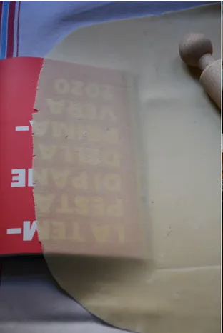
Strudel pastry is said to be thin enough when you can read a newspaper through it. This suggests a legibility test for typefaces – which ones are most legible in these extreme conditions? Can some keen pastry chef set up a test, please?

Rachel Roddy's recipe in the Guardian, from my brief google search, seems to be the only one that actually shows the principle.


Friday, October 09, 2015

Legibility research: seeing is unbelieving

A few years I did some legibility testing for BAA who were considering changing fonts for their airport signs. A key finding was that a narrow, condensed typeface (Vialog) was less legible from a distance than the regular ones tested (eg, Frutiger).


Top: Vialog
Bottom: Frutiger


In fact the results suggested that a smaller size of a regular font was just as legible as a narrow one at the same size – so using a condensed font to fit in longer names is actually unnecessary unless your main concern is consistency of x-height. [Insert usual disclaimer about more research being needed.]

This phenomenon is also recognised in studies by Garvey et al (1997) and Rubin et al (2006). It reinforces the warning that it is unsafe to assume that research results obtained with a particular typeface can be generalised across other typefaces – particularly if size is only defined in terms of height (eg, points or x-height) without taking relative width into account.

However, I recently read Gordon Legge and Charles Bigelow's very thorough 2011 review of recent legibility research. It's particularly interesting because Legge is a vision researcher and Bigelow a typographer, both distinguished and much published in their fields.

They express the opposite view, that narrower type is more legible, citing a 1996 study by Aries Arditi who has worked quite extensively with Metafont to explore different proportions and spacing of letters to optimise text for people with poor vision.

A little surprised at this, I've found the Arditi study and here is what he tested:


So... stop right there before you conclude anything at all from this with respect to setting proper typefaces for continuous reading. These letterforms are from opticians' test charts.

Although I imagine they are designed to occupy the same space on the chart, they are remarkably poorly conceived even to meet that objective. It is bizarre, for example, that the W has been compressed so it occupies the same maximum width as everything else, making no allowance for its angularity. No kerning has been allowed, with the result that although normally a wide letter it actually looks narrower than other letters.

By the way, don't worry, the narrow and wide letters here are the extreme forms tested (although why you would go that far I don't understand. Why would that ultra-wide 'I' ever be recognised? I have to confess that I understand very little of the Arditi study which uses a specialist terminology and reports its results quite cryptically, but it seems to be looking at the correct reading of individual letters in short strings, by very small numbers of visually-impaired people.


Arditi, Aries (1996) Typography, print legibility and low vision, in
Roy G. Cole and Bruce P. Rosenthal (eds), Remediation and management of low vision. Mosby Incorporated.

Garvey, P., Pietrucha, M., and Meeker, D. (1997). Effects of font and capitalization on legibility of guide signs. Washington, DC: Transportation Research Board, National Research Council.

Legge, G. E., and Bigelow, C. (2011). Does print size matter for reading? A review of findings from vision science and typography. Journal of Vision, 11(5), 1–22

Rubin, G. S., Feely, M., Perera, S., Ekstrom, K., and Williamson, E. (2006). The effect of font and line width on reading speed in people with mild to moderate vision loss. Ophthalmic and Physiological Optics, 26(6), 545-554.

Waller R. (2007) Comparing typefaces for airport signs, Information Design Journal, 15, 1-15

Monday, January 19, 2015

New legibility test - just turn it upside down

I stared at this pen for a long time trying to decipher the brand name – but I had no problem reading the words KING SIZE.


Turn it the right way around and it's the familiar Sharpies brand. Have I just developed a new legibility test?


In my early career at the Open University I used multiple photocopying passes to show how some typefaces degrade more quickly than others - try it with Arial vs Bodoni and you'll see what I mean, although it worked better before photocopiers went digital.

You can also compare how easy it is to read typefaces through multiple layers of tracing paper. My business partner David Lewis used the term Strudel Test for this - following his mother's measure of when strudel pastry was thin enough (can you read a newspaper through it?).


Thursday, July 24, 2008

Architects and signs

Sign designers sometimes complain that architects don't like signs cluttering up their beautiful buildings. As Edo Smitshuijzen reports in his recent book, Signage Design Manual, “They perceive signage as an assault on the aesthetics of their creation and as an insult to the self-evidence of their spatial design. A lot of them carry an almost sacred but entirely unfounded belief in the functionality of their ‘wordless’ buildings”.

Perhaps this is taking it a bit far, so, as preparation for a short article I'm writing on this, I thought I would see what coverage sign design and wayfinding gets in the RIBA bookshop.

There was one book on signs - Smitshuijzen's. And I can confirm that there was indeed a sign outside the building... just.


Friday, April 04, 2008

Small print walks tall

There's been an interesting discussion on the infodesign cafe list about a recent attempt by a British Member of Parliament (Nick Palmer) to introduce a minimum type size for 'small print'. On the advice of the RNIB (the main advocate group for the partially sighted in the UK) and the Plain English Campaign, he suggests a minimum of 12pt. This recommendation surfaces from time to time, but is usually unaccompanied by suggestions about what to do about the paper mountain that would ensue. As several correspondents on the list observed, 12pt type is not a very precise term, and height does not in itself bring legibility... as film posters demonstrate: I've sometimes wondered why Hollywood stars insist on taller type to assert their importance on film posters. Has anyone ever insisted on a contractual right to legible type?


Saturday, January 26, 2008

Design police


Thanks to Beth Shepherd for alerting me to the Design Police (2022 note: the link has disappeared). It's obviously hit the spot because it's on practically every design blog - and has revealed one or two sense of humour failures, judging by some of the comments. 
*The Design Police are Stephen Woowat and Karl Goldstraw. 

I wonder if this doesn't represent a real insight into simple, engaging ways to represent good practice. Having said that, each rule invites the question 'why', and the answers would range from legibility research to simple 'nice boys/girls don't do that'. 

For example, using inch marks for quotations doesn't actually do anyone any harm, but it is a signifier of competence that people will judge you by – like using the wrong knife at dinner. 

Inspired by the Design Police, I'm now speculating about repurposing road signs (not original, I know) to warn readers of problems ahead in complex writing. Here are some signs whose meaning I hope is clear: