Showing posts with label Affordance. Show all posts

Thursday, August 12, 2021

Toot

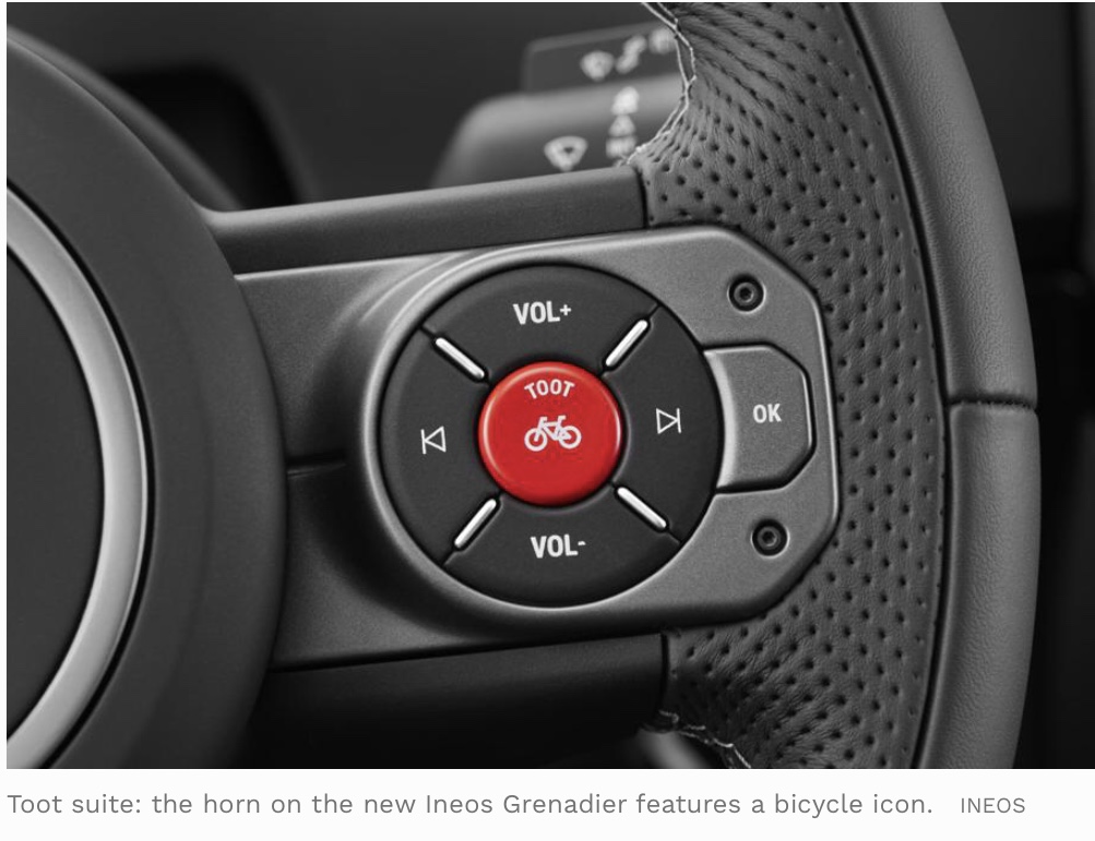
In a taxi in Istanbul a year or two back I was impressed by the driver’s light (and more or less constant) touch on the horn. He was able to produce a light toot as a gentle prod, or a savage blast when necessary.

I’ve long wanted a set of horn buttons - a gentle toot to say hi to a friend I’ve spotted, or ‘I’m outside your house’. A klaxon to say ‘Oi, you just cut me up’, a loud but cheery one to say ‘watch out I’m coming round the corner’. 

Now Ineos have done exactly this on their new off-roader, the Grenadier. Brilliant.

But I still want some drum pads on the steering wheel to play along with the radio.


Wednesday, January 20, 2021

10.30am

This sign outside a church in Bath shows good design thinking. 

It's on a busy road but drivers might glance across.

We know it's a church. We know they meet on Sundays. The only thing that's worth saying legibly enough to be read at a glance is '10.30am'. And the sheer size of it gives a strong affordance of 'you're invited'.


Thursday, August 06, 2020

What 3 TVs

If you try to choose a TV you could find yourself comparing the merits of a LG 55UN80006LA, Samsung UE50TU8507UXXU or a Sony KD55XH8096BU. Or how about a Panasonic TX-50HX580B?

You have no hope of retaining any of these model names in your head. So how are you supposed to think through your decision, read reviews and find the model online, or check where the cheapest price is. You can cut and paste and search, but the algorithms are ahead of you and insert other models into the search results.

The electronics industry could learn from What3words. This is the brilliant app that assigns a unique set of three random words to each 3m square of the planet. So GPS co-ordinates 51.520847, -0.19552100 become filled.count.soap.

You could ask... why not just give the GPS coordinates? Well just try reading those out accurately when you're calling mountain rescue. What3words is a brilliant tool that understands that most humans can remember words a lot better than they remember numbers. It's information design, actually.

So I look forward to the day when I can choose my next TV that way. How about a Panasonic boot.fidget.balloon or a Samsung stapler.butterfly.fruitcake?


Seriously, which of these is the easiest to remember?

Tuesday, February 09, 2016

Belt and braces

Multi-modal communication seen at the Swedenborg Institute in London, where the Information Design Association hold meetings.


Excited by a door bell (I know, I know)

This blog is temporarily converting to a consumer review site (today only).

I just bought a new door bell - not just any door bell. Because both of us work in outbuildings, we kept missing callers, and wireless door bells didn't have enough range. This one is wifi connected, so it rings on your phone wherever you are. And then there's a camera and a mike.

So a builder called while I was in Birmingham, and I could speak to him. Freaked him out when my voice appeared, but we got over that. Actually, this looks like being an issue with some of the other brands which have very obvious cameras, but just don't look like door bells. This one is branded 'ring', which also works as an instruction, of course.

It's very expensive for a door bell but brilliant. And what branding people call the 'out of box experience' was great too.

They gave me all the tools I need, down to the bubble thing to make sure I installed it level. And the app was equally good.


Tuesday, November 24, 2015

Guardian colour code fail now sorted

A while back I moaned about the Guardian's use of colour coding in the 'recent form' column of their football league tables.

They have a coded bar for games lost (red), won (green) and drawn (grey). The problem is that the colours are tonally similar and the significant number of males with some degree of red-green colour blindness will struggle to see the difference.

Then:


But I looked again recently, and they've now introduced an additional spatial code - a nice example of necessary redundancy.

Now:


Thanks!

Sunday, March 15, 2015

Recipe book designers: please think about the cook


A recent survey pointed out that while most of us have a shelf full of recipe books, we have a repertoire of about nine meals we actually cook.

So are recipe books actually for cooking from, or just for giving and receiving as presents?

Nigel Slater's Eat is a truly lovely object that reminds us of the joy of holding a well-made book. Just as meals are more than nutrition, books are more than information. Eat is bound beautifully with a bendy board and soft-feeling cloth.

The only thing is, having enjoyed choosing what to cook, I had to place some of the ingredients on top to hold it open.


Tuesday, February 17, 2015

So the bears don't get you

If you're worried whether it's safe to walk on the metal grating in Canada, these big feet are reassuring.


Tuesday, January 13, 2015

Guardian colour code fail

Like a lot of blokes, I'm slightly red-green colourblind.

It hardly manifests itself in everyday life. I find it difficult to see when the amber light has turned to yellow-green on my Apple wifi router. And I'm slower at picking raspberries than other people. I can see the red fruit and the green leaves, but they're tonally similar and obviously shine brighter for others.

And now I can't read the Guardian's football page. The little bars are coded green, red or grey to show each team's run of form. Actually I suspect a lot of people will have trouble picking out these lines.

Designers please note: key distinctions should not be made in small areas of red and green.


Sunday, June 22, 2014

Which way to the metro?

We encountered this sign at Copenhagen airport recently, looking for the metro.

I went for the at-a-glance visual cluster and headed for the left. Jenny saw the horizontal grid, and headed for the right. I eventually followed.


Thursday, December 19, 2013

Baffled but whose fault?


I recently bought a timer device from Clas Ohlson, the Swedish household store that's opened a branch in my town.

I have been completely defeated in my attempts to set it up. The first evening I put this down to tiredness, so I tried again in the morning.

There seem to me to be four possibilities:

  • 1. the timer is faulty
  • 2. the timer is faulty because I hurled it across the room
  • 3. the instructions are not clear
  • 4. I am too dim to understand the instructions.
My question is: am I entitled to a refund? Yes, if option 1 is true, but how do I prove it? But shouldn't I also be refunded if either option 3 or 4 is true, since the product (the switch and its instructions) are not usable by me (the customer of average intelligence). And perhaps also if option 2 is true because it is the inevitable outcome.

Have a look for yourself. I think the giveaway is the warning at the beginning.


Thursday, August 22, 2013

Really? That's what you think?

Heard in a meeting where we were discussing local authority forms:
"The trouble is that you keeping thinking about the users and their problems, and not about us".

Tuesday, April 09, 2013

Direction of travel


Some trains on the Hong Kong metro have diagrams like this: the remaining stations on your journey light up (in this case, Mong Kok, Prince Edward and Sham Shui Po) and one set of directional arrows ripple round to show you the direction of travel. There is also a light (not in this photo) to tell you which side the doors will open at the next station. Nice one. 

Friday, February 01, 2013

Chasing the answers


Here's a quiz in the Times iPad edition. The answers are upside down, so you just turn the screen around to read them.

Oh.

Monday, January 14, 2013

It's behind you


I'm not sure why backwards pointing arrows are so rare - like these ones on a flight information display at Helsinki Airport.

If you don't know where something is, it is only by chance that you might be facing in the right direction when you look for it on a sign.

Usually it is the absence of an obvious destination that tells you it is not in the direction you are facing. So you have to turn around and look for it on another sign, or, in the case of a hanging sign, look on the other side to see if it is listed there.


Friday, April 27, 2012

Ups and downs on the Tube

See what I nearly did (the clue is the position of the down arrow)?

Friday, February 03, 2012

Cancel that

This is only clear if I ignore what it actually says, and just know what it means.

Saturday, November 12, 2011

Green and black


Hey, Shell, what are you thinking of? Green is the colour code for petrol, black for diesel. So it's not surprising that I nearly put diesel into my car instead of petrol.

It doesn't help that the green brand name is positive (dark on light) and the qualifying word 'diesel' is negative. It's hard to see both at once, as this older blog post demonstrates.

Wednesday, November 02, 2011

Vs and Us

I don't know about you, but I read this bus shelter poster as 'Help glue a child'. Note to font designers: please make your Vs v-shaped.

That apart, it's an interesting use of type size and underlining to score our reading aloud.