The comic book character Dan Dare is 70 this year. If you don't know of him, ask a sixty-something year old Brit who read Eagle comic as a child.
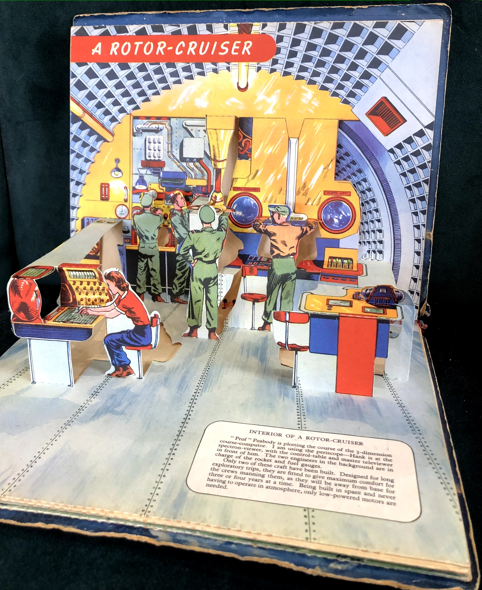
Here's my Dan Dare pop-up book:

The comic book character Dan Dare is 70 this year. If you don't know of him, ask a sixty-something year old Brit who read Eagle comic as a child.
Here's my Dan Dare pop-up book:
'...Einstein may have crafted this aphorism, but there is no direct evidence in his writings. He did express a similar idea in a lecture but not concisely. [Composer] Roger Sessions was a key figure in the propagation of the saying. In fact, he may have crafted it when he attempted to paraphrase an idea imparted by Einstein.'

"An interesting item and the story is indeed Bestall's and the date noted above it is in the hand of Ian Robertson who was the Rupert Editor at the time this was reprinted in the Express.The story is Rupert and Raggety and the reprinted story used 27 of the original 40 panels.It would appear that the Express have used a b/w copy of Bestall's original artwork and someone has coloured it for reproduction in the newspaper. Who the colourist is I do not know but they were using Gina Hart as a colourist at the time so it could be she.How this escaped from their archives I cannot speculate but it is an interesting and unique item."
Simplification often involves pruning information that has grown too long. It's often grown too long because of ill discipline in the writing process – we forget what and why we're trying to communicate, and each thought sparks off another.
The wonderful Eric Blore shows how it's done in this clip from the Fred Astaire film Shall We Dance?
When banks warn you about fraudulent emails, they always advise you to look out for spelling mistakes. But why is it that the fraudsters can't spell or recruit a reasonably literate criminal to proofread for them. I think there's an opportunity here.
Here's one I got today:

Yep, definitely dodgy I'd say.

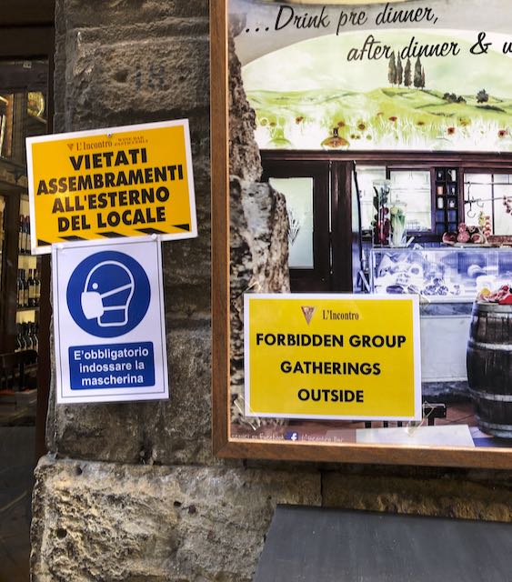
Visiting the Uffizi in Florence, it was refreshing to see graphic prohibitions that don't try to be traffic signs. I don't think I've seen this way of showing a negative on a public sign before (rather than a smartphone app).


We thought it pretty odd to find a You Are Here map just outside the gents at Pisa airport. But then we noticed the tactile path leading to it. It's a 3D map for people with sight impairment. So pretty good.


Double negatives are controversial. Pedants may think that 'I didn't do nothing' means 'I did it', but we all know the second negative is an intensifier.
So hopefully this doesn't come across as 'Don't use the litter bin'. But risky.
The great journalist and editor Harold Evans died on 23 September this year. Simon Schama wrote in Time magazine's obituary that Evan's career was 'a supreme reminder of the indispensability of fearless journalism to a democracy grounded in truth', and that he 'showed time and again that the hard work of uncompromising investigative reporting could defeat cowardly cover-ups, corruption and conspiracies of lies. He wrote and he edited with a fistful of facts.' Timely remarks for today.
He played a significant part in our smaller world of information design. As the obituary in his old paper The Times put it:
'Evans believed good newspaper design, rich in striking photographs and explanatory graphics, was essential to good storytelling and his interest in appearance extended to the choice of typeface in headings and text. This visual preoccupation led him to write the book series Editing and Design and, with the help of his inspirational head of design Edwin Taylor, Pictures on a Page, which elevated newspaper design to a fine art.'
As you would expect from a journalist, he was a prolific writer and his books on newspaper design and photojournalism were hugely helpful for the work we did on graphic formats at the Open University. Under his leadership, The Sunday Times was a pioneer of what we now call infographics, and his co-author of Pictures on a page, Edwin Taylor, spoke at the first Information Design Conference.
Journalists explain complex issues to their readers, and information designers have a lot to learn from them. I was proud that Harold Evans agreed to be on the editorial board of Information Design Journal when we launched in 1979.