I've bought a new radiator for our bathroom. The fitting guide is not so much instructional as liturgical: "Appoint on the wall the place of drilling the orifices... In the appointed places drill the orifices. The congregation shall stand."
Speaking of drilling, Plasplugs used to provide slightly superfluous instructions on using their drill bits. I think it was just so they could use the heading 'Boring instructions'.
Monday, July 30, 2007
Sunday, July 22, 2007
Star spotting in Laos
Wednesday, July 18, 2007
Tom Fishburne's met our clients
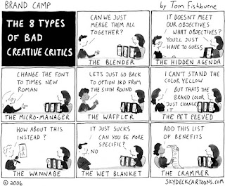
In our studio, when someone spoke of the client as 'barking', they didn't mean mad – they meant 'you don't buy a dog and do your own barking'. But then we found Tom Fishburne's classic '8 types of bad creative critics'. He's identified the full set of favourite client types. We have met every one of these clients, and could give you their names.


Tom has a brilliant collection of marketing and branding observations at his Marketoonist website.
Note to current clients: none of you are like this. Never.
Note to current clients: none of you are like this. Never.
Monday, July 16, 2007
An early bath for heads up, or a heads up on early doors
What am I on about? Phrases which arrive through slips of the tongue, and stick around. Too many metaphors, I know, but stay with me a moment.
An example is 'early doors' which is generally assumed to have originated with football manager Ron Atkinson - famous for his expressive but sometimes mangled English (see this nice YouTube explanation). It is used to mean 'early on' but no one knows where the doors bit comes in.
In our own information design world, we come across the term 'heads up mapping', which refers to maps that are oriented not with north at the top, as is conventional, but so the direction you are facing is at the top. In the research environment, I have seen this referred to as 'forward up', and this makes more sense to me. But because it is the way maps are shown on heads-up displays in aircraft cockpits, the term has slipped across to refer to map as well as the display.
Personally I am not convinced that forward-up mapping works best for everyone. But more on this another time.
Wednesday, July 11, 2007
Introducing the Simpleton
I've changed the name of my blog to reflect a new multidisciplinary research centre that I'm planning, called the Simplification Centre. It will help government departments, businesses, and regulators to simplify communications about complex topics such as tax, financial services, and health. I'm moving to the University of Reading to set it up this September.


One problem with the word 'simplification' is that it's not simple. That's why my temporary logo leaves out a syllable. Who knows, it could catch on. After all, there is a precedent. So many people find 'quantitative' such a mouthful that it's only a matter of time before 'quantative' gets into the dictionary through usage.


One problem with the word 'simplification' is that it's not simple. That's why my temporary logo leaves out a syllable. Who knows, it could catch on. After all, there is a precedent. So many people find 'quantitative' such a mouthful that it's only a matter of time before 'quantative' gets into the dictionary through usage.
The bigger the Small Print the smaller the small print
Quite a few copywriters have the original idea of calling terms and conditions 'The Small Print'. Of course, you know when you see this, that you've seen the last bit of plain English you'll see for quite some time. In fact there seems to be a law of inverse proportions here: the larger the title, the more assertive the implicit claim to have addressed the problem, the smaller the smaller print actually is. Here's one we got from Goldfish, the credit card people:
Subscribe to:
Comments (Atom)


