Friday, December 11, 2020

Oxymoronic

An oxymoron is when two contradictory terms are used together, usually for rhetorical effect – 'deafening silence', for example. 

How about this instruction from Made.com about how to return a chair that just collapsed after 2 years:

We’ve made our returns as easy as possible. All you'll need to do is:1)Re-package your item (they’ll need to be in the original packaging or a suitable alternative)...

No, Made, that's not as easy as possible. It's as difficult as possible. Who keeps the packing for furniture?

Sunday, November 15, 2020

The meaning of life?


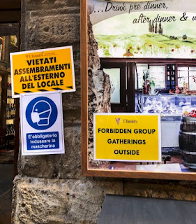
On a church door in Italy. 

I know that's supposed to be a tourist guide in the top icon, but having just emerged from the Uffizi I'd seen a lot of images with a larger central figure with raised hand and a halo...

Incidentally, that's a man's hat in the icon - women are fine with hats, and in fact St Paul insisted on them.

Thursday, October 22, 2020

Dan Dare is 70

The comic book character Dan Dare is 70 this year. If you don't know of him, ask a sixty-something year old Brit who read Eagle comic as a child.

Here's my Dan Dare pop-up book:


Clive Richards has a theory that James Dyson's industrial design is entirely inspired by Dan Dare's spaceship.

What is easy is seldom excellent

The true saying "What is written without effort is in general read without pleasure" is usually attributed to Samuel Johnson. 

Well, most things like this seem to be attributed to Johnson, Churchill, Einstein or Twain.

Quote Investigator is a wonderful website for people who are suspicious of loose attributions. They think Samuel Johnson did use a similar expression ('What is easy is seldom excellent') but there are many precedents.

I could have done with them when we started the Simplification Centre. I collected quotes on simplification, including 'Einstein's' saying 'Everything should be made as simple as possible, but no simpler'. I assumed he probably hadn't said it but couldn't find any evidence either way. 

It turns out this attribution is a pretty good one, although it is a summary of something Einstein said. Quote Investigator concludes:
'...Einstein may have crafted this aphorism, but there is no direct evidence in his writings. He did express a similar idea in a lecture but not concisely. [Composer] Roger Sessions was a key figure in the propagation of the saying. In fact, he may have crafted it when he attempted to paraphrase an idea imparted by Einstein.'

Rupert is 100!

Ten years ago I posted about the 90th anniversary of Rupert Bear. Well, it's now his centenary and there's an exhibition planned for 7th November in Canterbury, home of his creator Mary Tourtel. And Royal Mail has issued a special set of stamps.

I recently bought this artwork at auction. It claimed to be an original by Alfred Bestall, the artist who created the famous multi-layered format that I see as an information design archetype. I know it couldn't be, as it's dated 1994, and Bestall died in 1986.

It turns out to be artwork used when this particularly story was re-used by the Daily Express in 1994. It is a copy of Bestall's monochrome artwork which has been hand coloured for the republication. 

This information was very helpfully supplied to me by John Beck, Secretary of the Followers of Rupert Bear. He commented:
"An interesting item and the story is indeed Bestall's and the date noted above it is in the hand of Ian Robertson who was the Rupert Editor at the time this was reprinted in the Express.
The story is Rupert and Raggety and the reprinted story used 27 of the original 40 panels.
It would appear that the Express have used a b/w copy of Bestall's original artwork and someone has coloured it for reproduction in the newspaper. Who the colourist is I do not know but they were using Gina Hart as a colourist at the time so it could be she.
How this escaped from their archives I cannot speculate but it is an interesting and unique item."
I love that job title: Rupert Editor. 

Shall We Dance?

Simplification often involves pruning information that has grown too long. It's often grown too long because of ill discipline in the writing process – we forget what and why we're trying to communicate, and each thought sparks off another. 

The wonderful Eric Blore shows how it's done in this clip from the Fred Astaire film Shall We Dance? 


Monday, October 19, 2020

Spellchecker for fraudsters?

When banks warn you about fraudulent emails, they always advise you to look out for spelling mistakes. But why is it that the fraudsters can't spell or recruit a reasonably literate criminal to proofread for them. I think there's an opportunity here. 

Here's one I got today: 


Yep, definitely dodgy I'd say.

Tuesday, October 13, 2020

That's what I call personalisation

How did Tesco know that's how I was feeling that day? 


No thunderbolts


Bearing in mind this is outside a church, who exactly is the No Thunderbolts sign on the bottom row directed at? Zeus no longer lives here.

Friendly prohibitions


I love a friendly sign, when you're in a friendly place like a garden. 

Things you can't do, drawn nicely

Visiting the Uffizi in Florence, it was refreshing to see graphic prohibitions that don't try to be traffic signs. I don't think I've seen this way of showing a negative on a public sign before (rather than a smartphone app).


A warning or a promise?

On not jumping to conclusions

We thought it pretty odd to find a You Are Here map just outside the gents at Pisa airport. But then we noticed the tactile path leading to it. It's a 3D map for people with sight impairment. So pretty good.


Icon grammar


Double negatives are controversial. Pedants may think that 'I didn't do nothing' means 'I did it', but we all know the second negative is an intensifier.

So hopefully this doesn't come across as 'Don't use the litter bin'. But risky.

RIP Harold Evans

The great journalist and editor Harold Evans died on 23 September this year. Simon Schama wrote in Time magazine's obituary that Evan's career was 'a supreme reminder of the indispensability of fearless journalism to a democracy grounded in truth', and that he 'showed time and again that the hard work of uncompromising investigative reporting could defeat cowardly cover-ups, corruption and conspiracies of lies. He wrote and he edited with a fistful of facts.' Timely remarks for today.

He played a significant part in our smaller world of information design. As the obituary in his old paper The Times put it: 

'Evans believed good newspaper design, rich in striking photographs and explanatory graphics, was essential to good storytelling and his interest in appearance extended to the choice of typeface in headings and text. This visual preoccupation led him to write the book series Editing and Design and, with the help of his inspirational head of design Edwin Taylor, Pictures on a Page, which elevated newspaper design to a fine art.' 


As you would expect from a journalist, he was a prolific writer and his books on newspaper design and photojournalism were hugely helpful for the work we did on graphic formats at the Open University. Under his leadership, The Sunday Times was a pioneer of what we now call infographics, and his co-author of Pictures on a page, Edwin Taylor, spoke at the first Information Design Conference.

Journalists explain complex issues to their readers, and information designers have a lot to learn from them. I was proud that Harold Evans agreed to be on the editorial board of Information Design Journal when we launched in 1979.

Wednesday, September 16, 2020

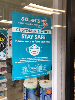
Covid19 notices and their tone


Equal opportunity icons at River Island.


You can't tell if people are smiling under a mask. In this case I suspect not.
Do you ever need the word Notice? It started as a verb (as in 'take notice' or 'look!') but now it's a noun. And it's a waste of a headline. 


Too Much Information Did Not Read


Way Too Much Information Did Not Read


Linking safety to the reason you're here. Some churches are using 'Stay safe. Love one another'. Also nice.

Fair comment

Public signs should include a comments section, or in this case some FAQs to explain why this road is closed but no work is happening (Margate again). 


Maybe


Don't you just love a decisive notice? Seen on a recent trip to Margate.


Monday, August 17, 2020

A minor character

I confess to googling myself, and have discovered I am a list as a 'PG Wodehouse minor character'.

Well, I'll settle for 'a benevolent-looking man, with a pair of mild blue eyes behind his spectacles'. Could be worse...

Update in December 2022: the wikipedia page has gone – see my new post about why


Thursday, August 06, 2020

What 3 TVs

If you try to choose a TV you could find yourself comparing the merits of a LG 55UN80006LA, Samsung UE50TU8507UXXU or a Sony KD55XH8096BU. Or how about a Panasonic TX-50HX580B?

You have no hope of retaining any of these model names in your head. So how are you supposed to think through your decision, read reviews and find the model online, or check where the cheapest price is. You can cut and paste and search, but the algorithms are ahead of you and insert other models into the search results.

The electronics industry could learn from What3words. This is the brilliant app that assigns a unique set of three random words to each 3m square of the planet. So GPS co-ordinates 51.520847, -0.19552100 become filled.count.soap.

You could ask... why not just give the GPS coordinates? Well just try reading those out accurately when you're calling mountain rescue. What3words is a brilliant tool that understands that most humans can remember words a lot better than they remember numbers. It's information design, actually.

So I look forward to the day when I can choose my next TV that way. How about a Panasonic boot.fidget.balloon or a Samsung stapler.butterfly.fruitcake?


Seriously, which of these is the easiest to remember?

Tuesday, August 04, 2020

Which? best buys: I don't buy this format

Which? the consumer testing magazine and website, can be remarkably dense sometimes. We were looking at food mixers and Kenwood have done brilliantly in bagging the top four Best Buy slots.


Well done, Kenwood. The red one was best, then the white one, then the cream-coloured one, then the black one. Yes, they are the same mixer in different colours. 

Assuming they don't actually test the different colours separately, I reckon this is an information design problem. This format doesn't allow them to do the sensible thing and present this as one product with colour variants.

They could just call it the 'Kenwood KMix KMX754...', and the next column could list the colour variants.

Sh*t, S**t, S***

A friend remarked approvingly that I used the word 'shit' in a recent post. It's odd how words shift their position on the spectrum of rudery (or should that be prudery).

My late mother, who would have given Hyacinth Bucket a run for her money (although she was the real thing), would use the word freely (as in 'I've put chicken shit on my roses'), as a straight synonym for manure. 

I always think that when a newspaper prints a coyly bleeped word like 'sh*t' it forces me to think of all the rude words I know that might fit - not very edifying. Sometimes I'm stumped which makes me feel rather naïve.

I mentioned this in this blog a few years ago, after seeing the word 'w***e' in a headline. Click here for the answer, which disappointingly isn't even rude (unless someone is using to describe you). 

End of the Argos catalogue, end of an era

The Argos catalogue is no more. If you are the reader of this blog who lives outside the UK, I should explain that this was like a mail order catalogue but no mailing was involved. Argos has stores in every town, where you can/could browse a catalogue and order every kind of stuff, which was stored in a back room, mostly not on display. It inevitably moved online, and after acquisition by Sainsbury's the stores are moving to supermarkets.

Argos does a remarkable job of making a wide range of stuff available in small towns which now longer have specialist shops. At one of our early summer schools the host institution failed to supply a projector... so we popped out to Argos and bought the one we still use. 

Some of the vox pop comments in radio interviews struck a chord. Most homes had an Argos catalogue and in the pre-internet days it gave kids access to window-shopping. Families would browse the catalogue together and plan purchases, voice their aspirations and drop birthday present hints.


I'm not sure what the current figures are, but when Argos was a client in the 2000s the figures were astonishing and surprising: for example, they were one of the largest jewellers, furniture retailers and suppliers of electrical goods. Most of the photographers in Milton Keynes where they were based seemed to be sustained by product shots for the catalogue.

The production of the catalogue was a major operation involving five or six printing plants around Europe, and several binderies. They were delivered on pallets near the door of Argos stores for people to take home. When we asked about recycled paper it emerged that there wasn't enough recycled paper in Europe to print the Argos catalogue.

Every now and again they would ask us to review a particular aspect of the catalogue and propose improvements. We treated these projects as exercises in decision support, helping people to choose what features and qualities they needed, and which products had them. We would produce beautifully crafted explanations which were then made rather naffer by in-house designers to fit in with the brash Argos brand.

It was a fascinating encounter with the world of retail. For example, Good Better Best: a typical product range has to have basic products (good), an average products (better) and a top end (best). Some customers will invariably buy from one of these relative price points. 

When we worked on the Argos jewellery section, it included a diamond ring priced well over £3,000  although the average jewellery purchase was under £10. No one I spoke to could remember the expensive ring ever being sold but its job was to be Best and lift the image of the Argos jewellery brand. The recipient of a gifted ring could not know for sure that the giver was a cheapskate.

Friday, July 31, 2020

Why do flies shit on our HomePod?

It's a little hard to see in this picture, but there are several black flies sitting on our black Apple HomePod, which has dots of black fly shit on top. Why do they do it? There's nothing in the user guide.

Oddly enough I haven't seen this commented on. It's rare to get a dead end on Google.


Things you can't do in Madeira

Following the popular series of posts 'Things you can't do...' (2013), here's what we weren't allowed to do in Madeira last year.

I particularly like 'no walking on stilts near ladies', and 'don't do a poo while walking on water', although it meant the holiday wasn't much fun.


Wednesday, July 01, 2020

Gender neutral icons

Classic Isotype charts are sometimes referred to as 'rows of little men'. But how could we instead show rows of little persons?

I love this gender neutral icon which Tesco are using in their supermarkets. Just by stretching the arms out a little, it allows people of any gender identity to see themselves in it - it could be wearing a dress (or have wider hips) or perhaps its arms are just positioned like this.


The Noun Project has various other attempts:
The one on the left by Dan Brunsdon is typical of solutions which just combine icons - not so much gender neutral as both-genders. 

 I quite like the right hand one by James Walker, with its suggestion of hips.

Monday, March 16, 2020

RIP Michael Hertz

I regret I wasn't aware of him until he died, but the designer of the New York subway map passed away recently, and there's an interesting obit in the NY Times.


When clients drop the ball

Karen Schriver recently tweeted: "What do Information designers do when a client spends a large sum to do a high-profile project, but then drops the ball and has no time to manage it?"

This is all too familiar, and over a long career I've had a few of these experiences, some of which are possibly still covered by NDAs or the Official Secrets Act so detail is not possible. They are infuriating and disappointing because even if we have charged for our work that's not the only reason we do it – we want to do great stuff and improve the world.

One notable one from around 20 years ago was a major government form that almost every citizen uses. We redesigned it and ran a large scale live pilot which showed we'd dramatically reduced error rates. The government agency realised that each error took a civil servant around 30 minutes to deal with, and the reduction in errors therefore meant that they would have to fire or redeploy around 1000 people, leading to a probable trade union dispute. They just took some minor aspects of our work which reduced errors by around 6%, which was their target for the project.

I have also heard civil servants worry that the improvement was so great that it would make them look like idiots for putting up with the old version for so long.

And I have had work ruined by in-house designers or contracted branding agencies who were tasked with implementing it, and digital teams who insist on controlling everything.

Oh well...

Monday, February 24, 2020

This is a sign

Looking back at those huge but ineffectual anti-Brexit marches, at least the signs were great. I particularly liked this one which wasn't picked up in the press coverage (yes, I was there so now you know what I think of Brexit).


Thursday, February 20, 2020

Dodgy chart hits the front page

It's not often you see information design cited in a political row but today the Number 10 press office tweeted about a dodgy chart used in an EU statement about trade relations with the UK. It's reported more fully on the Politico.eu website.

The EU published a chart showing the scale of trading relationships with various partners. It uses circles to represent amounts, and I've blogged about this before (well, it's nine years ago now...).


You shouldn't do that because humans can't compare volumes as well as they compare lengths. This is what Isotype was about...

Below left is the comparison they made. Then I've show the comparison by length, and, even better, horizontal bars with a block for every 10 billion and the figures provided.


According to Politico.eu:
'David Spiegelhalter, a professor of the public understanding of risk at Cambridge University, said the Commission's approach was "indefensible" and went against "standard graphical practice."
"It's also the biggest mistake to make. It's incorrect to use diameter to represent volume," he said, adding that it was "the sort of thing a junior person would do."'
...or a graphic designer, I'm afraid.

Wednesday, February 19, 2020

Hello again

After a break of more than three years, this blog is back.

I stopped in 2016 because of various distractions, notably the rebuilding of our home and the design and construction of the garden, which is my pride and joy.

It's all settled down now, so I'm once again in need of an outlet for my opinions, observations and anxieties... however few people are listening.