Sunday, March 24, 2013

Signs of New York

Just back from a great trip to New York, with a few signs to share.


 Nice and direct.


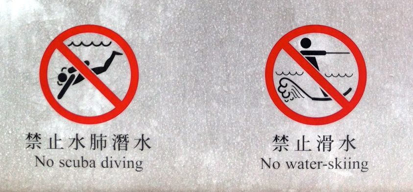
 Strangely specific icons on the way in the 9/11 memorial. Is that a flick knife? Are other kinds OK?


 I like their thinking - putting the 'No Dogs' sign on a lamp post. But it's a little high up for them to read.


 OK! OK! OK!


Not sure why I find this funny, but I do.


Sunday, March 10, 2013

Film warnings I'd like to see


I don't think I've seen this kind of warning before. It's on a poster for the film Mama. Handy, because I'm not keen on ghost films. Perhaps we could also have warnings for wrong-font-for-period, the pretty girl dies, Steven Fry.


Thursday, March 07, 2013

Extreme Su Doku


So fiendish I couldn't begin to solve it. The Times iPad edition strikes again.

When editors get cross

I can't remember seeing anything quite like this page from the Charity Commission document Charities and Public Benefit: The Charity Commission’s general guidance on public benefit. (This link will presumably die, when the guidance is revised).


What's behind this is that private schools don't like the way the Charity Commission interpreted the Charities Act 2006, threatening their charitable status. For example, the Charity Commission say:
"Where benefit is to a section of the public, the opportunity to benefit must not be unreasonably restricted
 • by geographical or other restrictions
 or
• by ability to pay any fees charged"
In 2011 the Charity Commission lost a court case, and are, or should be, revising the guidelines. But pending an appeal, they have continued to publish the disputed text, but crossed out.
Here's a BBC report of the case.

Jacques Derrida uses crossed out words to signify that they don't quite express what he means. Perhaps we could all adopt the technique.

"Dear Granny, Thanks for the lovely socks. They are just what I wanted."
"Dear Valued Customer".


Tuesday, March 05, 2013

Ronald Shakespear

Thanks to Unit Editions for publishing a great series of books on the designers who influenced my generation. Herb Lubalin and Ken Garland were given the treatment most recently, and others are in the pipeline.

And thanks to them for highlighting the work of the Argentine designer and photographer Ronald Shakespear, whose name I knew, but not his work. Have a look at the interviews on their website. He comes across as a lovely guy in the interview and also in the work. Drawn as always to the information design part of anyone's oeuvre, I particularly love this Buenos Aires taxi sign from 1971.


In the interview Ronald quotes some nice advice given by Milton Glaser when he visited his students: 'Learn all what you can from your teachers now and when you cross the street, please forget it all'

Unit Editions is a collaboration between Tony Brook and Adrian Shaughnessy.

Wednesday, February 13, 2013

A better class of lost and found

As you'd expect, you get a better class of lost and found notices in a leading art school. This from the Royal College of Art notice board.


Negatives in signs

The grammar of warning signs is somewhat challenged by these examples, found within a few metres of each other in Hyde Park.


These icons are clear enough for me. Although, according to international standards, the red circle should be enough, in the UK we've never quite accepted its negative force,. So we tend to add a diagonal line to make sure.

But what I like about this is the additional prohibition: "It is an offence to damage this sign". I want to see that as a pictogram, please – the hand that was feeding the squirrel now attacking the sign with a hammer... all in a red circle with a line through it.


Pragmatically I'm fine with this, but it's a challenge to the sign regs pedant. A red circle generally means no whatever is depicted inside the circle. So this says 'no dogs on leads'... doesn't it?
So we'd need a dog with no lead in the circle... perhaps accompanied by a permissive sign for dogs with leads (generally white on blue).


This one seems to reflect the fact that No Cycling signs don't seem to work - the designer is just having a go at something different to see if it'll work. The black bike in a red circle apparently has come to mean 'cyclists welcome', if the pedestrianised shopping streets of Reading are anything to go by.

Tuesday, February 05, 2013

The inevitable typo

Some words are so confusable you can sense the typo around the corner before you get to it.

So it is with a leaflet from a neighbour who is raising funds for the Britain Nepal Otology Service. This worthy organisation sends medical teams to Nepal to treat ear problems. They don't treat people who are unsure whether they exist: that's the Britain Nepal Ontology Service mentioned on page 2.

I wonder if there is a Britain Tibet Ontology Service.

Friday, February 01, 2013

Chasing the answers


Here's a quiz in the Times iPad edition. The answers are upside down, so you just turn the screen around to read them.

Oh.

Sunday, January 27, 2013

It's digital - they won't mind

Just another of those 'we didn't bother to proof-read because it's digital' pages from the Sunday Times iPad edition. But this one has a certain charm, I think.


Monday, January 14, 2013

Extreme outsourcing

Spotted by Michael Green in a department store in Albuquerque, New Mexico.


It's behind you


I'm not sure why backwards pointing arrows are so rare - like these ones on a flight information display at Helsinki Airport.

If you don't know where something is, it is only by chance that you might be facing in the right direction when you look for it on a sign.

Usually it is the absence of an obvious destination that tells you it is not in the direction you are facing. So you have to turn around and look for it on another sign, or, in the case of a hanging sign, look on the other side to see if it is listed there.


Sunday, January 13, 2013

Wednesday, January 02, 2013

Compared to what?

Without the helpful pie chart, I'd struggle to understand this American Express statement.


Thursday, December 13, 2012

Baffling label of the day

A second-hand book just arrived from the USA. Appears to violate an international treaty obligation. Does this mean war?


Monday, October 08, 2012

Ideal font for Lucie Attwell fans with dyslexia


The BBC website recently featured the OpenDyslexic font by Abelardo Gonzalez. I'm not dyslexic so can't form an opinion, but I wonder whether Mabel Lucie Attwell was an influence.


Friday, September 14, 2012

Gate 16

This photo does not include Gate 17 – that's a 6 on the right (at Riyadh airport, where I was last week). The number on the left uses Arabic numerals, but the one on right, being in the Arabic script, does not.

Confused? We call our numerals Arabic because Europeans learned about them from the Arabs. But Arabs call their numerals Hindi or Indian, because India is where they are actually from.

Tuesday, August 28, 2012

News from Brighton

I'm very late discovering this great collection of news stand posters from the Brighton Argus (last updated several years ago. It's clearly where life happens - makes you want to go and live there. Thanks to David Woodward for the link.


Friday, August 24, 2012

Branding triumph

Banner saying 'surprising Reading'

Historic Reading
Beautiful Reading
Reading, paradise by the Kennet and Avon Canal
Reading, the Athens of ...
I heart Reading.

I'd have liked to have been in that meeting.

Wednesday, August 22, 2012

Olympics retrospective

Quite a few of us are still puzzled by that logo. Graffiti concept - great. Execution of the concept - not so great. I rather like the one the New York Times used for its Olympics coverage.


Is it the one that got away?

Incidentally, their Olympics blog, by Campbell Robertson, included this nice quote:

'...Visa went too far. Not only was it the only credit card accepted at venues, signs on every cash register read, “We are proud to accept only Visa,” a slogan of doublespeak so hideous its originator deserves a back of the hand from Don Draper.'


Monday, August 20, 2012

Follow the true Path

Two versions of the same message seen at Wisley Garden.


I'm trying to decide if they mean the same thing. Obviously they do, in that the outcome is the same (if we ignore the option of walking on the flower beds). There is also a strong hint in the positioning of the Path version – it's on the grass. 'Oi! Not 'ere. Can't you see the path?'

But 'Keep off the grass' comes with baggage: bossy park keepers, school rules (at my school, the teachers and prefects could walk on the grass).

'Keep to the paths' mostly works, except that some of the paths are grass... which would stop robots in their tracks if they've also seen the 'keep off the grass' version.

I like the way Paths is capitalised, by the way - a multi-faith notice.