
Wednesday, February 13, 2013
A better class of lost and found
As you'd expect, you get a better class of lost and found notices in a leading art school. This from the Royal College of Art notice board.

Negatives in signs
The grammar of warning signs is somewhat challenged by these examples, found within a few metres of each other in Hyde Park.


Pragmatically I'm fine with this, but it's a challenge to the sign regs pedant. A red circle generally means no whatever is depicted inside the circle. So this says 'no dogs on leads'... doesn't it?

This one seems to reflect the fact that No Cycling signs don't seem to work - the designer is just having a go at something different to see if it'll work. The black bike in a red circle apparently has come to mean 'cyclists welcome', if the pedestrianised shopping streets of Reading are anything to go by.

These icons are clear enough for me. Although, according to international standards, the red circle should be enough, in the UK we've never quite accepted its negative force,. So we tend to add a diagonal line to make sure.
But what I like about this is the additional prohibition: "It is an offence to damage this sign". I want to see that as a pictogram, please – the hand that was feeding the squirrel now attacking the sign with a hammer... all in a red circle with a line through it.

So we'd need a dog with no lead in the circle... perhaps accompanied by a permissive sign for dogs with leads (generally white on blue).

Saturday, February 09, 2013

Tuesday, February 05, 2013
The inevitable typo
Some words are so confusable you can sense the typo around the corner before you get to it.
So it is with a leaflet from a neighbour who is raising funds for the Britain Nepal Otology Service. This worthy organisation sends medical teams to Nepal to treat ear problems. They don't treat people who are unsure whether they exist: that's the Britain Nepal Ontology Service mentioned on page 2.
I wonder if there is a Britain Tibet Ontology Service.
Friday, February 01, 2013
Chasing the answers

Here's a quiz in the Times iPad edition. The answers are upside down, so you just turn the screen around to read them.
Oh.
Sunday, January 27, 2013
It's digital - they won't mind
Just another of those 'we didn't bother to proof-read because it's digital' pages from the Sunday Times iPad edition. But this one has a certain charm, I think.


Monday, January 14, 2013

It's behind you

I'm not sure why backwards pointing arrows are so rare - like these ones on a flight information display at Helsinki Airport.
If you don't know where something is, it is only by chance that you might be facing in the right direction when you look for it on a sign.
Usually it is the absence of an obvious destination that tells you it is not in the direction you are facing. So you have to turn around and look for it on another sign, or, in the case of a hanging sign, look on the other side to see if it is listed there.
Sunday, January 13, 2013

Wednesday, January 02, 2013
Compared to what?
Without the helpful pie chart, I'd struggle to understand this American Express statement.


Thursday, December 13, 2012
Baffling label of the day
A second-hand book just arrived from the USA. Appears to violate an international treaty obligation. Does this mean war?


Monday, October 08, 2012
Ideal font for Lucie Attwell fans with dyslexia

The BBC website recently featured the OpenDyslexic font by Abelardo Gonzalez. I'm not dyslexic so can't form an opinion, but I wonder whether Mabel Lucie Attwell was an influence.

Friday, September 14, 2012
Gate 16

Confused? We call our numerals Arabic because Europeans learned about them from the Arabs. But Arabs call their numerals Hindi or Indian, because India is where they are actually from.
Tuesday, August 28, 2012
News from Brighton
I'm very late discovering this great collection of news stand posters from the Brighton Argus (last updated several years ago. It's clearly where life happens - makes you want to go and live there. Thanks to David Woodward for the link.


Friday, August 24, 2012
Branding triumph

I'd have liked to have been in that meeting.
Wednesday, August 22, 2012
Olympics retrospective
Quite a few of us are still puzzled by that logo. Graffiti concept - great. Execution of the concept - not so great. I rather like the one the New York Times used for its Olympics coverage.

Is it the one that got away?
Incidentally, their Olympics blog, by Campbell Robertson, included this nice quote:

Is it the one that got away?
Incidentally, their Olympics blog, by Campbell Robertson, included this nice quote:
'...Visa went too far. Not only was it the only credit card accepted at venues, signs on every cash register read, “We are proud to accept only Visa,” a slogan of doublespeak so hideous its originator deserves a back of the hand from Don Draper.'
Monday, August 20, 2012
Follow the true Path
Two versions of the same message seen at Wisley Garden.

I'm trying to decide if they mean the same thing. Obviously they do, in that the outcome is the same (if we ignore the option of walking on the flower beds). There is also a strong hint in the positioning of the Path version – it's on the grass. 'Oi! Not 'ere. Can't you see the path?'
But 'Keep off the grass' comes with baggage: bossy park keepers, school rules (at my school, the teachers and prefects could walk on the grass).
'Keep to the paths' mostly works, except that some of the paths are grass... which would stop robots in their tracks if they've also seen the 'keep off the grass' version.
I like the way Paths is capitalised, by the way - a multi-faith notice.
Sunday, August 12, 2012
Guerilla signs on the underground
Thanks to Gill Ereaut for pointing me to this. There's loads more on The Poke. I'll now be paying more attention to notices on tube trains.


Thursday, July 26, 2012
Neighbouring signs
Seen in Goodge Street: probably just my immaturity, but I like the way that a shop called Bang Bang ends up next to a sex shop.

And in the same street, I can't help wondering where the Jennings Bet designer had just had lunch on the day he or she designed the logo. Or was it the other way around?
.jpg)

And in the same street, I can't help wondering where the Jennings Bet designer had just had lunch on the day he or she designed the logo. Or was it the other way around?
.jpg)
Monday, July 09, 2012
New Simplification Centre blog
We've just moved the Simplification Centre website to WordPress, thanks to the hard work of Kate Stinson, and this means our blog has a lot more potential... so I'll be blogging there quite a bit from now. Please have a look from time to time at www.simplificationcentre.org.uk/blog/
Monday, June 18, 2012


Friday, April 27, 2012
Apple's daft questions: my answers
This may not be very secure of me, but Apple have asked me those daft questions again (this time on my laptop - last time it was the iPhone).
This time I've answered truthfully.

This time I've answered truthfully.

.jpg)
Wednesday, April 25, 2012

More daft security questions... from Apple this time
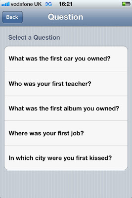
My Apple account has suddenly demanded I set up some security questions so at some future date they can interrogate me to see if I am who I say I am.
Who writes these things? I've no idea of the answers to any of these questions. I actually remembered the wrong car as being the first one, and found I couldn't correct it. I could make something up, but who's to say I'll invent same thing when the Apple cop is on the phone.
In which city was I first kissed. Huh? How old are you, Apple?


Sunday, April 22, 2012
Internet gateway

Could explain why my broadband is slow in the evenings.
Thursday, April 05, 2012
Misérables
With the Information Design Conference happening next week, and dominating my life for the last several months, I've been regaling friends with hilarious tales of conference disasters of yesteryear. Like the one at Cranfield where they served coffee in the foyer of a building where students were sitting final exams. Invigilators burst out shushing us as we chatted. Then there was the time they scheduled major roof repairs for the day of the conference. And the symposium I organised in a Cotswold hotel, inspected in the summer, but found to have no central heating when we met in November. It was market day, and luminaries such Pat Wright, Michael Twyman and David Olson sat around the table in army surplus jumpers.
So just before leaving for the long weekend, Greenwich University broke the news today that Working Title will be filming Les Misérables, with Russell Crowe and other famous people, just outside the window of the conference next week. Crowd scenes, horses, dodgy accents, occasional gunfire and music to accompany the dance sequences.
At least we won't be bored.
Sunday, March 18, 2012


Thursday, March 15, 2012

Tuesday, March 13, 2012
Signs of optimism
I'm just back from a great holiday in India. These two signs in Pune seem rather optimistic, each in their own way.


Thursday, March 01, 2012
Decision time
Paddington Basin, London. Thanks to Martin Evans for this. I'm guessing which route he took – I admire him greatly but wouldn't say he walks on water.


Wednesday, February 29, 2012
A room called Barry
Companies often give names to their meeting rooms – for example, the names of iconic cities, such as Paris, New York or LA. You soon learn that a meeting in Milan doesn't guarantee great coffee.
An energy company I'm working with has a meeting room called Barry. Their meeting rooms aren't named after famous gas fitters, as you might suppose, but power stations.
It's just unfortunate for such a safety-critical industry that one of them is Killingholme.
An energy company I'm working with has a meeting room called Barry. Their meeting rooms aren't named after famous gas fitters, as you might suppose, but power stations.
It's just unfortunate for such a safety-critical industry that one of them is Killingholme.
Thursday, February 16, 2012
Welcome to Reading
I like documents which bear traces of a continuing conversation – like author's manuscripts, whiteboards in a meeting room, or this one in Reading town centre.


Thursday, February 09, 2012
Four kinds of digital page
I'm revising a conference paper for publication, and was recently speaking about it with a student. So I thought I'd put this thought from it on the blog, in the hope of one or two comments.
----
Hypertext prophets used to speak as if the advent of digital text were a paradigm shift, incommensurate with past ways of thinking and acting through text. It is perhaps more common now to speak about the convergence of technologies and channels. In that spirit I identify four page archetypes which reflect generic resonances from the past, the continuing need for traditional functions of the document, and the technical capabilities and connectness of the current world.
Fixed pages are the most diagrammatic, and are found in illustrated books and PDFs. Because they are locked in place, the reader can assume that relationships between elements (text blocks, pictures, headlines, etc) are intentional and potentially meaningful. A page break signifies the end of a unit of text, in the same way as a sentence or a paragraph. The designer and writer, for their part, can craft graphic relationships knowing that they will survive the various technical transmission processes and reach the reader.
Flowed pages are represented by traditional novels, or by e-reader books. The author’s words are flowed in and fill the pages one by one, with page endings that are as arbitrary as the line endings are. But those page endings are fixed for the life of the document (or, in the case of e-documents, until the text is re-flowed after a change of font). Readers can therefore move back and forth between pages and use the constant geography of the book to navigate.
Fugitive pages are formatted temporarily and perhaps also populated with content temporarily. Pages are created afresh for each reading, and may change when revisited. A common example is an online newspaper, which offers a reasonably coherent appearance and user experience, but which is constantly updated. If you return to a story later in the day, you may find that it has been relegated to a lower position in the hierarchy or even disappeared from view.
Fragmented pages are compilations of page elements from a variety of sources which may not have any relationship predictable by their authors. Examples are the results of a search, or an aggregation application such as Flipboard (which assembles content from a range of the user’s favourite sources, such as blogs or social networking sites, into a magazine-like format).
These page types may exist in pure form or co-exist in combination. For example, an online newspaper may have fixed layouts into which fugitive content is flowed, and a column of fragmented advertisements drawn in through personalisation rules.
Why might this be interesting? Because there's a lot of talk about how the reading process is changing in the digital era, which has introduced us to fugitive and fragmented texts. Flowed texts are the stuff of e-readers, which are taking over from flowed paper books. But fixed pages, carefully crafted and diagrammed multimodal pages, are a challenge for digital channels. This could mean they die out, or it could mean someone will invent a digital channel that can handle them. Products like Inkling and the Apple iBooks textbook go some way, and are a response the finding that textbooks have not yet found a happy home in e-readers.
Sunday, February 05, 2012
Best Typography Oscars
Thanks to Kate Cooper for pointing me to this nice blog that nominates films for a Best Typography Oscar.
Coincidently, I was today reviewing an article for a journal which asserts that typographers choose typefaces with personalities that match content. My first reaction was that, as a typographer, I cannot remember the last time I did that. But, of course, I don't get to work on film posters.


Mind you, these are both historical references rather than personality-laden. For example, the War Horse title is not horse-like, but of its time - and beautifully observed.
Coincidently, I was today reviewing an article for a journal which asserts that typographers choose typefaces with personalities that match content. My first reaction was that, as a typographer, I cannot remember the last time I did that. But, of course, I don't get to work on film posters.


Friday, February 03, 2012

Saturday, January 07, 2012
Book crime
A book has appeared on my shelf that I cannot remember buying, borrowing or reading. Somehow it's found its way there. I wonder... did I steal it? is it hiding out on my shelf while the dogs are after it?
Its title: Criminal behaviour: a psychological approach to explanation and prevention.
Friday, January 06, 2012
Ronald Searle RIP
Goodbye to the incomparable Ronald Searle. As a reluctant boarding school pupil, his Molesworth books helped me see the joke and his cartoons were everywhere as I was growing up.

He was a prisoner of war with my father, but I don't know if they knew each other – Dad never talked about that time, but Searle drew it all.


Something I said? Is my Mac breaking up with me?
I know it's just a machine, but I was quite upset when my email system refused to deliver an email recently. I never found general feedback very helpful at school either – was it my grammar, my spelling, or just my general attitude?


Thursday, January 05, 2012
Doctor, doctrix
It is 2012 isn't it? They do allow ladies to be doctors, don't they. Not according to the poor man who set up the registration page for this Aussie telco. Thanks to Kimberley Crofts for retweeting this one.


Tuesday, December 27, 2011
Proper handwriting

Tuesday, December 06, 2011
Odd Peugeot graphic

Subscribe to:
Posts (Atom)