
Monday, June 18, 2012

Friday, April 27, 2012
Apple's daft questions: my answers
This may not be very secure of me, but Apple have asked me those daft questions again (this time on my laptop - last time it was the iPhone).
This time I've answered truthfully.

This time I've answered truthfully.


.jpg)
Wednesday, April 25, 2012

More daft security questions... from Apple this time
My Apple account has suddenly demanded I set up some security questions so at some future date they can interrogate me to see if I am who I say I am.
Who writes these things? I've no idea of the answers to any of these questions. I actually remembered the wrong car as being the first one, and found I couldn't correct it. I could make something up, but who's to say I'll invent same thing when the Apple cop is on the phone.
In which city was I first kissed. Huh? How old are you, Apple?
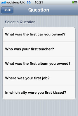


Who writes these things? I've no idea of the answers to any of these questions. I actually remembered the wrong car as being the first one, and found I couldn't correct it. I could make something up, but who's to say I'll invent same thing when the Apple cop is on the phone.
In which city was I first kissed. Huh? How old are you, Apple?


Sunday, April 22, 2012
Internet gateway

Could explain why my broadband is slow in the evenings.
Thursday, April 05, 2012
Misérables
With the Information Design Conference happening next week, and dominating my life for the last several months, I've been regaling friends with hilarious tales of conference disasters of yesteryear. Like the one at Cranfield where they served coffee in the foyer of a building where students were sitting final exams. Invigilators burst out shushing us as we chatted. Then there was the time they scheduled major roof repairs for the day of the conference. And the symposium I organised in a Cotswold hotel, inspected in the summer, but found to have no central heating when we met in November. It was market day, and luminaries such Pat Wright, Michael Twyman and David Olson sat around the table in army surplus jumpers.
So just before leaving for the long weekend, Greenwich University broke the news today that Working Title will be filming Les Misérables, with Russell Crowe and other famous people, just outside the window of the conference next week. Crowd scenes, horses, dodgy accents, occasional gunfire and music to accompany the dance sequences.
At least we won't be bored.
So just before leaving for the long weekend, Greenwich University broke the news today that Working Title will be filming Les Misérables, with Russell Crowe and other famous people, just outside the window of the conference next week. Crowd scenes, horses, dodgy accents, occasional gunfire and music to accompany the dance sequences.
At least we won't be bored.
Sunday, March 18, 2012


Thursday, March 15, 2012

Tuesday, March 13, 2012
Signs of optimism
I'm just back from a great holiday in India. These two signs in Pune seem rather optimistic, each in their own way.


Thursday, March 01, 2012
Decision time
Paddington Basin, London. Thanks to Martin Evans for this. I'm guessing which route he took – I admire him greatly but wouldn't say he walks on water.


Wednesday, February 29, 2012
A room called Barry
Companies often give names to their meeting rooms – for example, the names of iconic cities, such as Paris, New York or LA. You soon learn that a meeting in Milan doesn't guarantee great coffee.
An energy company I'm working with has a meeting room called Barry. Their meeting rooms aren't named after famous gas fitters, as you might suppose, but power stations.
It's just unfortunate for such a safety-critical industry that one of them is Killingholme.
An energy company I'm working with has a meeting room called Barry. Their meeting rooms aren't named after famous gas fitters, as you might suppose, but power stations.
It's just unfortunate for such a safety-critical industry that one of them is Killingholme.
Thursday, February 16, 2012
Welcome to Reading
I like documents which bear traces of a continuing conversation – like author's manuscripts, whiteboards in a meeting room, or this one in Reading town centre.


Thursday, February 09, 2012
Four kinds of digital page
I'm revising a conference paper for publication, and was recently speaking about it with a student. So I thought I'd put this thought from it on the blog, in the hope of one or two comments.
----
Hypertext prophets used to speak as if the advent of digital text were a paradigm shift, incommensurate with past ways of thinking and acting through text. It is perhaps more common now to speak about the convergence of technologies and channels. In that spirit I identify four page archetypes which reflect generic resonances from the past, the continuing need for traditional functions of the document, and the technical capabilities and connectness of the current world.
Fixed pages are the most diagrammatic, and are found in illustrated books and PDFs. Because they are locked in place, the reader can assume that relationships between elements (text blocks, pictures, headlines, etc) are intentional and potentially meaningful. A page break signifies the end of a unit of text, in the same way as a sentence or a paragraph. The designer and writer, for their part, can craft graphic relationships knowing that they will survive the various technical transmission processes and reach the reader.
Flowed pages are represented by traditional novels, or by e-reader books. The author’s words are flowed in and fill the pages one by one, with page endings that are as arbitrary as the line endings are. But those page endings are fixed for the life of the document (or, in the case of e-documents, until the text is re-flowed after a change of font). Readers can therefore move back and forth between pages and use the constant geography of the book to navigate.
Fugitive pages are formatted temporarily and perhaps also populated with content temporarily. Pages are created afresh for each reading, and may change when revisited. A common example is an online newspaper, which offers a reasonably coherent appearance and user experience, but which is constantly updated. If you return to a story later in the day, you may find that it has been relegated to a lower position in the hierarchy or even disappeared from view.
Fragmented pages are compilations of page elements from a variety of sources which may not have any relationship predictable by their authors. Examples are the results of a search, or an aggregation application such as Flipboard (which assembles content from a range of the user’s favourite sources, such as blogs or social networking sites, into a magazine-like format).
These page types may exist in pure form or co-exist in combination. For example, an online newspaper may have fixed layouts into which fugitive content is flowed, and a column of fragmented advertisements drawn in through personalisation rules.
Why might this be interesting? Because there's a lot of talk about how the reading process is changing in the digital era, which has introduced us to fugitive and fragmented texts. Flowed texts are the stuff of e-readers, which are taking over from flowed paper books. But fixed pages, carefully crafted and diagrammed multimodal pages, are a challenge for digital channels. This could mean they die out, or it could mean someone will invent a digital channel that can handle them. Products like Inkling and the Apple iBooks textbook go some way, and are a response the finding that textbooks have not yet found a happy home in e-readers.
----
Hypertext prophets used to speak as if the advent of digital text were a paradigm shift, incommensurate with past ways of thinking and acting through text. It is perhaps more common now to speak about the convergence of technologies and channels. In that spirit I identify four page archetypes which reflect generic resonances from the past, the continuing need for traditional functions of the document, and the technical capabilities and connectness of the current world.
Fixed pages are the most diagrammatic, and are found in illustrated books and PDFs. Because they are locked in place, the reader can assume that relationships between elements (text blocks, pictures, headlines, etc) are intentional and potentially meaningful. A page break signifies the end of a unit of text, in the same way as a sentence or a paragraph. The designer and writer, for their part, can craft graphic relationships knowing that they will survive the various technical transmission processes and reach the reader.
Flowed pages are represented by traditional novels, or by e-reader books. The author’s words are flowed in and fill the pages one by one, with page endings that are as arbitrary as the line endings are. But those page endings are fixed for the life of the document (or, in the case of e-documents, until the text is re-flowed after a change of font). Readers can therefore move back and forth between pages and use the constant geography of the book to navigate.
Fugitive pages are formatted temporarily and perhaps also populated with content temporarily. Pages are created afresh for each reading, and may change when revisited. A common example is an online newspaper, which offers a reasonably coherent appearance and user experience, but which is constantly updated. If you return to a story later in the day, you may find that it has been relegated to a lower position in the hierarchy or even disappeared from view.
Fragmented pages are compilations of page elements from a variety of sources which may not have any relationship predictable by their authors. Examples are the results of a search, or an aggregation application such as Flipboard (which assembles content from a range of the user’s favourite sources, such as blogs or social networking sites, into a magazine-like format).
These page types may exist in pure form or co-exist in combination. For example, an online newspaper may have fixed layouts into which fugitive content is flowed, and a column of fragmented advertisements drawn in through personalisation rules.
Why might this be interesting? Because there's a lot of talk about how the reading process is changing in the digital era, which has introduced us to fugitive and fragmented texts. Flowed texts are the stuff of e-readers, which are taking over from flowed paper books. But fixed pages, carefully crafted and diagrammed multimodal pages, are a challenge for digital channels. This could mean they die out, or it could mean someone will invent a digital channel that can handle them. Products like Inkling and the Apple iBooks textbook go some way, and are a response the finding that textbooks have not yet found a happy home in e-readers.
Sunday, February 05, 2012
Best Typography Oscars
Thanks to Kate Cooper for pointing me to this nice blog that nominates films for a Best Typography Oscar.
Coincidently, I was today reviewing an article for a journal which asserts that typographers choose typefaces with personalities that match content. My first reaction was that, as a typographer, I cannot remember the last time I did that. But, of course, I don't get to work on film posters.


Mind you, these are both historical references rather than personality-laden. For example, the War Horse title is not horse-like, but of its time - and beautifully observed.
Coincidently, I was today reviewing an article for a journal which asserts that typographers choose typefaces with personalities that match content. My first reaction was that, as a typographer, I cannot remember the last time I did that. But, of course, I don't get to work on film posters.


Friday, February 03, 2012

Saturday, January 07, 2012
Book crime
A book has appeared on my shelf that I cannot remember buying, borrowing or reading. Somehow it's found its way there. I wonder... did I steal it? is it hiding out on my shelf while the dogs are after it?
Its title: Criminal behaviour: a psychological approach to explanation and prevention.
Friday, January 06, 2012
Ronald Searle RIP
Goodbye to the incomparable Ronald Searle. As a reluctant boarding school pupil, his Molesworth books helped me see the joke and his cartoons were everywhere as I was growing up.

He was a prisoner of war with my father, but I don't know if they knew each other – Dad never talked about that time, but Searle drew it all.


Something I said? Is my Mac breaking up with me?
I know it's just a machine, but I was quite upset when my email system refused to deliver an email recently. I never found general feedback very helpful at school either – was it my grammar, my spelling, or just my general attitude?


Thursday, January 05, 2012
Doctor, doctrix
It is 2012 isn't it? They do allow ladies to be doctors, don't they. Not according to the poor man who set up the registration page for this Aussie telco. Thanks to Kimberley Crofts for retweeting this one.


Tuesday, December 27, 2011
Proper handwriting

Tuesday, December 06, 2011
Odd Peugeot graphic

Friday, November 25, 2011

Saturday, November 12, 2011

Green and black

Hey, Shell, what are you thinking of? Green is the colour code for petrol, black for diesel. So it's not surprising that I nearly put diesel into my car instead of petrol.
It doesn't help that the green brand name is positive (dark on light) and the qualifying word 'diesel' is negative. It's hard to see both at once, as this older blog post demonstrates.
Compare and contrast
No prizes for guessing which of these notices is from Pizza Hut, which from an engineering company, and which from a university. Branded language is real!
'These toilets should be spotless (we check them all the time). If they're not, just let us know and we'll sort it.'
'All bathroom incidents should be reported to Facilities Management.'
'Would you kindly refrain from putting chewing gum in the urinals.'
'These toilets should be spotless (we check them all the time). If they're not, just let us know and we'll sort it.'
'All bathroom incidents should be reported to Facilities Management.'
'Would you kindly refrain from putting chewing gum in the urinals.'
Monday, November 07, 2011
Novelties, eh?
Forgeries are now sold as 'novelties' it seems. You can get a utility bill, driving licence, student card, or degree certificate tricked up with your name and address, and off you go. Of course they could be so bad, or obvious, that no one'll be fooled... but who'd pay £40 for that?

But would the designers of the newest BT bill please let them have up to date artwork with the right font: using the old one with a new date might just raise suspicions.

Are Western Union really sponsoring this?
I should add that this company do have commendably clear terms and conditions, that disclaim anything but 'novelty' uses. I do like their final statement and wish every firm did the same: "Custom-cards.me.uk have kept the T&C's simple and straight forward. This way we hope that everybody will understand them and abide by them."

But would the designers of the newest BT bill please let them have up to date artwork with the right font: using the old one with a new date might just raise suspicions.

Are Western Union really sponsoring this?
I should add that this company do have commendably clear terms and conditions, that disclaim anything but 'novelty' uses. I do like their final statement and wish every firm did the same: "Custom-cards.me.uk have kept the T&C's simple and straight forward. This way we hope that everybody will understand them and abide by them."
Wednesday, November 02, 2011
Vs and Us

That apart, it's an interesting use of type size and underlining to score our reading aloud.
Wednesday, October 12, 2011
What we're all thinking?
A couple of refreshingly frank titles from blogs that just came up in a Google search. Haven't looked at them yet, but I don't really need to.
Stop Already With the F*cking "Infographics"
Enough with these so called ‘infographics,’ they’re nothing but chartcrap
Stop Already With the F*cking "Infographics"
Enough with these so called ‘infographics,’ they’re nothing but chartcrap
Monday, October 10, 2011
Early morning grid
The sky outside our window, a couple of mornings ago. You can tell these aren't Swissair planes, or they'd have drawn their grid straight.


Helpful sign

Accurate labelling can be so important – presumably when there's just one left, someone changes the sign to Apple. (The Russell Hotel, London).
Friday, October 07, 2011
My Mac Plus
Steve J's death has brought the old Mac Pluses out in a burst of affectionate nostalgia. Here's my contribution: when I finished my doctoral thesis, Jenny commissioned a portrait of my Mac from artist friend Diane McKeating. It is sitting on top of my enormous state-of-the-art 20 megabyte hard drive. Well, this was '87.


Thursday, October 06, 2011
Steve Jobs RIP
I ran experiments and analysed results on my Apple II (1980)
I wrote my thesis on my Mac Plus (1985)
I started my business with my Apple II (1988)
I run my life on my MacBook, iPhone, iPad (2011)
Extraordinary guy, who put it all together, made it happen, and made it fun.
I wrote my thesis on my Mac Plus (1985)
I started my business with my Apple II (1988)
I run my life on my MacBook, iPhone, iPad (2011)
Extraordinary guy, who put it all together, made it happen, and made it fun.
Tuesday, October 04, 2011
Cooincidence?
Last week I had a pop at the Co-operative Bank on this blog, because a form I downloaded to print off at home had a solid blue cover (using up a lot of blue toner). Going back there today, it's changed. Much better, thanks.


Coincidence? Or do they have some system that looks for online mentions so they can respond. If so, that's really responsive... co-operative, in fact.


Coincidence? Or do they have some system that looks for online mentions so they can respond. If so, that's really responsive... co-operative, in fact.
Monday, October 03, 2011
Brown signing
Not a book signing by Gordon, but a nice website celebrating those brown signs that point to tourist attractions (allegedly).
Fans of strangely specific icons (not just 'farm' but 'cider farm', not just 'horse' but 'heavy horse') will enjoy Angela Hone's blog.


Fans of strangely specific icons (not just 'farm' but 'cider farm', not just 'horse' but 'heavy horse') will enjoy Angela Hone's blog.


Sunday, October 02, 2011
For musicians

My sister encountered this and Facebooked it. I'm thinking we could usefully take this approach to all kinds of instructions. For example, installing any kind of Windows software or device: "Click on 'install'. Stay calm."
Or phoning your broadband helpline: "Phone 0845 123456. Watch your language."
Or phoning your broadband helpline: "Phone 0845 123456. Watch your language."
And so on.
Wednesday, September 28, 2011
If you're designing a form to print out at home
If you're designing a form for people to print out and send in, please make a note: don't use up all my blue ink.
I'm talking to you, Cooperative Bank.

I'm talking to you, Cooperative Bank.

Tuesday, September 27, 2011
DIY doom
This morning's brief distraction: make your own warning signs at www.warningsigngenerator.com


Now we just need a European version.
Sunday, September 25, 2011
Infographics as knowledge curation
It's noticeable that more and more people are describing themselves as 'curators' - a term one used to encounter only rarely as the job title of someone arranging neolithic arrow heads in a museum. Words only appear or change their meaning when enough people have a new meaning they want to express. Perhaps the new curation is a reaction to the fragmentation of the digital world - we feel the need to make sense of the chaos, the speed of change, and the sheer vastness of what's on offer. So each of us curates our Facebook page or blog, in an updated version of the mixer tape, or the coffee table display of novels, CDs and obscure fruit we artfully disarrange to impress and educate our guests.
I wonder if this doesn't also explain why infographics are so in vogue. We can abandon the dismal process of endless clicks through news stories that retrace their path, that are all based on the same primary source, or that leave us stranded as if we're at the top of the stairs trying to remember what we came up for. Someone has looked at the data, sorted out the arguments and presented them to us in a single compelling display: they've curated the issues.
I wonder if this doesn't also explain why infographics are so in vogue. We can abandon the dismal process of endless clicks through news stories that retrace their path, that are all based on the same primary source, or that leave us stranded as if we're at the top of the stairs trying to remember what we came up for. Someone has looked at the data, sorted out the arguments and presented them to us in a single compelling display: they've curated the issues.
Friday, September 16, 2011
Overheard
Overheard on the Docklands Light Railway the other day.
'Excuse me mate, is this the right train for Kennington' (New Zealand accent)
'No it's completely the wrong direction'
'Oh, we need to change at Kennington for City Airport'
'Ah, you mean Canning Town'
'That's right, Kennington.'
'Excuse me mate, is this the right train for Kennington' (New Zealand accent)
'No it's completely the wrong direction'
'Oh, we need to change at Kennington for City Airport'
'Ah, you mean Canning Town'
'That's right, Kennington.'
Wednesday, August 31, 2011
Still invisible after all these years
When the Information Design Association was started in the early 1990s, one of the things I remember discussing was the invisibility of our specialism. In the Yellow Pages, we had to go under Designers, Advertising & Graphic.

One early success was to get a category created in the Design Effectiveness Awards, run by the Design Business Association. It survived a few years, but has disappeared now.
I was reminded of this when applying for a savings account with Santander (or Abbey, Bradford, Bingley, Alliance & Leicester, as I think they were once called).
They wanted to know my occupation, but it was back to the bad old days.

Thursday, August 18, 2011
Dissertations online: what's that all about
Searching for the British Library's online database of theses, most of the Google links were to services that offer to actually write your dissertation for you. Perhaps everyone else except me knew this is how you do it, but apparently you get the grade you want or your money back, and all the work is done by PhDs or Masters graduates, and tested with plagiarism software...

But you gotta love their student-friendly office opening hours.


But you gotta love their student-friendly office opening hours.


Subscribe to:
Posts (Atom)