My 95-year old Dad died recently and I had the task of designing the order of service for his funeral. Looking for a model to follow, I stumbled across several design-it-yourself websites. I enjoyed the sense of fun in the wide choice of colour options, and the choice of fonts, from the Cooperative Funeral Service.
I suspect Dad might well have gone for the Comic Sans or Arial, for its legibility.
Instead, I commissioned some calligraphy from Dublin calligrapher Gareth Colgan, an ex-Reading student. You can see more of his work on his website: http://www.garethcolgan.com
Monday, September 13, 2010
Monday, August 23, 2010
Soft drinks only
Sitting in the wonderful Vinoteca restaurant in St John Street, the other day (favourite place, next to where I used to work), I found myself looking at the other eating places across the street. Sandwiched between a pizza place and another pizza place (it's all about context...) was what appears to be the St Clements Dental Cafe. Intriguing... lots of calcium rich foods, nothing with sugar, definitely no toffee? Perhaps the food is like those cat biscuits they claim have ingredients that clean your cat's teeth.
You've guessed by now that the missing letter was in fact an 'r'.
Sunday, August 15, 2010
Singular pants
I remember reading somewhere that the word 'pea' is a comparatively recent introduction. We used to call it a 'pease'. Now Marks and Spencer, and presumably other shops, seem to be doing the same for the word 'shorts' and 'pants'. You can now buy a 'short' and a 'pant'. I don't think you can buy a trouser yet, though.
As this swing ticket says: 'This lightweight trekking pant is made from...'. But it goes on: '...so they work in any terrain'. Obviously still a work in progress, this transition.
Odd thing is, on the website it/they is/are called trousers.
As this swing ticket says: 'This lightweight trekking pant is made from...'. But it goes on: '...so they work in any terrain'. Obviously still a work in progress, this transition.
Odd thing is, on the website it/they is/are called trousers.
Wednesday, July 28, 2010
Before and after: it had to happen
I suppose if I hung around long enough in this business it was bound to happen - one of our designs appearing in a case study as the bad old 'before' in contrast to the shiny new 'after'.
In this case I couldn't help noticing our T-Mobile bill design as the 'before' to the new design developed by Boag Associates and Tullo Marshall Warren, illustrated in Borries Schwesinger's The Form Book. While not wanting to take anything away from the new design, I thought it might be worth looking at why designs become obsolete and need revisiting.
The bill we developed started as the One2One bill, developed by Karen Moate and Abi Searle-Jones (forgive me, other colleagues, if I have mis-remembered). It was pretty revolutionary in its day - colourfully branded, and designed to work both on paper and on screen. The key information is in the top half of the page, to allow for on-screen viewing as a PDF, and information on other pages is flagged on tabs at the top of the page - designed to become clickable on screen, and to act as an iconic access device on paper. To achieve this top half focus, we moved the postal address into the bottom third, where it was folded to appear in the envelope window, either on its own, or incorporated into the payment slip for people who paid by cheque.
A key constraint of this design was that it had to be implemented in the Flexible Bill Formatter application that is integral to the Amdocs billing platform. Amdocs dominates mobile phone billing and although at this time (the project started in 1998, I think) their formatter was very primitive compared with dedicated systems such as Doc 1, we had to use it... and were surprised to find that it could not cope with double column layouts. That's why in our design the customer information block is to the right and below the main billing information – Amdocs could not get it to sit in the white space above.
The new One2One bill was developed with live-data testing and real customers – this meant formatting around 20 real bills, with all their itemised numbers, and mailing them, followed by interviews. Reactions are far more authentic when presented with your own data rather than a scenario. All the usual achievements were noted after launch: fewer enquiries, higher satisfaction. And to crown it all, we won an award, presented at a bizarre but enjoyable dinner in Cannes. Here's a picture of our client Michael Soter receiving the award from Joan Collins. You never knew the world of billing was so glamorous, did you?
When T-Mobile acquired One2One they asked us to adapt the bill to the new brand, with the result below left. The new brand guidelines no longer allowed the tinted background that previously had highlighted the total on a white panel. But note that this is different in two key respects from the 'before' that appears in the case study (below right). In our version the customer information is anchored by the vertical line, that in the case study 'before' floats below it. And in our version, there is a prominent contact phone number at the top right, missing in the case study example (and criticised for being missing there).

The lesson from this – information design works in a shifting environment, where products change brands change, and most importantly people change. Memories fade, and designs aren't always maintained.
When we became fully integrated into Enterprise IG, following our own acquisition, we had to stop working for T-Mobile as Vodafone was a major client of the group. This was regrettable, as we had by then been asked to develop radical new designs for the bill, which, it was obvious to everyone, was no longer fit to cope with the new products and tariffs being offered by that time (2004). Here is one of the more exploratory designs we developed, never produced (designer: Richard Bland).
In this case I couldn't help noticing our T-Mobile bill design as the 'before' to the new design developed by Boag Associates and Tullo Marshall Warren, illustrated in Borries Schwesinger's The Form Book. While not wanting to take anything away from the new design, I thought it might be worth looking at why designs become obsolete and need revisiting.
The bill we developed started as the One2One bill, developed by Karen Moate and Abi Searle-Jones (forgive me, other colleagues, if I have mis-remembered). It was pretty revolutionary in its day - colourfully branded, and designed to work both on paper and on screen. The key information is in the top half of the page, to allow for on-screen viewing as a PDF, and information on other pages is flagged on tabs at the top of the page - designed to become clickable on screen, and to act as an iconic access device on paper. To achieve this top half focus, we moved the postal address into the bottom third, where it was folded to appear in the envelope window, either on its own, or incorporated into the payment slip for people who paid by cheque.
A key constraint of this design was that it had to be implemented in the Flexible Bill Formatter application that is integral to the Amdocs billing platform. Amdocs dominates mobile phone billing and although at this time (the project started in 1998, I think) their formatter was very primitive compared with dedicated systems such as Doc 1, we had to use it... and were surprised to find that it could not cope with double column layouts. That's why in our design the customer information block is to the right and below the main billing information – Amdocs could not get it to sit in the white space above.
When T-Mobile acquired One2One they asked us to adapt the bill to the new brand, with the result below left. The new brand guidelines no longer allowed the tinted background that previously had highlighted the total on a white panel. But note that this is different in two key respects from the 'before' that appears in the case study (below right). In our version the customer information is anchored by the vertical line, that in the case study 'before' floats below it. And in our version, there is a prominent contact phone number at the top right, missing in the case study example (and criticised for being missing there).

The lesson from this – information design works in a shifting environment, where products change brands change, and most importantly people change. Memories fade, and designs aren't always maintained.
When we became fully integrated into Enterprise IG, following our own acquisition, we had to stop working for T-Mobile as Vodafone was a major client of the group. This was regrettable, as we had by then been asked to develop radical new designs for the bill, which, it was obvious to everyone, was no longer fit to cope with the new products and tariffs being offered by that time (2004). Here is one of the more exploratory designs we developed, never produced (designer: Richard Bland).
Borries Schwesinger's The Form Book
I've just been reviewing Borries Schwesinger's The Form Book for IDJ. I'm a fan. It's an engaging book that manages to combine a sense of the history and social role of forms, with a primer in basic typography, a genre analysis identifying the essential features of different kinds of form, and a portfolio section of interesting forms from information designers around the world - some more exemplary than others.
Formulare Gestalten, the original German edition has been out for a few years, and this new version, with a more international set of illustrations is set to sit alongside Robert Barnett's work as essential reading for forms designers.
My only criticism (apart from carping minor ones that would only draw attention away from Borries' achievement) is that it has come rather late in the day – just as paper forms are starting to seem rather irrelevant and unnecessarily complex when compared with their personalised, carefully-paced, take-it-easy digital cousins.
The Form Book is published by Thames & Hudson, 2010.
Thursday, July 15, 2010
Energy and apathy
This is the energy meter I bought last year - it is supposed to tell us how much energy we are using at any one time, and to shock us into saving it.
Just noticed the battery's run out but no idea how long ago, and I don't think I'll bother replacing it. The truth is I stopped looking at it in about week three. Nothing changed very much, and few of the figures it displayed shocked us very much. Rather the opposite in fact. Running around the house turning off appliances on stand-by hardly dented the figure. And while putting the tumble dryer on was very noticeable, it was easy to conclude that we could afford the 90p per hour.
This makes me wonder about the millions being spent on the national rollout of smart meters. Most studies of their effectiveness report that few people are moved by them to reduce their energy consumption, and that for many people the economic motivation doesn't work that well. Having said that, whatever approach they end up taking to what is a huge behavioural change challenge, feedback will play some part - so there will be a function for these meters after all.
Just noticed the battery's run out but no idea how long ago, and I don't think I'll bother replacing it. The truth is I stopped looking at it in about week three. Nothing changed very much, and few of the figures it displayed shocked us very much. Rather the opposite in fact. Running around the house turning off appliances on stand-by hardly dented the figure. And while putting the tumble dryer on was very noticeable, it was easy to conclude that we could afford the 90p per hour.
This makes me wonder about the millions being spent on the national rollout of smart meters. Most studies of their effectiveness report that few people are moved by them to reduce their energy consumption, and that for many people the economic motivation doesn't work that well. Having said that, whatever approach they end up taking to what is a huge behavioural change challenge, feedback will play some part - so there will be a function for these meters after all.
Thursday, May 27, 2010
Monday, May 17, 2010
Impressive
It is nice to see information design reaching new areas of life. The Clear Building Survey, offered by some building surveyors, looks much easier, both to write and to read, than the traditional kind.
Economic recovery - I'll drink to that
Sunday, May 16, 2010
Which? chart is the dodgier?
We've been discussing the concept of graphic literacy in our department. Part of it has to be the ability to spot errors, in the same way that you might spot a word used incorrectly, or poor grammar.
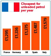
The Met Office chart was one example of poor graphic proof-reading, and here is another one. I saw this in Which? magazine last November and sent them a green-ink letter. It's from an article about the cost of living in the UK, compared to other European countries. The article actually showed that the UK was the second cheapest of the five countries they compared, but they chose to highlight the high cost of fuel in their headline.
In a geeky moment, I compared the figures they gave with the accompanying bar chart - the £39 difference between Germany and the UK results in twice the height difference as the £112 difference between the UK and Spain. And their chart does not appear to start at zero. Here's their graphic and one I knocked up by entering the figures in Excel.
Perhaps this is a bit geeky, but Which? claims to be unbiased and evidence-based. They said they'd check what had happened, but the offending graphics are still on their website.
The Met Office chart was one example of poor graphic proof-reading, and here is another one. I saw this in Which? magazine last November and sent them a green-ink letter. It's from an article about the cost of living in the UK, compared to other European countries. The article actually showed that the UK was the second cheapest of the five countries they compared, but they chose to highlight the high cost of fuel in their headline.
In a geeky moment, I compared the figures they gave with the accompanying bar chart - the £39 difference between Germany and the UK results in twice the height difference as the £112 difference between the UK and Spain. And their chart does not appear to start at zero. Here's their graphic and one I knocked up by entering the figures in Excel.
Perhaps this is a bit geeky, but Which? claims to be unbiased and evidence-based. They said they'd check what had happened, but the offending graphics are still on their website.
Probably a poor chart
UK people will remember that in 2009, one of the rainiest summers in memory (and the third rotten summer in a row), the Met Office issues an optimistic press release promising "The coming summer is 'odds on for a barbecue summer', according to long-range forecasts".
This was accompanied by this bar chart, brought to my attention by Emma Hicks, a student on our MA Information Design course. She is doing a project with our meteorology department to suggest improvements to the way they express probabilities in forecasts.
Not only does it display 20%, 30% and 50% in the wrong proportions, but the hotter orange colour for the 50% bar makes it appear that a much more extreme difference in temperature is being forecast. Actually the predicted differences are less then 1 degree apart.
As it happens, the summer was warmer than average... the only problem was it rained all the time.
The Met Office has since announced they are dropping long range forecasts. They might want to look at their PR department at the same time.
This was accompanied by this bar chart, brought to my attention by Emma Hicks, a student on our MA Information Design course. She is doing a project with our meteorology department to suggest improvements to the way they express probabilities in forecasts.
Not only does it display 20%, 30% and 50% in the wrong proportions, but the hotter orange colour for the 50% bar makes it appear that a much more extreme difference in temperature is being forecast. Actually the predicted differences are less then 1 degree apart.
As it happens, the summer was warmer than average... the only problem was it rained all the time.
The Met Office has since announced they are dropping long range forecasts. They might want to look at their PR department at the same time.
Sunday, May 09, 2010
In defence of Powerpoint
I recently became slightly embroiled in a debate about Powerpoint, when it came under fire [insert own pun about bullets] on the infodesign café list - best known critic is Edward Tufte, of course. Thought I might share my contribution here:
"In defence of Powerpoint, perhaps the contrarian view in this list...
- on one hand, there's nothing more deadly than someone reading off a load of bullet points, word for word
- but on the other hand something like this doesn't catch on unless it fills a need, and we should hesitate before assuming people are lazy or worse for using it
- it's not always displacing a longer reasoned argument (which takes hours to write). More often it's the alternative to a spontaneous, unscripted verbal performance, which goes unrecorded, can easily go wrong, and which not everyone is confident enough to attempt.
- I've found Powerpoint particularly useful when speaking to people whose first language is not my own, and for following presentations in another language, when I have only a school-level reading knowledge of it..
- it's also good for people who weren't at the meeting... when I've given presentations without slides, or with purely visual ones used as punctuation or as talking points, I end up producing bullet point versions to distribute later.
- is there some contradiction between the view that Powerpoint "fundamentally devalues reasoning and logic in an argument, and replaces it with mere summation and statement" and the idea that "one good image, or one good graph with important statistics, is much more persuasive"? [quote from another debater in the list]
- Powerpoint is easily mocked with the Gettysburg address or Churchill's speeches in bullet point form, but oratory uses similar techniques to make itself easily grasped and memorable: rhythm, alliteration, etc.
I think seven bullets is enough... "
Wednesday, May 05, 2010
Giant mosquitoes - you must be joking!
In the context of an academic network, someone recently recounted a well known anecdote about visual literacy in Africa - the one where farmers dismiss a film about controlling mosquitoes or locusts on the grounds they don't suffer from giant insects that are 4ft wide (the size they appeared on the screen - geddit?). I have heard this story too, and wondered if it was an urban myth (or rural myth, even).
A few moments' Googling produced the probable origin of the anecdote, and a different interpretation: that the African viewers were in fact joking, but were misinterpreted by colonialist observers predisposed to think them primitive and visually illiterate. James Burns, a historian of African culture traces it to a colonial film maker William Sellers.
William Sellers (1941) The production of films for primitive people, Overseas Education: A Journal of Educational Experiment and Research in Tropical and Sub-Tropical Areas, (October 1941), p. 221.
A few moments' Googling produced the probable origin of the anecdote, and a different interpretation: that the African viewers were in fact joking, but were misinterpreted by colonialist observers predisposed to think them primitive and visually illiterate. James Burns, a historian of African culture traces it to a colonial film maker William Sellers.
“After the war, when the magazine Colonial Development reported on the work of the Colonial Film Unit in Africa, it managed to squeeze two of Sellers’ stories into the article’s first paragraph.Burns goes on to suggest an alternative interpretation:
‘On one occasion, during the showing of a serious instructional film in Nigeria, the audience was unaccountably rocked with laughter. It was afterwards discovered that the behaviour of a white hen that had strolled into the picture had distracted attention from the main purpose of the film. A film on malaria being shown to a bush audience made little impact because at one point a greatly enlarged picture of a mosquito filled the screen so that its structure could be explained. The audience declared that there was no reason to fear the tiny mosquitoes they knew, which were quite different from the huge and terrifying creature they saw on the screen.’
George Pearson, who became the Colonial Office’s chief film maker in 1939, related the story in an article he published in 1949. ‘The reaction among the natives was ruinous to the film purpose, for they said there would be no need for them to worry about the little mosquitoes they knew; those in the film were enormous and terrible things quite different from anything in their country!’ Pearson then explained the obvious lesson: ‘What had been overlooked was the complete ignorance of the primitive mind and magnification’[24]. Pearson could not resist retelling it a decade later in his autobiography. The story lives on in Southern African today. The historian Tim Burke found it circulating among White professionals in the advertising industry in Zimbabwe in 1991.”
“One’s first impression is that these stories are apocryphal, particularly since the specifics of the incidents are rarely given. And if true they are certainly open to alternative interpretations. Megan Vaughan, in discussing the reaction of the audience to the mosquito on the screen, pointed out that Sellers and his successors never considered that such comments might have been meant ironically. My own experience in Zimbabwe suggests the likelihood of this possibility. Two separate former mobile cinema operators of the Rhodesian Information Service recounted to me their experiences showing rural people films explaining the lifecycle of a new strain of maize. The use of time-lapse photography inspired members of two separate audiences to ask ‘Why does our government not give us this maize which grows so fast?’ Both informants related this story as evidence of the credulity of their audiences. However, when I told a third retired cinema operator this story he merely laughed: ‘Did they not realise the people were only joking?’.”James Burns (2000) Watching Africans Watch Films: theories of spectatorship in British Colonial Africa, Historical Journal of Film, Radio and Television, 20: 2, 197 – 211
William Sellers (1941) The production of films for primitive people, Overseas Education: A Journal of Educational Experiment and Research in Tropical and Sub-Tropical Areas, (October 1941), p. 221.
Monday, May 03, 2010
Small print and your immortal soul
You may have read about the computer game company who inserted a new clause in their small print as an April Fools' Day jape. Around 7,500 customers apparently assented to terms and conditions that included the transfer of rights to their immortal soul to Gamestation.
On the basis that 12% of customers ticked an opt-out clause, Gamestation estimate that 88% of people fail read the small print before making online purchases. I'm surprised as many as 12% read them - I've asked this question at a number of conferences where I've spoken, and I reckon 2 out of about 400 people have put up their hand and admitted to reading the small print.
I found a nice comment about this on Mumsnet (in case you're wondering, no, I'm not a Mum - I googled it).
According to commenter GerbilMeasles, these are known as Friday Sandwich Clauses, and are sometimes inserted by playful solicitors to check if the other side is actually reading the contract they are supposed to be negotiating: 'They normally read something like "On completion and for a period of fifteen years from completion, the Vendor's solicitors shall on request from the Purchaser's solicitors provide on each Friday that is a Business Day a selection of sandwiches, pastries and other snacks as specified by the Purchaser's solicitors."'
Apparently a surprising number of these make it through to the final draft.
On the basis that 12% of customers ticked an opt-out clause, Gamestation estimate that 88% of people fail read the small print before making online purchases. I'm surprised as many as 12% read them - I've asked this question at a number of conferences where I've spoken, and I reckon 2 out of about 400 people have put up their hand and admitted to reading the small print.
I found a nice comment about this on Mumsnet (in case you're wondering, no, I'm not a Mum - I googled it).
According to commenter GerbilMeasles, these are known as Friday Sandwich Clauses, and are sometimes inserted by playful solicitors to check if the other side is actually reading the contract they are supposed to be negotiating: 'They normally read something like "On completion and for a period of fifteen years from completion, the Vendor's solicitors shall on request from the Purchaser's solicitors provide on each Friday that is a Business Day a selection of sandwiches, pastries and other snacks as specified by the Purchaser's solicitors."'
Apparently a surprising number of these make it through to the final draft.
Saturday, April 24, 2010
Flying 101
Kulula is a low budget airline in South Africa with playfully painted planes. Information designers will like this one, called Flying 101 by the airline - David Farbey sent this link to the infodesign café a while back, and I thought I'd pass it on.
Simplifying Time
'The one great thing was simplification. Simplification by organization, simplification by condensation and also simplification by being damn well simple.'Henry Luce, founder of Time magazine, quoted in The New Yorker, 19 April 2010, page 81.
And from an early prospectus, quoted in the same article by Jill Lepore:
'TIME is interested – not in how much it includes between its covers – but in HOW MUCH IT GETS OFF ITS PAGES INTO THE MINDS OF ITS READERS.'
Thursday, April 22, 2010
Fading timelessness
I bring you a minor ink irony. Just noticed that my copy of Christopher Alexander's The Timeless Way of Building, which was bright yellow when I bought it last year, has now faded to white.
Wednesday, April 21, 2010
Extreme simplification: strip out everything they're going to forget
When I hung around in the world of branding, we used to talk a lot about essences - the main idea about a product or company. We sometimes used an exercise in workshops to tease out the essence of an idea - we asked people to sum up a concept or brand in less than ten words.
We'd start with some generic ones to get the conversation flowing:
Starbucks: OK coffee, comfy chairs
The Atkins Diet: Eat lots of meat, get thin
Credit card interest: Pay it all now, or pay more later
The off-side rule: don't hang around near the goal
Then we'd throw in some of their products to see if they could do the same thing.
BlackBerry
Pay as you talk price plans
This is a form of extreme simplification. I was reminded of it on a visit to Kew Gardens today. Kalani Seymour, who is Interpretation Manager (it means she helps visitors to interpret what they see), is setting an MA project, and showed us around her enviable workplace.
On Kew's treetop walkway, Kalani has written and commissioned design for a series of ultra-short explanations of how trees work. The way she put it was 'you strip out everything they're going to forget'.
Here's one of them. A kind of scientific haiku, I reckon.
We'd start with some generic ones to get the conversation flowing:
Starbucks: OK coffee, comfy chairs
The Atkins Diet: Eat lots of meat, get thin
Credit card interest: Pay it all now, or pay more later
The off-side rule: don't hang around near the goal
Then we'd throw in some of their products to see if they could do the same thing.
BlackBerry
Pay as you talk price plans
This is a form of extreme simplification. I was reminded of it on a visit to Kew Gardens today. Kalani Seymour, who is Interpretation Manager (it means she helps visitors to interpret what they see), is setting an MA project, and showed us around her enviable workplace.
On Kew's treetop walkway, Kalani has written and commissioned design for a series of ultra-short explanations of how trees work. The way she put it was 'you strip out everything they're going to forget'.
Here's one of them. A kind of scientific haiku, I reckon.
Wheelie bin numbers: why so big?


Wheelie bins in Reading are often painted with enormous numbers. If you apply the ratio of size to viewing distance normally used for designing signage systems, I reckon these numbers are big enough to use on an airport runway, not a plastic bin that you're standing next to.
Big numbers are probably the result of people grabbing the best tool available for writing a number on a dark plastic bin - a pot of white gloss and a 2 inch brush left over from painting their house.
But our local garden centre now sells wheelie bin numbers in vinyl. Bizarrely, these are also enormous. I think we've witnessed the birth of a genre - to count as wheelie bin numbers, they have to be huge.
Monday, April 19, 2010
The declining public apostrophe: evidence mounts
Thanks to Andrew Belsey for this addition to the collection. I'm guessing which one of these Cambridge street signs is the newest - looks like apostrophes are going out of fashion.


On another matter, Andrew is fond of Polish peanut-themed chocolate snacks, and noticed this nice proof-reading before-and-after pair (clue: look at the foot of the image).
Please read this post in full and retain for future reference
Congratulate me, I'm now the proud owner of a chair from John Lewis. Those partners leave nothing to chance, and on the first page of the instructions we are enjoined to:
Please read the instructions carefully before use.
IMPORTANT, RETAIN FOR FUTURE REFERENCE: READ CAREFULLY
Please ensure the instructions are read in full before attempting to assemble this product.
Read this leaflet in full before commencing assembly.
The list of tools required is particularly thorough:
So we are well prepared before attempting the actual assembly:
Important
Expressive typography tries to communicates the writer's personality and tone of voice, and invites the reader to engage with an appropriate conversational stance. No, not an article in Emigré but this note from my sailing club.
See also my earlier post on encroaching boldness.
Tuesday, March 23, 2010
Nation Shudders At Large Block Of Uninterrupted Text
Thanks to Anita de Waard for pointing me to a nice piece in The Onion. It starts 'Unable to rest their eyes on a colorful photograph or boldface heading that could be easily skimmed and forgotten about, Americans collectively recoiled Monday when confronted with a solid block of uninterrupted text.'
Have a look.
Have a look.
Monday, March 22, 2010
Early hospital sign
Last week I was at the Multidisciplinary Approaches to Discourse conference held in Moissac, in southwestern France. Moissac Abbey is a rather fine church and former monastery dating from the seventh century - part of which was torn down to make way for the railway in the nineteenth century (well, you can't stop progress).
This picture of a man with a crutch announces the hospital wing of the abbey. An early pictogram, in effect, as many people would not have been able to read.
Sunday, March 14, 2010
Peat-free or not, it's a simple question
Buying some potting compost, I wanted to see if Levington compost has peat in it or not. So I looked at the pack.
"At Scotts we are justly proud of our environmental record and our concern for the environment, both at our production facilities and in your garden. With this in mind we continue to develop outstanding, consistent growing media using a range of peat based, reduced peat and peat-free ingredients many of which make use of otherwise waste material. Over the last decade we have significantly reduced the proportion of peat we use in our composts and will continue to do so. We do not harvest from SSSI or SAC sites and are actively involved in helping the management and restoration of the peat land areas that we harvest from. As we continue to work towards reduced peat formulations we are continually introducing new materials into our products (continued on p 94)."
Thank you, minister, that's all we have time for.
"At Scotts we are justly proud of our environmental record and our concern for the environment, both at our production facilities and in your garden. With this in mind we continue to develop outstanding, consistent growing media using a range of peat based, reduced peat and peat-free ingredients many of which make use of otherwise waste material. Over the last decade we have significantly reduced the proportion of peat we use in our composts and will continue to do so. We do not harvest from SSSI or SAC sites and are actively involved in helping the management and restoration of the peat land areas that we harvest from. As we continue to work towards reduced peat formulations we are continually introducing new materials into our products (continued on p 94)."
Thank you, minister, that's all we have time for.
Friday, March 12, 2010
Accused by Amazon
You can tell someone in the family is doing a PhD - just got one of those messages from Amazon saying:
"We've noticed that customers who have purchased or rated Education for Critical Consciousness (Continuum Impacts) by Paulo Freire have also purchased Art Education in the Postmodern World: Collected Essays (Readings in Art and Design Education Series) by T Hardy."
But we're rescued from Pseud's Corner by this other one:
"We've noticed that customers who have purchased music by Dolly Parton have also ordered Me & Bobby Maghee by Kenny Rogers."
It was ironic, honest.
"We've noticed that customers who have purchased or rated Education for Critical Consciousness (Continuum Impacts) by Paulo Freire have also purchased Art Education in the Postmodern World: Collected Essays (Readings in Art and Design Education Series) by T Hardy."
But we're rescued from Pseud's Corner by this other one:
"We've noticed that customers who have purchased music by Dolly Parton have also ordered Me & Bobby Maghee by Kenny Rogers."
It was ironic, honest.
Wednesday, March 10, 2010
Sam Sampson
I was saddened to hear of the passing of Sam Sampson last week. A co-founder of Sampson Tyrrell, later to become Enterprise IG, Sam was the person who brought Information Design Unit into the group.
Thursday, February 25, 2010
More slippery characters
Thanks to Asbjørn Clemmensen for the guy on the left who appears to have had an accident while ice-fishing. In the middle, he seems to be posing by the beach, while on a recent visit to Ljubljana I learned what 'disco dancing' is in Slovenian.
Friday, February 19, 2010
Mash
I've been just been looking at the 1859 Post Office Directory which lists all the commercial companies and traders in London.
My eye fell on the surname Mash. I note that of the eleven people listed with that name, no fewer than six were potato dealers (well, one of these was a greengrocer, so sold potatoes). Perhaps with that name they were drawn to the profession, like Thomas Crapper to toilet manufacture, or a former colleague of mine John Sparkes to electrical engineering.
I now plan to ask the curators to turn the directory open at the Bs, so I can check whether the theory holds good for people called Banger.
The directory is an exhibit in a very interesting exhibition of nineteenth century information design, Designing information before designers, organised by colleagues working on the AHRC funded project 'Designing information for everyday life, 1815-1914'. It has now moved from St Brides to Reading University where it will remain until 15 April.
My eye fell on the surname Mash. I note that of the eleven people listed with that name, no fewer than six were potato dealers (well, one of these was a greengrocer, so sold potatoes). Perhaps with that name they were drawn to the profession, like Thomas Crapper to toilet manufacture, or a former colleague of mine John Sparkes to electrical engineering.
I now plan to ask the curators to turn the directory open at the Bs, so I can check whether the theory holds good for people called Banger.
The directory is an exhibit in a very interesting exhibition of nineteenth century information design, Designing information before designers, organised by colleagues working on the AHRC funded project 'Designing information for everyday life, 1815-1914'. It has now moved from St Brides to Reading University where it will remain until 15 April.
Tuesday, February 16, 2010
Sunday, February 14, 2010
Microsoft Mot
Just a short irritated post from one who is suffering the hell that is Microsoft Word. I'm pouring a conference paper into a template provided by the organisers, who are in France. The template seems to have brought with it a French spell checker. So just after I have typed a word, it changes it to the nearest equivalent in its French dictionary, or in the case of the word 'bélong', its Franglais dictionary.
Tuesday, February 02, 2010
Not an urban myth
A colour-related factoid from Steven Fry's QI programme this weekend, which apparently is not an urban myth: during the cultural revolution in China it was thought that red, as the colour of progress, should mean 'go' in traffic lights, and green should mean stop. But they didn't all get changed over, so...
Colour blindness simulator
As a graphic designer I've often wondered whether to confess that I usually fail the classic Ishihara test for colour blindness. Perhaps that's why I prefer to call myself a typographer or information designer (we mostly work in black and white).
People tend to assume that colour blindness, or colour vision deficiency, is an on-off thing - that you just see grey, or that all colour blind people have the condition to the same degree. Mine is fairly mild, I maintain – it reveals itself in poorly lit shops where I pick out grey clothes and see they are labelled green (no, not lime green, but perhaps a dark olive or almost grey kind of green). And I am slower at picking raspberries than other people – I see the red against the green leaves but they just don't sing out to me as they obviously do to others.
Around 8% of men and 0.5% of women have some degree of colour blindness, mostly red-green. It is apparently genetic and carried by women, not men (somewhat ironic then to hear mothers criticising their sons' choice of clothes).
I found these christmas cracker facts on a useful website called colorblindor, run by Daniel Flück. It has a lot of resources and links – I was especially gratified to find his online RGB Anomaloscope test which reports on your degree of colour blindness (Ishihara just says you are or are not). Although all online tests are accompanied by a health warning about monitor settings, it seemed to work for me.
One useful feature is this colour vision deficiency simulator. You can upload an image and see what it looks like to someone with various colour deficiencies.
People tend to assume that colour blindness, or colour vision deficiency, is an on-off thing - that you just see grey, or that all colour blind people have the condition to the same degree. Mine is fairly mild, I maintain – it reveals itself in poorly lit shops where I pick out grey clothes and see they are labelled green (no, not lime green, but perhaps a dark olive or almost grey kind of green). And I am slower at picking raspberries than other people – I see the red against the green leaves but they just don't sing out to me as they obviously do to others.
Around 8% of men and 0.5% of women have some degree of colour blindness, mostly red-green. It is apparently genetic and carried by women, not men (somewhat ironic then to hear mothers criticising their sons' choice of clothes).
I found these christmas cracker facts on a useful website called colorblindor, run by Daniel Flück. It has a lot of resources and links – I was especially gratified to find his online RGB Anomaloscope test which reports on your degree of colour blindness (Ishihara just says you are or are not). Although all online tests are accompanied by a health warning about monitor settings, it seemed to work for me.
One useful feature is this colour vision deficiency simulator. You can upload an image and see what it looks like to someone with various colour deficiencies.
Thursday, January 21, 2010
Spam tone of voice breakthrough
I get quite a few spam comments on this blog which I have to delete. But I really like the tone of voice in this one. I think I'd like to get letters like this from my over-serious bank.
"Good day, sun shines!Mind you, they wouldn't get my money.
There have been times of hardship when I felt unhappy missing knowledge about opportunities of getting high yields on investments. I was a dump and downright stupid person.
I have never thought that there weren't any need in large starting capital.
Now, I'm happy and lucky, I begin take up real money.
It's all about how to select a proper companion who uses your money in a right way - that is incorporate it in real deals, parts and divides the profit with me."
Another clock
Thinking of Gene Z's chess set, this clock bought a few years ago from Habitat has a nice diagramming reference too. It's clever in a recursive kind of way, but not instructional in the way his chess set is.
Wednesday, January 20, 2010
Broccoli or pants: what's going on?
Paypal just asked me to fill in a questionnaire. This was the first screen - is this some kind of filter to check what browser I'm using, or to check if I'm not in an immature mood? Anyone know?
Sunday, January 10, 2010
Gene Zelazny's diagrammatic chess set
Each piece on this chess set, designed by Gene Zelazny, is a diagram of how it moves.
Gene Zelazny is Director of Visual Communications for McKinsey & Company, and I corresponded with him for a while when they were a client a few years back in the mid-90s. He's been there for many years (he started in 1961 and I think he's still there), and has trained generations of management consultants to do those diagrams they all love - I saw a great collection he compiled of visual metaphors used in management communications, but I don't think he's published it anywhere (he has several books out on the design of charts and presentations).
As a sideline he designs wonderful chess sets - I mentioned to him Ken Garland's interest in board game design, and he sent me one of his diagrammatic sets to pass on to Ken (which I reluctantly did). Here's a link to his chess set gallery.
Gene Zelazny is Director of Visual Communications for McKinsey & Company, and I corresponded with him for a while when they were a client a few years back in the mid-90s. He's been there for many years (he started in 1961 and I think he's still there), and has trained generations of management consultants to do those diagrams they all love - I saw a great collection he compiled of visual metaphors used in management communications, but I don't think he's published it anywhere (he has several books out on the design of charts and presentations).
As a sideline he designs wonderful chess sets - I mentioned to him Ken Garland's interest in board game design, and he sent me one of his diagrammatic sets to pass on to Ken (which I reluctantly did). Here's a link to his chess set gallery.
Figure-ground
Sorry about the quality of this image taken quickly on the move. It's a rare example of figure-ground problem in action. Perhaps you got it straight away but it took a little while for me to see the image here. I can't think why in retrospect - but, of course, once you've recognised something it's almost impossible to erase your understanding. That's why we need to test icons - the designer knows what they mean, and can never see them fresh.
Wednesday, January 06, 2010
Buildings and contents
If you've ever wondered what is covered by your buildings insurance rather than your contents insurance, here's a nice definition from Aviva's website:
"If you were to turn your home upside down, everything that fell out would be your contents, and what is left would be your buildings."
2.8% or 40%: how many people need large print?
A quote from the Arts Council's Get a Plan accessibility website:
"Did you know…40% of the population cannot easily read print if the type size is below 12 pt?"
That would mean 40% of the population couldn't read a newspaper, let alone the instructions on a packet of pills, or the small print on their car insurance.
Or the tests they use to measure literacy... wait a minute - could this explain the apparently low levels of literacy in the UK?
Well, only if the figure was true. The website owner is trying to trace the origin for me, but in the meantime here is a quote from an RNIB report:
'The prevalence in those aged 16+ of at least S9 (difficulty reading ordinary newsprint) was 2.8%' 1998/99 Survey of the Needs and Lifestyles of Visually Impaired Adults. (RNIB/ONS 2000) quoted in Tate et al, The prevalence of visual impairment in the UK (RNIB 2005).
Newsprint is usually about 9pt. All figures for visual impairment get significantly worse for people aged 75+. In this survey only 14% of them, not 40%, reported problems reading newsprint.
"Did you know…40% of the population cannot easily read print if the type size is below 12 pt?"
That would mean 40% of the population couldn't read a newspaper, let alone the instructions on a packet of pills, or the small print on their car insurance.
Or the tests they use to measure literacy... wait a minute - could this explain the apparently low levels of literacy in the UK?
Well, only if the figure was true. The website owner is trying to trace the origin for me, but in the meantime here is a quote from an RNIB report:
'The prevalence in those aged 16+ of at least S9 (difficulty reading ordinary newsprint) was 2.8%' 1998/99 Survey of the Needs and Lifestyles of Visually Impaired Adults. (RNIB/ONS 2000) quoted in Tate et al, The prevalence of visual impairment in the UK (RNIB 2005).
Newsprint is usually about 9pt. All figures for visual impairment get significantly worse for people aged 75+. In this survey only 14% of them, not 40%, reported problems reading newsprint.
Sunday, January 03, 2010
Alphabet updated
A few years ago I was at a talk on transport design organised by the Design Business Association - one questioner asked why it was that the icons were the same in every station or airport you went to. It's so boring and uncreative, he said, and just a cop out by lazy designers.
The same goes for the alphabet too, and the practice of writing from left to right. It's lazy blogging, I know, but I thought you'd be interested in this item from The Onion I found on the Information Design Watch blog from Dynamic Diagrams (always very good).
More memorable security questions
I had an account with First Direct for a short while about ten years ago (I used to open all sorts of accounts just to collect documents that might be relevant to clients we were working for). Now I'm opening another account with them, it turns out they haven't forgotten - they asked me the answers to security questions I set up in around 1998. I couldn't remember my memorable date, my memorable address or my memorable name.
So now I have to choose two new questions to remember at various random points in the future where it will really matter (such as when I have lost my card, or can't log on). Who thinks these things up?
Apostrophes in road signs, and other petitions to the Prime Minister
The e-petitions section on the Number 10 website continues to flourish - one current petition is 'We the undersigned petition the Prime Minister to introduce a nationwide policy enforcing apostrophe use in road signs, applying to all local councils.'
There is still time to sign it, if this is something that keeps you awake at night. Or if you have ever got lost trying to find King's Road when all you can find is Kings Road, which is obviously somewhere else entirely.
The Conservative party recently announced plans to offer a £1m prize to the best use of social networking to harness the collective wisdom of the population in policy-making.
Judging by a good proportion of the e-petitions on the Number 10 website this is a slightly scary idea. Here's a small selection that caught my eye (mind you, I've included one that I would definitely sign):
There is still time to sign it, if this is something that keeps you awake at night. Or if you have ever got lost trying to find King's Road when all you can find is Kings Road, which is obviously somewhere else entirely.
Judging by a good proportion of the e-petitions on the Number 10 website this is a slightly scary idea. Here's a small selection that caught my eye (mind you, I've included one that I would definitely sign):
- Stop the post office delivering mail to residents of the east riding of yorkshire improperly addressed.
- Ban the words 'Unlimited' in publications and/or advertisements by all companies where the service they offer is limited.
- Label lilies and bouquets containing lilies as deadly to cats.
- Bring Tony Blair to account over the war in Iraq.
- Stop The Council Destroying The Graves And Let Our Beloved Rest In Peace!.
- Force all foreigners to learn english when coming to the UK to migrate.
- Get us out of the EU and the sooner the better.
- Re-instate British dignity by banning political correctness against all things British!
- Ban Goverment TV information that use fear tactics.
- Stop the way tv licencing sends rude threatening and down right obnoxious letter to everybody based on the rather crass assumption we are all licence dodgers.
Friday, January 01, 2010
The strange websites of thought leaders
My mention of Robert de Beaugrande's website reminds me of some others I've encountered from prominent thinkers where there's a strange disconnect between the quality of the thinking and the visual design.
Here's a page from the website of Christopher Alexander, something of a hero of mine for his work on pattern languages. Perhaps I'm reacting like a modernist architect might to some of the vernacular structures he celebrates... I'll have to ponder that one.
Robert de Beaugrande
I picked up Robert de Beaugrande's Text production the other day, and thought I'd look a little more at the author. I've found his account of how writers deal with the problem of linearity (that is, the problem that language is linear, but what we want to talk about is not) really helpful in explaining the contribution of typography and layout. He doesn't make the connection himself, although he does apply his ideas to punctuation.
As readers we imagine what writers are like from their work. So visiting Robert's website (link removed 2022 as it's disappeared) I was surprised to find a highly individual, committed and even eccentric scholar - a pioneer of discourse linguistics but not an establishment academic. It's full of pictures of him on his travels around the world (and in company with distinguished linguists), and full of digs at Cambridge University Press, Microsoft, the Tories and other elitist groups he's taken against. Quite strange in many ways - but sincere and committed. He was obviously very deeply engaged in thinking about language, how it works in everyday life, how it should be studied.
He spent a lot of time in recent years scanning in his major publications, including the books, to make them freely available (and free) on his website.
I use the past tense because he died last year - I can't find a biography, just this short obituary, so I don't know how old he was. Not old enough, I suspect.
As readers we imagine what writers are like from their work. So visiting Robert's website (link removed 2022 as it's disappeared) I was surprised to find a highly individual, committed and even eccentric scholar - a pioneer of discourse linguistics but not an establishment academic. It's full of pictures of him on his travels around the world (and in company with distinguished linguists), and full of digs at Cambridge University Press, Microsoft, the Tories and other elitist groups he's taken against. Quite strange in many ways - but sincere and committed. He was obviously very deeply engaged in thinking about language, how it works in everyday life, how it should be studied.
He spent a lot of time in recent years scanning in his major publications, including the books, to make them freely available (and free) on his website.
I use the past tense because he died last year - I can't find a biography, just this short obituary, so I don't know how old he was. Not old enough, I suspect.
If I may be so bold
This is a nice demonstration of encroaching-boldness syndrome from Barclay's banking website. Everything is very important, except for 'This is the', 'of', 'for the' and 'They are presented in'.
Wednesday, December 30, 2009
The large print giveth, the small print taketh away
In my recent post about Tom Fishburne's cartoon I meant to say that he attributes the quote to the Tom Waits song 'Step right up'. Here it is:
I spy with my little eye... branded language!
'I spy with my little eye... something's missing!'
So starts a letter I've just had from First Direct about our application to open an account. We're changing our bank account, in reaction to poor service at our previous award-winning customer-oriented bank. What was missing was information they hadn't previously asked for, so to my ear the headline is not only infantilising but blaming. Perhaps I hadn't said 'please' when I asked for a bank account.
In the same post we also got two identical welcome packs, confirming the account is open... so perhaps they don't need the other information after all. Those letters are headed 'Welcome to first direct (you'll notice the difference in minutes)'. I don't think they are ironically intended.
Now I'm not against branded language (for that is what this is) and when in professional practice used to sell it and do it. But you can't do it in an unthinking way, and every brand doesn't have to sound as chirpy as Innocent smoothies. And you have to be realistic - First Direct's tone of voice would be fine if modulated to match my likely mood (for example, with my gender, age and expressed unhappiness with previous bank, I clearly fall into the grumpy old man demographic). But their systems don't match the aspirations of their brand.
So starts a letter I've just had from First Direct about our application to open an account. We're changing our bank account, in reaction to poor service at our previous award-winning customer-oriented bank. What was missing was information they hadn't previously asked for, so to my ear the headline is not only infantilising but blaming. Perhaps I hadn't said 'please' when I asked for a bank account.
In the same post we also got two identical welcome packs, confirming the account is open... so perhaps they don't need the other information after all. Those letters are headed 'Welcome to first direct (you'll notice the difference in minutes)'. I don't think they are ironically intended.
Now I'm not against branded language (for that is what this is) and when in professional practice used to sell it and do it. But you can't do it in an unthinking way, and every brand doesn't have to sound as chirpy as Innocent smoothies. And you have to be realistic - First Direct's tone of voice would be fine if modulated to match my likely mood (for example, with my gender, age and expressed unhappiness with previous bank, I clearly fall into the grumpy old man demographic). But their systems don't match the aspirations of their brand.
Sunday, December 27, 2009
My spell checker is trying to hold a seminar
My spell checker just queried the word 'semiological'. It suggested it should be semi-logical. Very profound, I thought.
It reminds me of a paper Henri Henrion wrote many years ago, entitled 'Semiotics or semi-idiotics'.
Thursday, December 24, 2009
The grocers/grocer's/grocers' apostrophe
At my public lecture the other day, a questioner raised the matter of the grocer's apostrophe - that's the apostrophe's in potato's, apple's and carrot's.
I said I wasn't particularly bothered as long as I get my potato's.
I was pleased to see support for my position on the BBC programme QI last week, where Stephen Fry said: "People have been ridiculing what has become known as the grocer's apostrophe since the eighteenth century. The Oxford Companion to the English Language notes that there was never a golden age in which the rules for the use of the possessive apostrophe in English were clear cut, and known, understood and followed by most educated people - never."
Have a look at this nice 'apostrophes for Africa' sketch with Omid Djalili playing the part of Lynne Truss, and Marcus Brigstocke on the grammar bullies on Room 101.
I said I wasn't particularly bothered as long as I get my potato's.
I was pleased to see support for my position on the BBC programme QI last week, where Stephen Fry said: "People have been ridiculing what has become known as the grocer's apostrophe since the eighteenth century. The Oxford Companion to the English Language notes that there was never a golden age in which the rules for the use of the possessive apostrophe in English were clear cut, and known, understood and followed by most educated people - never."
Have a look at this nice 'apostrophes for Africa' sketch with Omid Djalili playing the part of Lynne Truss, and Marcus Brigstocke on the grammar bullies on Room 101.
Monday, December 21, 2009
Another Tom Fishburne cartoon

I've mentioned Tom Fishburne's wonderful Brand Camp cartoons before - here's one I used in a public lecture I was asked to deliver in Reading last week. The point I wanted to make was that it's actually OK for there to be some small print - that is, for information to be layered so some of it is more prominent than the rest, or structured so you read different bits of it at different points in your journey to a decision, to new knowledge or whatever your goal is. It's actually considerate to the reader to reflect their priorities, or to guide them through the big picture. But the bad stuff shouldn't only live in the small print.
Instead, the large print structureth, and the small print filleth in the detail.
Subscribe to:
Posts (Atom)