Slate some years back collected together the poetry of Donald Rumsfeld. There is no point in reproducing the famous 'Known unknowns' – it is too well known. But I thought this ode to clarity would suit this blog very well.
Clarity
I think what you'll find,
I think what you'll find is,
Whatever it is we do substantively,
There will be near-perfect clarity
As to what it is.
And it will be known,
And it will be known to the Congress,
And it will be known to you,
Probably before we decide it,
But it will be known.
Feb. 28, 2003, Department of Defense briefing
Tuesday, September 29, 2009
Tube map latest
I'm less worried about the river, and more concerned about the welfare of the famous animals on the underground.
Wednesday, September 23, 2009
Little people run to the left
Monday, September 21, 2009
Ladies THIS WAY
Usability in action. Not one but two extra signs have been required here to persuade the ladies that this really is the way in. What's gone wrong? At a guess, the height of the signs, the collision of too many signs (the baby, the shower... or is it a jellyfish), but perhaps the icons for men and women are just too similar. The two word sign 'Ladies toilet' forces the type to a smaller size, too.
Another thought - where do dads go to change their babies?
Monday, September 14, 2009
Thursday, September 10, 2009
More titles to choose from
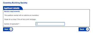
While I'm twitting the Coventry Building Society (nice old-fashioned phrase, that - not the same as tweeting, although you could do both: you could tweet a twit on twitter) here's their choice of titles. They obviously do well with the RAF and the Royal Artillery, and not just the officers. But not as posh as Harrods etc, obviously.
Back to the next page
Monday, September 07, 2009
Doing without signs
I mentioned before that architects don't seem to like signs. I was in a brand new office block last week, looking for the loos. There were labels on the doors themselves to distinguish the ladies from the gents, but nothing you could see side on or from more than a couple of metres. But I had no trouble finding them by instinct, or perhaps through deduction (they are often near the lifts as they both need the central service shaft). Of course the clincher was the cleaning trolley.
Sunday, September 06, 2009
Beanfeast
Not only do signs fade – so do words. If you pass this sign in Highgate, and wonder why all the beans, let me save you the trouble. I looked it up, and a beanfeast is "an annual dinner or party given by an employer for employees". The bean bit may not be connected with beans, apparently, coming instead from the Latin bene.
Friday, September 04, 2009
Visual Voltage
Visual Voltage is an inspiring exhibition by a group of Swedish designers and engineers, of technology that helps people visualise their energy use in the home. We've just installed a meter that tells us how much energy we're using - you can switch the washing machine on and see the hourly cost shoot up. But it's not very compelling, and you forget about it quite quickly. These devices are more visceral - some of them actually work on an emotional level (such as the energy flower than blooms when you use less electricity). The powercord (below) looks like it's wasting energy, and you can't wait to switch it off. The energy clock maps your households usage, and shows you the times when you might need to change your habits.
The exhibition is touring at the moment, but there don't seem to be any UK dates.


The exhibition is touring at the moment, but there don't seem to be any UK dates.
Thursday, September 03, 2009
Making Policy Public
Have a look at http://www.makingpolicypublic.net/, where the Centre for Urban Pedagogy publishes a regular series of foldout posters that explain public policy. They act as go-between to introduce campaigners to designers and the results are impressive. Here's one on predatory equity (businesses who buy up rent controlled buildings, then harrass tenants until they leave).

Top: folded out as a poster
Below: information spread

Top: folded out as a poster
Below: information spread
Subscribe to:
Comments (Atom)


