Look at the table to see what order Everton, Bolton, Reading and Newcastle are in. But rather than dismiss reversed type as unusable, we should instead see this as a phenomenon we can use wisely to good effect. In fact it is most often used for navigation, where we are designing for a two stage reading process (find it, then read it).
Thursday, December 21, 2006
Reversed type for headings
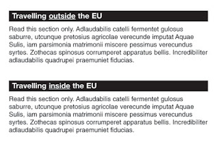
Usability research sometimes shows that people are ignoring reversed headings. When reading aloud, they will often just skip the heading as if they haven't noticed it. This is probably an example of the figure-ground illusion (often illustrated using the famous candlestick-faces diagram).
You can see this at work in typography when lists are printed this way. I remembering seeing the football league table printed this way – it was very hard to read both the white and black type together.
Look at the table to see what order Everton, Bolton, Reading and Newcastle are in. But rather than dismiss reversed type as unusable, we should instead see this as a phenomenon we can use wisely to good effect. In fact it is most often used for navigation, where we are designing for a two stage reading process (find it, then read it).
Look at the table to see what order Everton, Bolton, Reading and Newcastle are in. But rather than dismiss reversed type as unusable, we should instead see this as a phenomenon we can use wisely to good effect. In fact it is most often used for navigation, where we are designing for a two stage reading process (find it, then read it).

