Monday, June 23, 2008

Indent, outdent, shake it all about

I've been reviewing a new graphic design textbook: Graphic design: the new basics by Ellen Lupton and Jennifer Cole Phillips. I tend to flip to the contents list, index and bibliography first to get an overview. Here's how the bibliography starts.


There's indenting and outdenting, and I know which works for me. Well, I did say it was a graphic design textbook. Not information design.

I should say that it looks like a good graphic design textbook - and although it seems to be something of a user-free zone, it gives a very good grounding in the aesthetics of graphic form.

Friday, May 30, 2008

Got alight?

Following previous posts on this, I note that you can still get a light for the Planetarium at Baker St tube station.

Whose Tom Jones?


If you didn't know that Henry Fielding is the author, and Tom Jones is the book, you might be confused by this Oxford World's Classics book cover that gives them equal billing. But seen in a bookshop, with others in the series, the relationship of author to title is clear:


So here, the status of author and title are indicated solely by position. But collecting together other editions gives a nice demonstration of how, in certain circumstances, typographic, layout and verbal codes are interchangeable.


The ones that use Fielding's original full title are the least ambiguous. In this last one, it's the picture that really disambiguates:

Friday, May 23, 2008

Unknown at this address


Speaking of direct mail, Tiscali have just sent a letter to our house that obviously needs redirecting to Donald Rumsfeld.

You can read Donald's poetry here.

Friday, May 09, 2008

Chandlery

I quoted a sailing manual in a post the other day, and I've been reading more. Much of the terminology is absolutely functional - you have to distinguish between ropes with different functions (halyards that pull sails up, sheets that control them, the painter that you tie the boat up with, and stays and shrouds that hold up the mast). And 'left' and 'right' don't really cut it when everyone on the boat is facing in a different direction. 'Port' and 'starboard' are relative to the boat itself, not the way you happen to be standing.

But it seems to me that quite a bit of nautical writing goes a little too far. It's the verbal equivalent of the gadgetry that boat owners love to buy. We love to rummage around for interesting pieces of kit - some of us want the high tech stuff, others are strictly traditional. But a lot of it is designed for selling not for using.

Verbal chandlery might describe words that are lovely to have, and to bring out from time to time, but which are not strictly necessary.

The best ones are made from wood and brass. Like the word 'witnesseth' that my solicitor included in a lease he's just drafted. Or the word 'thusly' that appeared twice in a student dissertation I've just marked.

Molesworth and personalised mail


People of my age and background may have spotted the Molesworth reference in my last post. I nicked this image from the St Custards website.

As a boarding school pupil I loved the Molesworth books* which normalised my odd experience of childhood. Our hero, Nigel Molesworth is at an archetypal prep school, St Custards, that I was convinced was modelled on my own.

His letters home start off as detailed accounts of his school-life, gradually homing in on test marks received, the latest school football match and the present he would like to be sent. Finally they come down to a form letter: (a) Maths 3/10 (b) St Cakes 4-0 (c) water pistol.

When my son Alex was about that age we were able to take advantage of modern technology to build a simlar mail merge system for his Christmas letters: the mail merge table contained a column with 'Granny, Aunt Marjorie, etc', another with a choice of suitable adjectives ('nice, interesting, great, brill') and third with a choice of gift ('cheque, book, WHSmith token', etc). It worked very effectively for several years.


*Written by Geoffrey Willans and illustrated by Ronald Searle, they were written in the mis-spelled voice of Molesworth. They are the origin of the Private Eye catchphrase 'as any fule kno'.


The correct form of address

I just looked up the postal address for information design consultancy and/or/if (they are former colleagues and very good). It is:

and/or/if,
Oakridge Barn,
Plum Park Estate,
Watling Street,
Paulerspury,
Towcester
NN12 6LQ
England
Great Britain
Europe
Earth
The Universe

I repeat it in full here not just to make my plug more complete, but to remark on the sevenlinesness of their address.

They do a lot of design for personalised laser-printed documents, and one of the things you have to do in that line of work is to test for worst-case examples. Long names or addresses for example. Years ago we worked on documents for BT, and found that their customer database required us to allow up to eleven lines for the name and address.

I suspect and/or/if deliberately chose their address so they could themselves feature as a test scenario. Expect one of them to change their name any minute to Lieutenant-Colonel Richard Trumpington-Verylongname.

Thursday, May 01, 2008

Exit alight

A while back I commented on the quaint use of 'alight', meaning 'get off train'. As in the message at King's Cross underground station saying 'Alight for the Royal National Institute for the Blind' (geddit?).

At some point recently the message changed to 'exit for the Royal National Institute of Blind People'.

So farewell alight as exit enters. And exit 'for', and enter the more empowering 'of' and the more respectful 'people'.

Home grown jargon

Hearing about the new Simplification Centre at Reading, David Betts (a retired member of staff) has written to suggest we look to our own language. As he points out, since his time, "'Porters' have become 'Building Facilities Attendants'; 'Buildings Officer' has become 'Director of the Directorate of Facilities Management and Estates'; 'Wardens' have become 'Group Senior Resident Tutors'."

Fair comment. I'll get one of our Linguistic Communication Disambiguation Officers on to it straight away.

Thursday, April 24, 2008

Ruff, Gaff and Guff

Here are three short text passages. How would you simplify them?

Two Hearts by West was not a pretty contract. North led the queen of spades and South overtook with the king and returned the queen of clubs, preparatory to a defensive crossruff. Declarer won the club and led with his diamond. North won the ace, gave his partner a club ruff, and South followed with two more top spades, North discarding a diamond, then a fourth spade, ruffed with the nine and overruffed with the jack. North gave his partner a final club ruff, then came a fifth spade, declarer’s ruff with the ten winning. From the bridge column of The Times newspaper.

The common and traditional way to rig the tops'l sheet (or clew outhaul) is from the clew to a turning block at the after end of the gaff, then forward and down to a turning block on the lower side of the gaff jaws, continuing down to deck level to be belayed. Traditionally, the belay point is on the main boom, near the gooseneck/yaws, and the turning block at the gaff jaws is hung from a short pendant. With the belay point on the boom, sheet tension ought to remain constant from one tack to the other (as opposed to being belayed to a pin on deck, where the lead would change). From the website of the Old Gaffers Association (hint: sailing boats)

The UK funding system introduced by the Pensions Act 2004 works on the basis that the target funding level (technical provisions) combined with the employer covenant forms the basis of security for defined benefits. If the covenant is removed or marginalised, trustees should recognise that this should substantially increase the scheme’s appropriate level of technical provisions, and they should reflect this potential change in negotiations and the mitigation they seek. From a discussion paper of The Pensions Regulator


If it was just a matter of plain English, I wouldn't do anything to the first one - according to the Flesch-Kincaid readability formula it is already grade 7.2, which is pretty good. The other two are grade 12. But even after looking up 'ruff' in the dictionary (it means 'an act or instance of trumping when one cannot follow suit'), I am none the wiser. To make this passage clear to me would require an evening class over several weeks, at the very least. Even though the sentences are short, I don't know what the words mean. Even when I know what the words mean, I don't know the rules.

On that count, the sailing example should be clear to me, though. I happen to know what most the technical words mean, and I have a boat, so I know the rules. But it is not clear, and I need to draw a diagram to be able to place the different items on the boat, and understand how they are connected.

The third item is very similar to some text I am trying to edit right now. I have no idea whether its intended audience can understand either the words or the rules of the game.

Sunday, April 20, 2008

Walk this way


Waiting to pay for a book in Foyles at St Pancras station the other day, I found myself queuing from the wrong direction. When the shop person finished dealing with the person in front, she then served someone else who just arrived from the other direction... as if I wasn't there.

I apparently misinterpreted the sign pictured here. I saw it as indicating the direction of travel of the queue, and as ushering me into the space just behind it. Its real intention was to point in the direction I should walk before turning around and queuing from the other side. I should add that the other side did have a notice saying 'queue from this side' but it wasn't visible to me.

Feeling stroppy, and wishing to embarrass my family as all good fathers and husbands should, I complained. The shop person just could not see the problem, because she knew which direction the queue was supposed to go. In effect, she made the case for user-testing. Just because we, having written and designed something, have no difficulty with it, does not mean someone else will react in the same way.

Happily for me, the next customer who arrived made the same 'mistake' as me. So of our sample of three customers, 66.6666% recurring interpreted the arrow as I did.

Friday, April 04, 2008

Small print walks tall

There's been an interesting discussion on the infodesign cafe list about a recent attempt by a British Member of Parliament (Nick Palmer) to introduce a minimum type size for 'small print'. On the advice of the RNIB (the main advocate group for the partially sighted in the UK) and the Plain English Campaign, he suggests a minimum of 12pt. This recommendation surfaces from time to time, but is usually unaccompanied by suggestions about what to do about the paper mountain that would ensue. As several correspondents on the list observed, 12pt type is not a very precise term, and height does not in itself bring legibility... as film posters demonstrate: I've sometimes wondered why Hollywood stars insist on taller type to assert their importance on film posters. Has anyone ever insisted on a contractual right to legible type?


Friday, March 28, 2008

Pub spelling

Sign outside a bar in Reading: "Credit cards excepted". I think I know what they mean, but I suppose they could mean what they say.

Another sign outside a pub, this time in Dublin: "Help wanted. Apply wittin".

Role on phonetic spelling.

Friday, March 21, 2008

What's that in buses?

A reader complained to the BBC today about a report on the new terminal at Heathrow airport - he thought they had been patronising in describing its length as 'three football pitches' when we would be perfectly capable of visualising metres.

In the UK, we use double decker buses for length and height, and football pitches for length and area. We also use Nelson's columns for height, and Wales is our unit of large area. And, as Stephen Fry pointed out on the telly the other day, we use fahrenheit for heat ('it's in the nineties') but celsius for cold ('it's minus three').

Other countries have their own variants, and I remember thinking that it was odd that my Michelin guide to New York used Eiffel Towers to express the height of the Empire State Building. I thought, if they've bothered to translate it from French into English, why couldn't they translate the pictures too?

I've just googled this and found a rather nice translation utility: The Double-Decker Bus Calculator. You can use it to translate between preferred measures: for example it turns out that Wales is 401.138996 Manhattan Islands. Oddly enough, it omits Belgium (the metric equivalent to Wales).

Wednesday, March 19, 2008

Responsibility avoidance: how the passive voice helps

Easyjet wants an extra fiver for something called 'Speedy Boarding Plus'. Presumably this means you get to jump the queue in the boarding sprint. Here's how they explain it:

"Speedy Boarders get the widest choice of seats provided you’re at the gate when boarding starts. At certain airports we offer Speedy Boarding Plus which means you can check in at a dedicated priority desk. If you are bussed to the aircraft we can’t guarantee that you’re off the bus first."

We need a connective between the last two sentences: I think it means 'However, if you are bussed...'. In fact it sounds like people who pay the fiver get onto the bus first, which usually means they are last off.

Of course it would not be Easyjet's fault if you paid them a fiver and 'you are bussed'. In the passive voice, it just happens. No one makes it happen. It's just the way it is.

Tuesday, March 04, 2008

Benefits of dramatic projection

Police procedurals like CSI often include interfaces that the TV detectives use for matching fingerprints or tracking vehicles. These interfaces are unlike any normal ones you find in workplaces - graphic features have to be exaggerated in order to be legible on television. Similarly, ransom notes are always written in large legible writing.

Actually, this how everything should be designed - clear and bold enough to get how it works at first glance. It isn't a bad design principle to ask yourself: how would my interface work on TV?

Friday, February 01, 2008

Good news! We putting up the price!

We buy our electricity on a green tariff from Good Energy, who buy only from renewable sources. They've just written to say they have put the price up, reflecting changes in the wholesale market... or something - there is a bit of gobbledegook about how the market works and how the price increase is nothing to do with them (and there's me thinking there's a direct wire from their windmill to my house).

The letter ends with a splendid piece of rhetoric: 'We hope that increases in price, although unwelcome, will have a positive outcome by helping households across the UK to treat electricity as the precious resource it is and to use it wisely'.

Perhaps they should have gone the whole hog, and entitled the letter: Great news! Electricity prices have gone up!

Thursday, January 31, 2008

Indexed blog to be a book

A plug for a wonderful blog (you probably know it already). Jessica Hagy's Indexed blog is full of wonderful Venn diagrams and equations that describe essential life truths. Occasion for the plug now is that it's coming out as a book. Here's a link to it at Amazon. And here's a sample.

Saturday, January 26, 2008

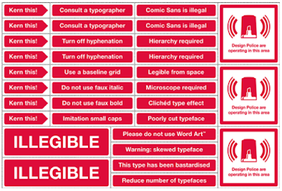
Design police


Thanks to Beth Shepherd for alerting me to the Design Police (2022 note: the link has disappeared). It's obviously hit the spot because it's on practically every design blog - and has revealed one or two sense of humour failures, judging by some of the comments. 
*The Design Police are Stephen Woowat and Karl Goldstraw. 

I wonder if this doesn't represent a real insight into simple, engaging ways to represent good practice. Having said that, each rule invites the question 'why', and the answers would range from legibility research to simple 'nice boys/girls don't do that'. 

For example, using inch marks for quotations doesn't actually do anyone any harm, but it is a signifier of competence that people will judge you by – like using the wrong knife at dinner. 

Inspired by the Design Police, I'm now speculating about repurposing road signs (not original, I know) to warn readers of problems ahead in complex writing. Here are some signs whose meaning I hope is clear:

Friday, January 18, 2008

Certain discrepancies

Standard Life wrote recently to tell us they are raising the management charge on our ISA. I'm trying to find the right adjective to describe their explanation of the reason for this:
"Standard Life Investments conduct regular reviews of their products. Following their most recent review, certain discrepancies came to light between their charging structure and those of their competitors."
Don't you just love the third person - nothing to do with us, it's them... although them is actually us. And obviously a discrepancy is a terrible thing. I'm so glad they've put it right. Happy to pay more. Wouldn't want a discrepancy. Oh no.

Tuesday, December 11, 2007

Virgin Media... we're watching you

Well we're not watching your TV service yet, actually, as the kit I need to connect in my new house hasn't arrived. The courier who tried to deliver my package left a printed note saying they had 'popped round'. For a cup of sugar, and a chat?

Judy Delin's 'Hello you' letter (see earlier post) should have warned me off this lot.

In order to arrange redelivery I had to call Virgin. Good thing was, it was only a couple of menu levels to reach what was apparently the right number. Bad thing was, they hung up on me every time. How about this for pseudo politeness: "we're still unusually busy, so instead of staying on the line you may like to give us a call later..." [cue the dial tone].

They are usually unusually busy, it seems.

Thursday, December 06, 2007

French french fries


This table was printed on a poke of chips at a fast food chain in France. 

I don't think the lady on the right eats many chips. The bloke, on the other hand... is that his left arm or his tummy?

Monday, November 26, 2007

Memory load and internet security

Following the loss of citizens' banking and personal details by HMRC, we're getting a lot of advice about internet security. My bank, Smile, tells me that 'each password should be unique and unrelated to any of your other passwords.'

They go on to advise: 'You shouldn't write them down, and you shouldn't share them with anyone, even your best mates... Strong passwords use combinations of uppercase and lowercase letters, numbers, and punctuation, they aren't usually found in any dictionary. For example using 'river' would be a weak password, whereas 'r!V3r_78' would be much stronger.'

So strong it wouldn't even let me in, because I wouldn't remember it. Many of us have accumulated dozens of relationships with banks, retailers, social networks, and other sites that want passwords. There is absolutely no chance of dreaming up unique, strong passwords for each one and not writing them down.

Smile's advice doesn't work. Poor information is no information.

Monday, November 19, 2007

"Labour kills off 'husbands' and 'wives'"

This was a story in the Mail on Sunday yesterday. Apparently the term 'partner' is now used in place of 'husband', 'wife' or 'spouse' on some HMRC forms. This is attributed by the paper to a socialist conspiracy to destroy marriage.

Well, actually it's used in the question 'Do you have a partner?' instead of something like 'Do you have a spouse, partner (defined as a person you are living with as if you are married) or civil partner?'. So this very probably points to a civil servant trying to save space and write in plain English. Do they really think the Prime Minister and his cabinet discuss the wording on a form?

The article also notes that on the Child Benefit form you are asked to select your title from 'Mrs, Miss, Ms, Mr', and attributes this sequence to a 'nod to feminism'. Well, no, actually. The legislation requires Child Benefit to be paid to the mother, unless the child is living with the father or other person. And most mothers are married women ('Mrs'), followed statistically by unmarried women ('Miss'). 'Mr' comes last because it is the least likely response to the question.

Wednesday, November 14, 2007

Web more visual? I don't think so

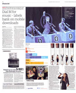
I occasionally hear people assert, as if a truism, that the web is a much more visual medium than text. I don't think it is. In fact the opposite is often true if you compare two versions of the same document. For example, here's a story from a recent issue of The Guardian newspaper.

The story (about the growth in music downloads) is illustrated by a graph comparing the years 2005 and 2006 in different countries, and also comparing mobile and online downloads. It is also decorated by images of a band, some people dancing in test tubes, and someone singing.

But compare with the online version. No images (except a portrait of the journalist we didn't see in the paper version), no graph (surely that contains a key message, even if the pictures don't. And the story is surrounded by navigation - links enticing you to stop reading this story and go somewhere else.


On another matter, the pictures in the paper are a veritable semiotic feast: what are the fascist-looking symbols in front of the band? have the test-tube ladies escaped from a story about cloning? and I love the singer's Remembrance Day poppy. Nothing is captioned so we'll never know the explanation.

Sunday, November 04, 2007

More silly questions


Further to my recent post, I've been helping my elderly father-in-law manage his online bank account with the Nationwide. It asked us to choose four security questions and give answers that we then have to remember at any point in the future. What age do they assume their customers are? Does anyone over 7 years old actually have a favourite colour? How about some questions suitable for people over 50? Such as 'how much did Mars Bars used to cost?', 'what do you hate most about online banking?', or the reliable 'where were you when you heard that President Kennedy had been shot?'. But best to stay away from 'what did you come upstairs for?' or 'where are your car keys?'.

Monday, October 22, 2007

Nice poster to buy


Get it from Flood the Valley.

Didn't find this myself - saw it first on a nice blog from and/or/if who are document designers I used to work with.

Favourite questions

Registering on a website today, I was asked to choose a security question from the following options:


Problem is:
  • Don't know, and seems a bit late to ask now.
  • If I pick one at random, would I pick the same one when I'm asked again. And, heck, it was 50 years ago.
  • Heck, it was 50 years ago
  • Heck, it was 50 years ago
  • Heck, it was 200 years ago
  • Which grandfather?

Friday, October 12, 2007

The Rupert principle

I sometimes find myself referring to a particular pattern of explanation as a Rupert, and this understandably puzzles people who didn't grow up in the UK at the time I did. Rupert Bear was a classic comic strip that was published in the Daily Express (and may still be, for all I know). It includes three parallel versions of the same story: a picture, a couplet, and a full text version. The combination allows different ways for children and parents to share the story, and is a classic pattern for information designers.
Here's what it looks like:

Born under a bad sign

If we had to choose a theme tune for simplification, what would it be? I'd pick Albert King's classic blues 'Born under a bad sign'. Apart from its obvious reference to poor wayfinding in maternity hospitals, it contains this lament for literacy:

I can't read.
I didn't learn how to write.
My whole life's been one big fight.

You can hear/get it at iTunes.

Tuesday, September 18, 2007

Just important stuff you don't need to read

Back to small print. Just got this example from O2, the mobile phone operator, who like everyone else has time to think of a clever idea for the cover, but not for making the information clear. Ho ho.


Monday, September 17, 2007

Word for the day: nocebo

The nocebo effect is the opposite of the better known placebo effect - Latin for 'I will harm' rather than 'I will please'. Just as dummy pills are known to produce beneficial results among around 25% of patients who believe them to be the real treatment, they also trigger side effects in many patients.

Interestingly for information designers, it's been suggested that lists of specific side effects in patient information leaflets (or web pages aimed at patients) may contribute to the effect.

And it turns out that the colour, size and shape of pills has long been known to influence their effectiveness: red, orange and yellow pills have a stimulant effect, while blue and green are more sedative. People expect pills for their heart to be red (but not necessarily heart-shaped, as far as I know).

Good reference on this is: Barsky et al (2002), Nonspecific medication side effects and the nocebo phenomenon. JAMA vol 287, 5, 622-627.

Your home may be at risk...

As I write there is a run on the bank at Northern Rock, the mortgage lender that has had to call on Bank of England help following the sub-prime lending problems in the USA.

Pundits are appearing on TV, commenting on what they see as irrational herd behaviour in customerswho are queuing to take their money out. They seem oddly baffled that risk averse people (that is, the kind of people who keep their life savings in a savings account, not the stock market) are in fact averse to risk.

What risk? Well, we shouldn't forget that financial information routinely accompanies warm reassurance with alarming disclaimers - simultaneously enticing customers with promises of enormous returns, while pointing out in the small print that nothing is guaranteed, and that they could lose their homes. Even though this time I haven't heard any disclaimers by the experts and politicians, perhaps people just assume them.

Wednesday, September 12, 2007

Anal about correct spelling

According to their website, publishers John Benjamins aim their Document Design Companion series at "text analists" among others. I don't know why I've never noticed the anal in analysis before, but this spelling just seems to bring it out.

Thursday, August 23, 2007

Hello, you - Our Ref: (KMM5896382I10596L0KM)

Judy Delin received an email with this title from Virgin Media about her cable TV account. A wonderful juxatposition of matey brand language and bureaucracy. You're not just a number. Well, you are.

The email welcomes her to her new provider, and concludes 'The whole adventure is just beginning'. Worrying, that phrase.

Saturday, August 04, 2007

Out of sight

I'm on holiday in Seattle, and just visited Peter Miller Books - he has a great stock of design and architecture books from small publishers as well as large. I've been there before and I always discover something I haven't seen before.

It's a stimulating and attractive shop to browse in. But you quickly discover that many of the books are out of reach - and out of sight, given the propensity of typographers to use tiny type on design books. Some of the shelves are, at a guess, over 3 metres tall. They look great - with their varying heights, they give the effect of a city skyline.

Peter says he puts the good stuff he doesn't want finger marks on there - books you have to know about and ask for. But I'm not so sure. It's also notable that there are no signs or labels to show how the shop is organised, and I think this reflects something wayfinding designers quickly learn about architects: it's mostly about how it looks and feels, and they hate signs.

Monday, July 30, 2007

Orifices

I've bought a new radiator for our bathroom. The fitting guide is not so much instructional as liturgical: "Appoint on the wall the place of drilling the orifices... In the appointed places drill the orifices. The congregation shall stand."

Speaking of drilling, Plasplugs used to provide slightly superfluous instructions on using their drill bits. I think it was just so they could use the heading 'Boring instructions'.

Sunday, July 22, 2007

Star spotting in Laos


Cara Gerard (former IDU colleague, and wayfinding designer) sent me this nice lady from Luang Prabang, Laos. But she reminds me of someone.

As Private Eye puts it, could they by chance be related?


Wednesday, July 18, 2007

Tom Fishburne's met our clients

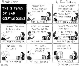
In our studio, when someone spoke of the client as 'barking', they didn't mean mad – they meant 'you don't buy a dog and do your own barking'. But then we found Tom Fishburne's classic '8 types of bad creative critics'. He's identified the full set of favourite client types. We have met every one of these clients, and could give you their names.


Tom has a brilliant collection of marketing and branding observations at his Marketoonist website.
Note to current clients: none of you are like this. Never.

Monday, July 16, 2007

An early bath for heads up, or a heads up on early doors

What am I on about? Phrases which arrive through slips of the tongue, and stick around. Too many metaphors, I know, but stay with me a moment.

An example is 'early doors' which is generally assumed to have originated with football manager Ron Atkinson - famous for his expressive but sometimes mangled English (see this nice YouTube explanation). It is used to mean 'early on' but no one knows where the doors bit comes in.

In our own information design world, we come across the term 'heads up mapping', which refers to maps that are oriented not with north at the top, as is conventional, but so the direction you are facing is at the top. In the research environment, I have seen this referred to as 'forward up', and this makes more sense to me. But because it is the way maps are shown on heads-up displays in aircraft cockpits, the term has slipped across to refer to map as well as the display.

Personally I am not convinced that forward-up mapping works best for everyone. But more on this another time.

Wednesday, July 11, 2007

Introducing the Simpleton

I've changed the name of my blog to reflect a new multidisciplinary research centre that I'm planning, called the Simplification Centre. It will help government departments, businesses, and regulators to simplify communications about complex topics such as tax, financial services, and health. I'm moving to the University of Reading to set it up this September.


One problem with the word 'simplification' is that it's not simple. That's why my temporary logo leaves out a syllable. Who knows, it could catch on. After all, there is a precedent. So many people find 'quantitative' such a mouthful that it's only a matter of time before 'quantative' gets into the dictionary through usage.


The bigger the Small Print the smaller the small print

Quite a few copywriters have the original idea of calling terms and conditions 'The Small Print'. Of course, you know when you see this, that you've seen the last bit of plain English you'll see for quite some time. In fact there seems to be a law of inverse proportions here: the larger the title, the more assertive the implicit claim to have addressed the problem, the smaller the smaller print actually is. Here's one we got from Goldfish, the credit card people:


In this example, from Vodafone, the designer makes his or her contempt for the reader pretty clear by devoting a third of the page to white space, rather than allowing the type to be more legible but fill the page.

Tuesday, May 15, 2007

An heck of an annoying use of 'an'

Something that brings out the grumpy old man in me, is the way journalists invariably use 'an' before the word 'historical'. "This summit represented an historical moment...".

My mother is from a generation who pronounces 'hotel' in a slightly French way ("I stayed in an 'otel") but she doesn't say "an Humphrey Bogart movie" or "an Hello magazine" or "an honey and peanut butter sandwich". Mind you should probably wouldn't ask for these last two - she's more likely to ask for "an Country Life" and "an cucumber sandwich".

Friday, February 23, 2007

Rite as yu spik


It's always good advice to 'write as you would speak'. Thanks to colleague Uwe Becker for this photo.

Affix affectation affliction

I don't think she'll mind me mentioning this because it was a triumph, but a group of us went to see (colleague and distinguished linguistics expert) Judy Delin's debut in stand-up comedy. She had some fun with the language you encounter on the tube ('Dogs must be carried', 'Use all available doors', 'Alight for the Royal Institute for the Blind').

What is it with railways and the word 'alight'. Do they get off (alight?) on quaint pomposity? And why don't they do the full Russell Brand? Alight from the carriage and perambulate towards the exit portal. Not forgetting to mind the gap and take all your personal belongings with you when you arrive in at the next station stop.

'Alight' has a distant cousin, 'affix'. For some reason, we stick stamps to personal mail, but affix them to business mail.

Tuesday, January 30, 2007

Octothorpe (you know what I mean)

A colleague’s been debating with a mobile phone company client how to refer to an old-fashioned steam telephone. They want to choose from ‘fixed line’ and ‘land line’, with a preference for the former. She asked for votes from users and ‘land line’ won by a mile. Needless to say, the client wants ‘fixed line’. Actually, a lot of people said ‘none of the above’ and generally refer to ‘home phone’ instead. 

This reminds me of a debate we had with BT a long time back, over what to call the # key when it needs to be spoken out loud in voice menus. 

The international telecommunications standard specifies ‘square’ and BT insist on using that to this day. The debate even went to their usability lab in Martlesham, who backed 'square' ... hmm. We believe 'square' could be there because the standard was translated from another language and the term with it. 

We went out in the street with a phone and as you would expect, no one called that key ‘square’. A lot didn’t know what to call it, but if they had a name it was generally called ‘hash’. Musicians called it the sharp sign, and someone with computing training called it ‘gate’. In the US it is more generally called the ‘pound sign’ or ‘number sign’. 

There is a good Wikipedia entry with further names under the headword Number sign. The most bizarre name for the # sign is Octothorpe. This apparently first appeared in the 60s or 70s, but there is disagreement about its origin. In Elements of Typographic Style (p. 282), Robert Bringhurst says that ‘in cartography, it is also a symbol for village: eight fields around a central square, and this is the source of its name. Octothorp means eight fields.’ 

Really? Type ‘octothorpe’ and ‘cartography’ into Google and all you get is dictionary definitions quoting Robert Bringhurst – nothing from a cartography source. 

Another explanation is given by a retired AT&T engineer, Ralph Carlsen, that he and a colleague made it up, when they needed a word for the # key when developing touchtone phones. I turn out not be the only person puzzled by this bizarre word. Here are just a couple of the various websites chasing its origin: http://www.worldwidewords.org/weirdwords/ww-oct1.htm http://www.robertfulford.com/2005-06-14-octothorpe.html 

Octothorpe is a truly bizarre phenomenon – a word that is never ever used for its notional meaning (ie, to refer to a telephone key), that has no real purpose or nuance to add, but that is in the OED (citing the daft ‘fields’ origin as a possibility), and whose origin is much discussed. At least one web dictionary I found claimed that there are variant spellings such as 'Octotherp', as if linguists had toured the country asking gnarled old telephone engineers for the terms that they and their forefathers had used for generations. 

So my plan is to invent a new word for something, and get it in the OED. Any ideas? More seriously, when you research something like this, it reveals the true limitations of the web – with its apparently authoritative websites packed with cut and paste repetitions of unsubstantiated information.

Thursday, January 18, 2007

Ranged left vs ragged right

My heading looks like a mistake ('ranged left' and 'ragged right' are synonyms). But although they refer to the same thing, I think they mean something different.

Whether or not justified or unjustified type works best is a perennial question. The term refers to the practice of padding out lines with extra space to achieve a straight right-hand edge.

It’s less of an issue that it used to be – owing largely to thirty years or so of modernist-influenced design education, and the displacement of compositors (printers who used to set metal type) by graphic designers, unjustified type is the default option these days. Newspapers and printed books are the only genres where justified type is still more or less compulsory – at least for certain types of content. Textbooks are more likely to be unjustified than novels, and newspapers use justification as a marker of formality – The Times uses justified type for news stories and the main editorial, but unjustified type for features and commentary.

Defenders of justified type have not found much support in reading research – psychologists looking for an effect on reading speed or accuracy have found it makes little difference. But typography isn’t just about making reading easy, or providing an efficient channel for words to pass from page to brain – it’s also about articulating meaning. It is part of the language resource that we use to communicate relationships between parts of a text. In particular, it is what makes written language more than just a secondary form, a transcription of speech. Looked at in this way, is there a role for justification?

I think there is a clue in the names we use. Unjustified type is often known under other names, ‘ranged left’ and ‘ragged right’ being the most common. The names didn’t just happen, but were a form of spin by modernist designers who were uncomfortable that the term ‘unjustified’ seemed to imply a lack of quality. In linguistic terms, ‘unjustified’ is the marked form that implies it is the exception not the rule, whereas ‘ranged left’ is a simple neutral description of the way the type is set. The very term ‘justified’ implies something correct, and properly finished, and in an age of symmetry and ornament anything else would have been seen as unfinished – like unplaned timber, or a garment with no hem.

As descriptive terms, ‘ranged left’ and ‘ragged right’ do quite different jobs, and the difference is instructive. ‘Ranged left’ refers to what is going on inside the column of type – the letters are ranged evenly from the left-hand margin – and makes no reference to the space outside the column. ‘Ragged right’, though, draws attention to the resulting untidy column edge.

In the ‘ranged left’ world view, then, the even texture of type in the column is the most important thing. The column of type is where reading happens, in isolation from other elements on the page.

‘Ragged right’, on the other hand, focuses us on the column edge and, in my view, the term implies a case for justified type.

Edges are critical in graphic design. Pages are made up of different elements, usually aligned in deliberate ways to contribute to the reading experience, whether through meaning, navigation or a simple sense of visual order. The space to the right of a column of type may have a job to do – a job of separating elements, of framing the text, of linking though the continuity of white space. This job can often be done better by a well defined rectangle.

For example, in multi-column layouts, ragged right is fine, so long as the lefthand columns are straight – too much indented type (of the kind you get with legal text) creates a ragged left effect, and the intercolumn space is a less effective visual element.

Here’s a simple demonstration of what I mean.

 
1: Ranged left is fine so long as you have a straight lefthand column to define the column (most of the time, in fact).


2: Where you have frequent multilevel indention in multicolumn text, it effectively creates a ragged left edge and the intercolumn space no longer forms a clear shape. 


3: Justified type restores the vertical alignment.

This note was inspired by a recent discussion on the Infodesign Café. The most thorough and insightful account of the debate is Paul Stiff's 1996 paper: Stiff P (1996) 'The end of the line: a survey of unjustified typography', Information Design Journal, vol 8: 125-152