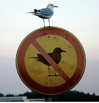
I took this photo in a plane WC a few years ago. If only all warning signs could emote like this.
I took this photo in a plane WC a few years ago. If only all warning signs could emote like this.

Blog posts whoosh past you and get forgotten. So here are one or two from 2010 you might enjoy.
Forget awesome and mind-blowing... we all know that interesting and amusing is as much as we can hope for most of the time.

This is from Punch magazine, 9 May 1962. I've been looking for it for some time but was searching under the wrong name. What astonishes me is that I don't remember any electronic gadgets in the 60s that displayed text. What exactly was he parodying?
Learn With BOOK
by R.J. Heathorn
A new aid to rapid—almost magical– learning has made its appearance. Indications are that if it catches on all the electronic gadgets will be so much junk.
The new device is known as Built-in Orderly Organised Knowledge. The makers generally call it by its initials, BOOK.
Many advantages are claimed over the old-style learning and teaching aids on which most people are brought up nowadays. It has no wires, no electric circuit to break down. No connection is needed to an electricity power point. It is made entirely without mechanical parts to go wrong or need replacement.
Anyone can use BOOK, even children, and it fits comfortably into the hands. It can be conveniently used sitting in an armchair by the fire.
How does this revolutionary, unbelievably easy invention work? Basically BOOK consists only of a large number of paper sheets. These may run to hundreds where BOOK covers a lengthy programme of information. Each sheet bears a number in sequence, so that the sheets cannot be used in the wrong order.
To make it even easier for the user to keep the sheets in the proper order they are held firmly in place by a special locking device called a ‘binding’.
Each sheet of paper presents the user with an information sequence in the form of symbols, which he absorbs optically for automatic registration on the brain. When one sheet has been assimilated a flick of the finger turns it over and further information is found on the other side.
By using both sides of each sheet in this way a great economy is effected, thus reducing both the size and cost of BOOK. No buttons need to be pressed to move from one sheet to another, to open or close BOOK, or to start it working.
BOOK may be taken up at any time and used by merely opening it. Instantly it is ready for use. Nothing has to be connected up or switched on. The user may turn at will to any sheet, going backwards or forwards as he pleases. A sheet is provided near the beginning as a location finder for any required information sequence.
A small accessory, available at trifling extra cost, is the BOOKmark. This enables the user to pick up his programme where he left off on the previous learning session. BOOKmark is versatile and may be used in any BOOK.
The initial cost varies with the size and subject matter. Already a vast range of BOOKs is available, covering every conceivable subject and adjusted to different. levels of aptitude. One BOOK, small enough to be held in the hands, may contain an entire learning schedule.
Once purchased, BOOK requires no further upkeep cost; no batteries or wires are needed, since the motive power, thanks to an ingenious device patented by the makers, is supplied by the brain of the user.
BOOKs may be stored on handy shelves and for ease of reference the programme schedule is normally indicated on the back of the binding.
Altogether the Built-in Orderly Organised Knowledge seems to have great advantages with no drawbacks. We predict a big future for it.
Our doctor's surgery places the receptionists in a space that sticks into the room. There's a perspex screen that they've treated as a notice board, now almost completely covered in notices with random rules and guidance.
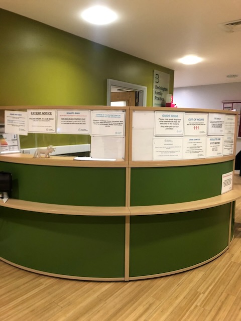
I don't think the notices are there only or even mainly to give information - there's another notice board across the room. They are there to make the receptionists feel more secure.
One of Christopher Alexander's design patterns describes this: 183 Workspace enclosures.
"People cannot work effectively if their workspace is too enclosed or too exposed... You feel more comfortable in a workspace if there is a wall behind you. (If your back is exposed you feel vulnerable–you can never tell if someone is looking at you, or if someone is coming towards you from behind.)"
I wondered if the gap at the back is there because they hadn't enough notices. But I'm pretty sure it is for them to look out through to check who is in the room.

Looked up a What3words reference for our information design summer school, about to start,
It gave me //friends.cuter.behind which is just too Benny Hill to actually give someone (#metoo), so I moved a few metres sideways and got //honey.sizzled.call.
What’s going on?

I've discovered that someone has created a Wikipedia page about me. I've no idea who. It's quite short (obviously) and Wikipedia flags it up as having 'multiple issues'. Well, yes, tell me about it...
I may have mentioned before that I (well, my name) was also listed in the Wikipedia entry 'PG Wodehouse minor characters' where Robert Waller was described as 'a benevolent-looking man, with a pair of mild blue eyes behind his spectacles'. He appears in one of the Psmith books.
I just checked the link and it's gone. But Robert Waller is now listed under a new page called List of PG Wodehouse characters where I am now described as 'an amiable sort, but a secret socialist'. Well, I'll take that too, up to a point.
It's odd to find a Wikipedia page disappear altogether. You can search for deleted pages, though, and find out why someone did this. I've heard that Wikipedia is patrolled by bossy types who like to police other people's efforts. In this case they've justified the deletion by saying '"Minor" denotes that they are inconsequential to the audience of a general encyclopedia'. Literal-minded or what? I hope the entry for Morris Minor isn't next.
Will Stahl-Timmins gave a great talk to the IIID last week (International Institute for Information Design). He is the data graphics designer for the BMJ, a leading medical journal.
Almost as an aside he mentioned the issue of trust: well-finished graphics in a medical context can sometimes be mistaken for marketing by pharma companies.
Integrity can be a problem for infographics, and I've mentioned it before: infographics which round the numbers up or down too much, or which haven't been proof-read against the data, give graphic design a bad name.
Over-simplification is the main objection the plain language movement face. You don't often hear it mentioned in the context of graphic design - perhaps that's because no one actually takes us seriously enough.
.jpeg)
.jpeg)
.jpeg)

On the other hand, Mum...
A lot of English names come from where one of our ancestors lived or what they did for a living (Baker, Smith etc).
This is happening afresh in our smartphone contacts apps when we don't know people's surnames, or think we won't remember why we put them there. How about we start again each generation? It could avoid the problem of whose name to pick when people marry/live together - just make up a new one.


.jpeg)
Actually, multimodality also describes how words combine with pictures.
So this is a multi-modal multi-modal public transport interchange text image combination
Well, yes. I'm a judge of the Plain Language Awards in New Zealand, and we're going through the Public Sector entries at the moment. I've been doing this since 2014, and really enjoy the process which is impressively thorough and open - you can see who the judges are, and what they look for.

There are now several apps you can use to copy text from books – Microsoft Lens, or Adobe Scan, for example. They are pretty good. You take a photo and it scans it with an OCR (Optical Character Recognition) routine to turn it into editable text.
I've noticed that, much like people, these apps struggle with less legible typefaces. So it's possible to use them for informal legibility testing - a kind of app-based strudel test we might say.
Here's some text from a paper I'm writing which I scanned with Microsoft Lens in three typefaces. One is Baskerville which is a typical book typeface, the other is Caslon Italic which most of us would think a bit less legible than Baskerville, and lastly I've included Pixelated, which recalls the earlier for matrix printers of the 1970s and which is on the threshold of legibility.

Lens read Baskerville perfectly, but here's what it managed to read in the Pixelated font:

It's a lot happier with Caslon Italic, although it joined a lot of words together.



.jpeg)